LITTLE SQUID AND THE SEA

Some illustrators create story artwork in one fell swoop, but my particular breed of children's illustration rarely (never?) pops out fully-formed.  In a 48 page book, I approach each drawing as an independent composition deserving of attention and much revision.  

Because I create the artwork by hand and then scan the individual elements to manipulate digitally, I can adjust layout, scale and color selection fairly easily.  For any scene, the drawing and composition may have endured dozens of changes over its lifetime!

Let's take a look at one example from the latest, Little Moon. 

In the story, the tiny protagonist, a Hawaiian Bobtail Squid, must journey to find home.  For me, this odyssey creates the perfect backdrop to introduce various ocean conservation issues to young readers.  The vast majority of ocean pollution originates on land, and I wanted to incorporate this topic into the illustrated subtext of Little Moon.

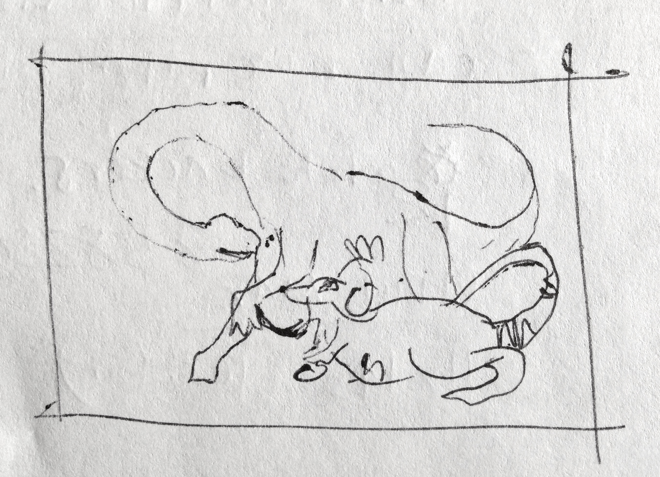
We are all familiar with the devastating impact of ocean debris on sea life.  My goal was to convey this to a child reader in a way that is not too scary, but certainly not funny.  The illustration began as a thumbnail sketch (enlarged here from its original 1" size):

Fun Fact: at the time of this drawing, I STILL used a flip phone (I'm what you might call a "late adopter"...)!  You'll note my homage to my flipper among the ocean trash.

Fun Fact: at the time of this drawing, I STILL used a flip phone (I'm what you might call a "late adopter"...)!  You'll note my homage to my flipper among the ocean trash.

I know that our next generation will have a different relationship with plastic than my own, so it made sense to focus on the effects of plastic in the ocean.  The first concept here was to trap the squid in a plastic bag.  From this, more detailed composition sketches followed:

Flipper is still there!!

Flipper is still there!!

Editing is key here.  Although a jumble of trash of many types does get the point across, it doesn't look too visually-pleasing as an illustration.  Just as in my architectural education, the first concepts tend to be messy with ideas – there is a natural tendency to just "do them all".  Selective editing is so important to narrowing down a broad idea to its main intent.  In these early studies, I simplified the types of background ocean trash to bottles and bags.

I soon found out that drawing a plastic bag with a pencil is WAY easier than painting one with watercolors:

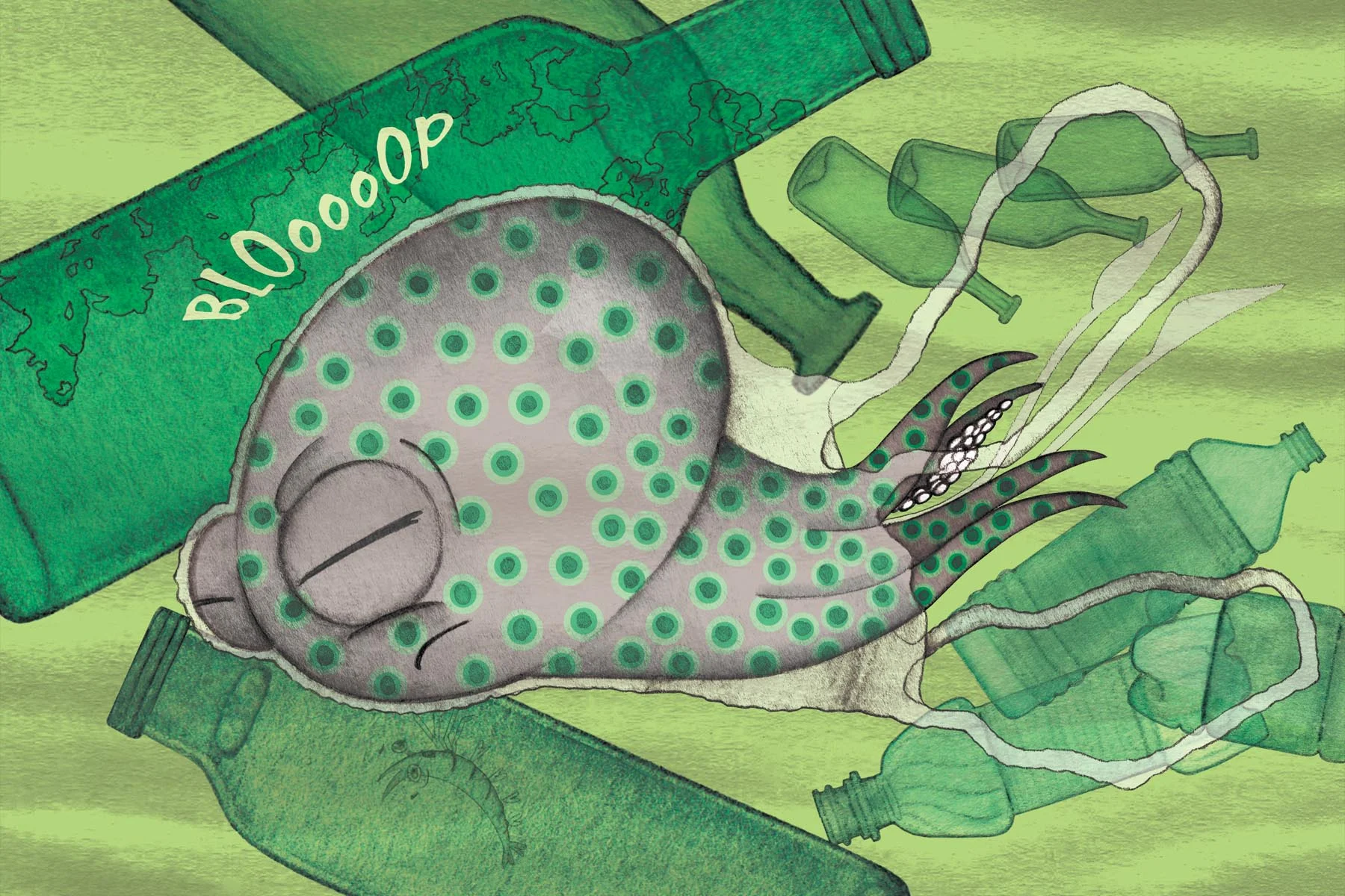
Also, what sound does a squid swimming into a bag make?  At the time, I thought "BLOooOOP", but in hindsight, maybe "PFFFT"?  Onomatopoeias are tough.

After sharing these versions of the illustration with my test audience, I received mostly confusion:

...and no amount of color adjustments could clarify for readers what exactly was happening in this scene.  I may be relatively new at illustrating picture books, but I know that if a reader can't even interpret what is happening in an illustration, that's a bad thing!

So I had to rethink the image.

Source: NOAA (National Oceanic & Atmospheric Association

Source: NOAA (National Oceanic & Atmospheric Association

I was reminded of this diagram I'd found in my story research.  Although plastic grocery bags are perhaps some of the most prevalent land objects in the ocean (and some of the most confusing and deadly for ocean life...and some of the most preventable (click here) for coastal communities!), it turns out that plastic and glass bottles decompose much slower.  This new idea for a vessel seemed much nicer as an illustrated element:
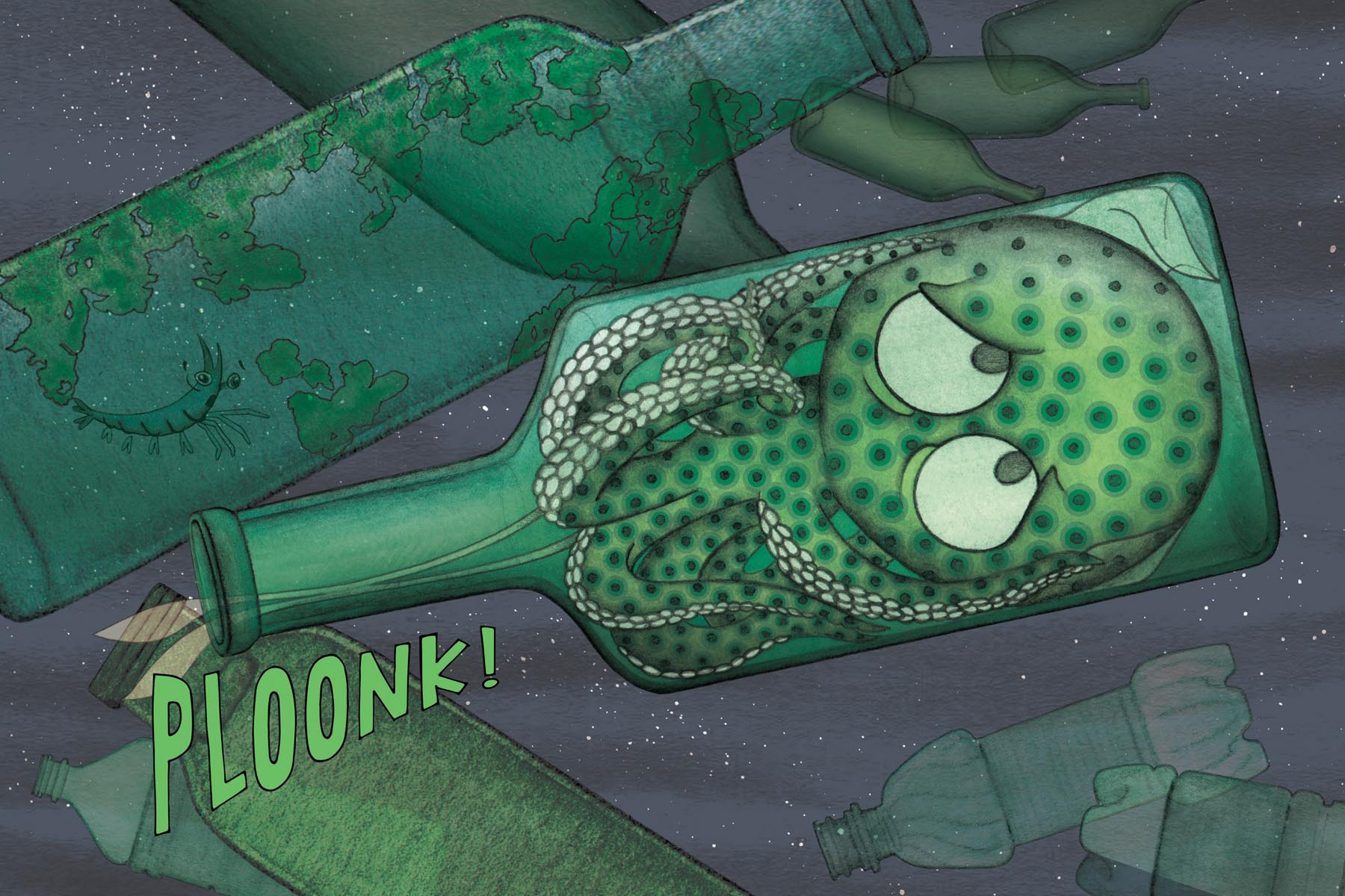
PLOONK, right?

PLOONK, right?

The color scheme for the final image was cross-referenced and coordinated with the tones of the entire book to imply an underlying "murkiness" to these harrowing ocean scenarios.  The tiny, "snowy" flecks are reminders that even at the scale of a tiny squid, there are even tinier beings floating around in the ocean, too small to detect.  As a whole, the image describes just one obstacle in Little Moon's brave journey home.

MO'S 1ST GRADE ADVENTURES

I received a gift that was too fantastic not to share!  A BIG, special thanks to the Big Contest winner and her fabulous first graders, who look to be having a great time with their classroom buddy, Big Mo :)  For a look back at the Big Contest entries: Creativity Spreads

Ms. Pierce and her students have gone above and beyond to incorporate Big Mo into the classroom, and it is so great to see his story inspire more creativity and a love for reading and writing.  They have written and printed their own book, following a typical day in school with Big Mo.

Thank you to Ms. Pierce and all hard-working teachers for making education engaging!

DISSECTING the © PAGE: P-CIP

One of the challenges of publishing your own book is to make it look and feel 'real' (or legit).  I knew that I would need to cross my 't's and dot my 'i's before releasing Big Mo into the Big world!

One of the first indications that a reader is holding a REAL book is a fully-fleshed out and accurate Copyright Page.  Every book has one, and few readers really pay much attention to them.  In this first installment of "Dissecting the © Page", let's look closer at the P-CIP.

Libraries have a lot of books.

La Biblioteca de Babel by Erik Desmazieres (inspired by Jorge Luis Borges novel of the same name), 1997.

La Biblioteca de Babel by Erik Desmazieres (inspired by Jorge Luis Borges novel of the same name), 1997.

Furthermore, librarians SEE a lot of books, and they have to find the proper shelf home for each one.  The purpose of the text block known as Cataloging in Publication (CIP) is to provide librarians with all the needed information to acquire and process a title.  Sounds reasonable, right?

To complicate things, there are two types of Cataloging in Publication: LC-CIP (issued by the Library of Congress Copyright Office) and the P-CIP (prepared by the publisher/agent).  Because the Library of Congress is swarmed by over fifty thousand titles each year, they do not accept self-published works unless the author has a proven history of creating books that are widely accepted by the nation's libraries (quite a daunting goal!).  For the nitty gritty: LC-CIP grit

Naturally, Big Mo falls into the P-CIP category as a self-published work.  Several companies offer authors a CIP-generating service, and I chose the very reputable Quality Books, Inc.  To create the data block, they ask for the book's (a) Plot, (b) Summary, (c) Keywords (for library searchie thingies), (d) Full Text and (e) Intended Audience.

One bit that caused me endless stress was drafting the "official" Summary as forged forever in ink (ie. may as well have been carved in stone) on the © page.  Since Big Mo has a major plot twist, I debated long and hard about the proper wording for the Summary, so as not to spoil the ending!  In the end, I received a lovely and compact block (affectionately, the "CIP Block"), which I then formatted to balance with the title page opposite:

Thank a librarian today!!

ROUGHIN' IT

Aside from those rare moments of sudden inspiration, most of the finished artwork I produce begins life as a rough sketch.  These initial sketches are an artistic tool like any other, and they help to inform and shape the final piece.  I've always valued seeing the "before and after" of other artists' work, allowing me to connect the dots between final piece and first spark.  Often, these initial scribbles are more emotive, or posses more character or movement.  

Still, I am a sucker for a polished piece, especially if it will be forever frozen in time in a painting, book or print!  The dinosaur sketch (above) was conceived as one piece in a series of six pairings of Big Mo and a "big" buddy.  The idea for The Big Series came to me mid-flight, where I brainstormed a list of JUMBO animals that might make for a nice composition with my oversized iguana.


I first determined the best body position for the dinosaur, keeping in mind that the composition would need to format nicely within a 5x7 inch frame.  After that, I penciled Big Mo in a curious interaction with a fellow giant lizard!

Next came the "therapeutic" part - hours of painting with watercolor and a teensy brush...
Until, VOILA:

Mo & the Brachiosaurus are available on blank notecards at my online shop:


...OR you can find me signing and selling handcrafted watercolor prints in person on the Convention circuit!  See 'Sightings' tab for details and dates :)