There was a not-too-distant time when adding the prefix "i" to a word somehow made it more personal, more imaginative, and coincidentally, more marketable. iPhone, iWALK, iRun, iSing, iTeddy (yes, these all exist!). Clearly, the trend has gotten a bit out of hand, but at the heart of the concept is the notion that the individual is in charge. This idea pervades all aspects of modern life, and lucky me – it even extends into the realms of writing and publishing.
To understand "new" publishing (and yes, even iPublish exists), we should first understand the traditional model:
What does a publisher do?
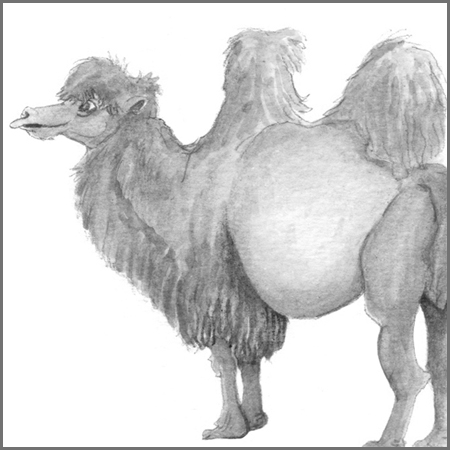
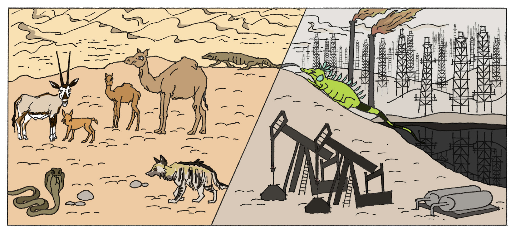
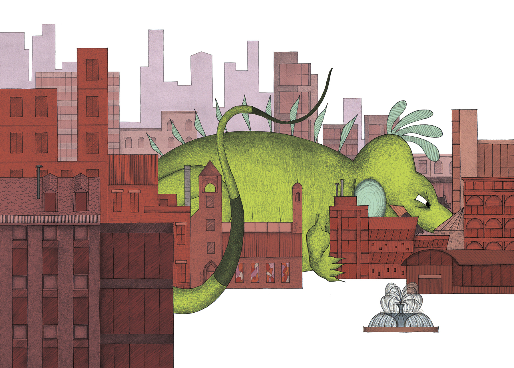
In my brain, which is wired a little funny, it helps to reference the natural world to answer this question. We can think of every book as having a LIFE CYCLE, just like the one you learned about in the third grade:

A publisher manages the life cycle of each book they publish, from its birth to its 'death' (ie. going out-of-print). While the author usually controls the conception of a story, her publisher may have strong input as to which literary recipe they are looking for at the time. Okay, I've gone overboard with the metaphors.
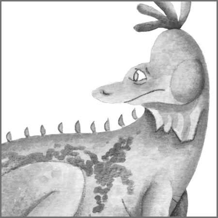
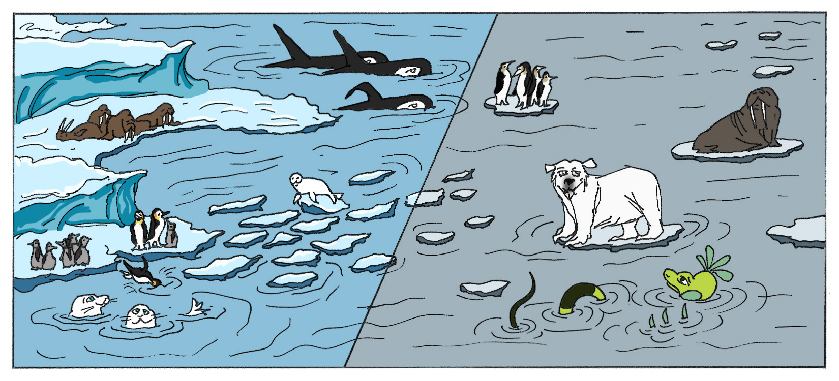
...well, not totally overboard just yet. Let's look at another life cycle that I am particularly fond of:

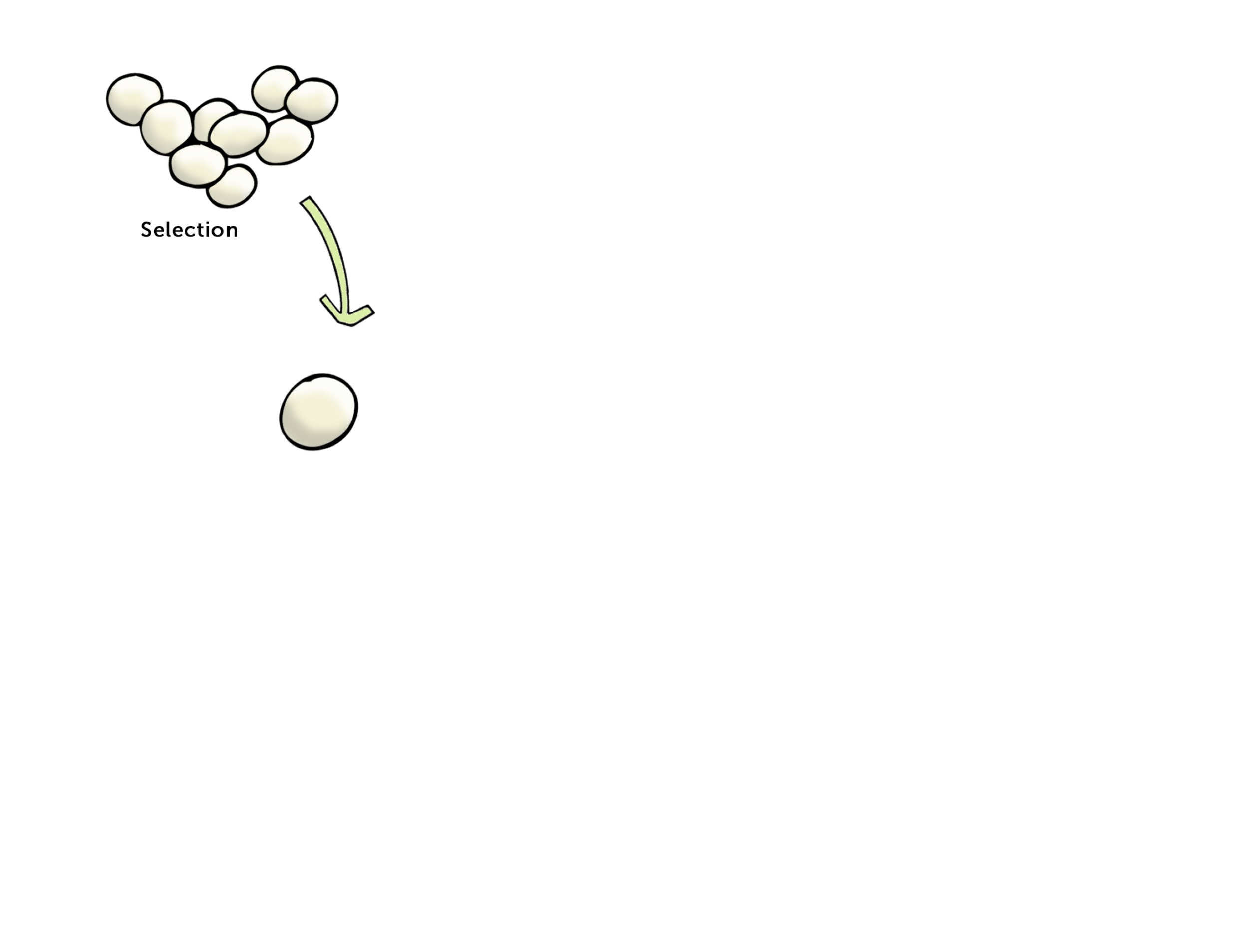
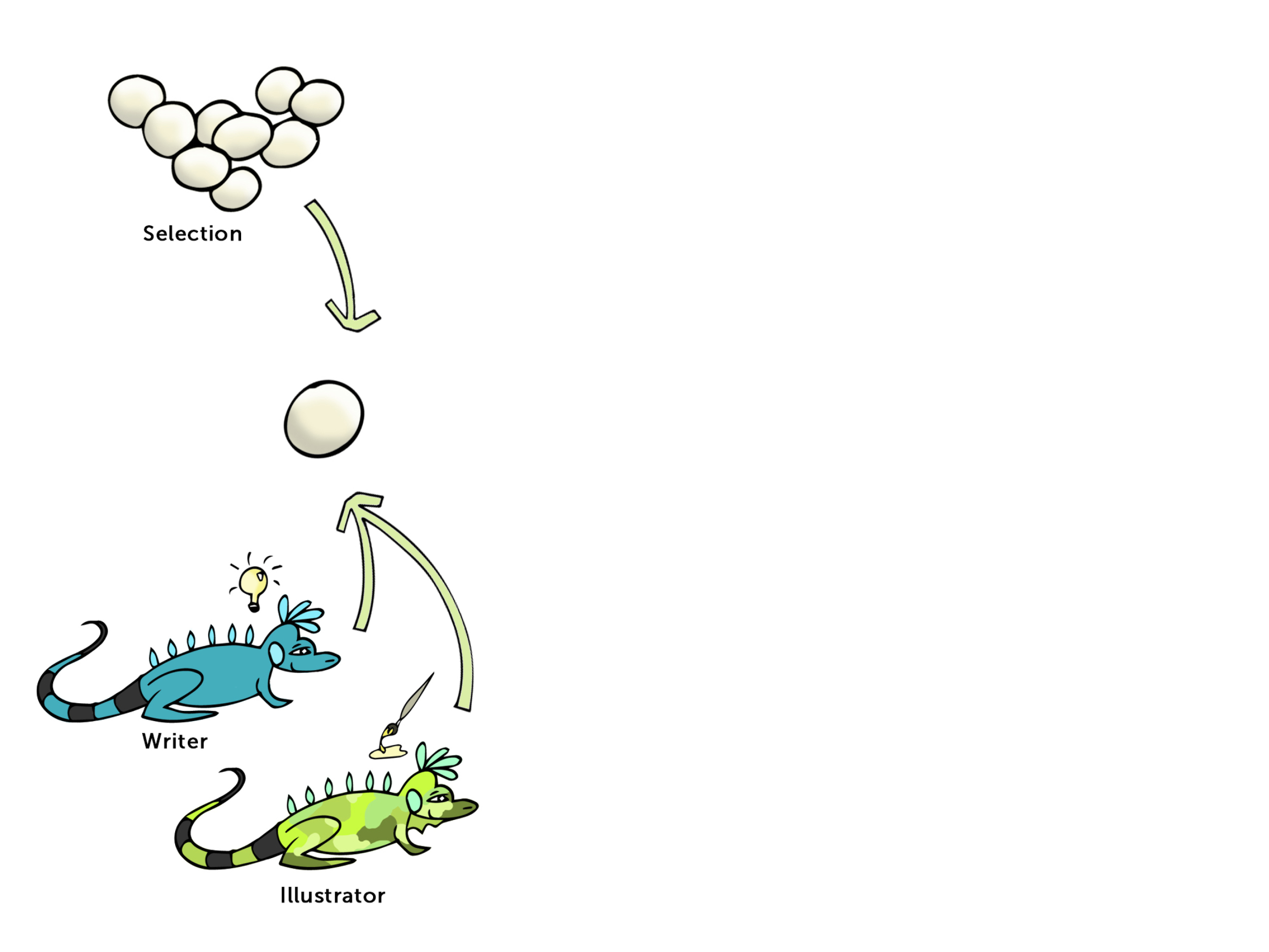
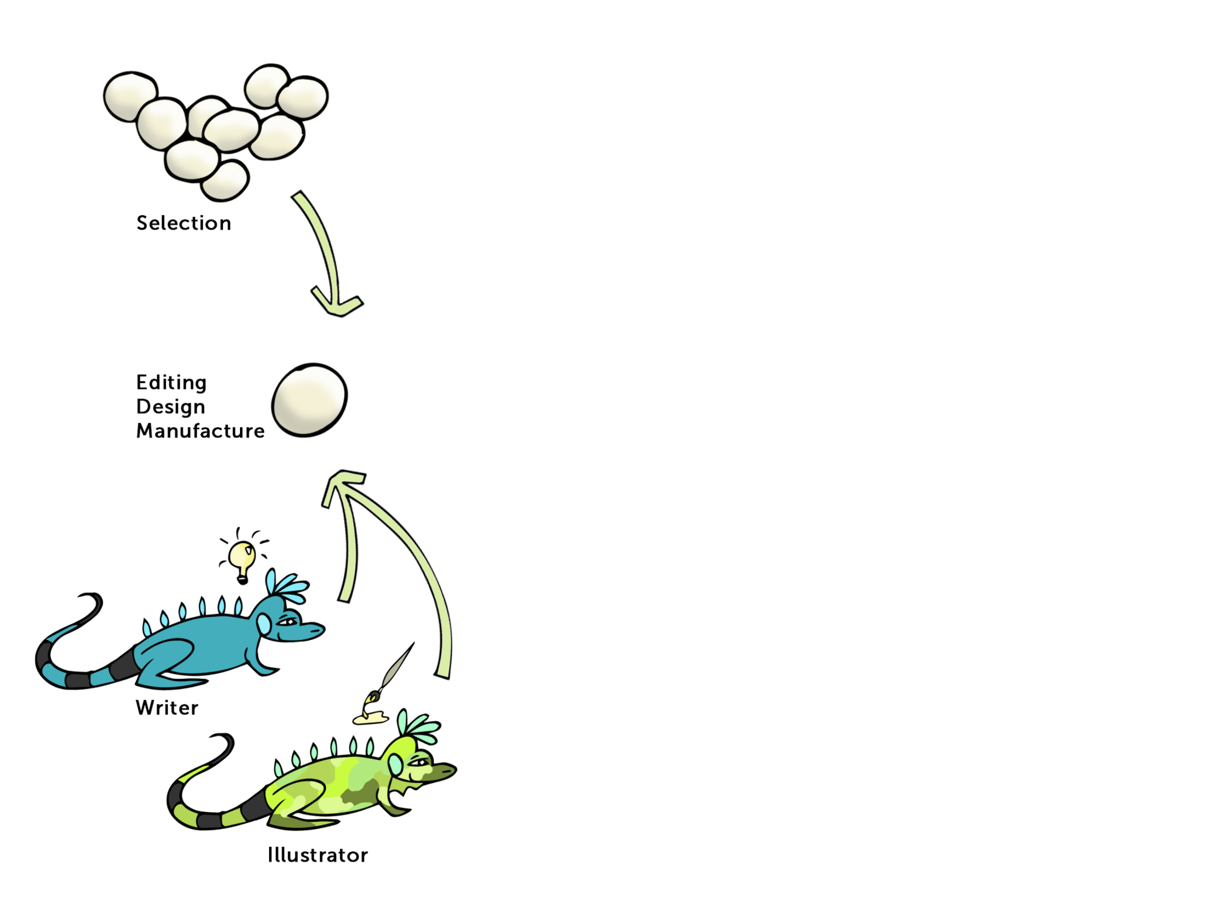
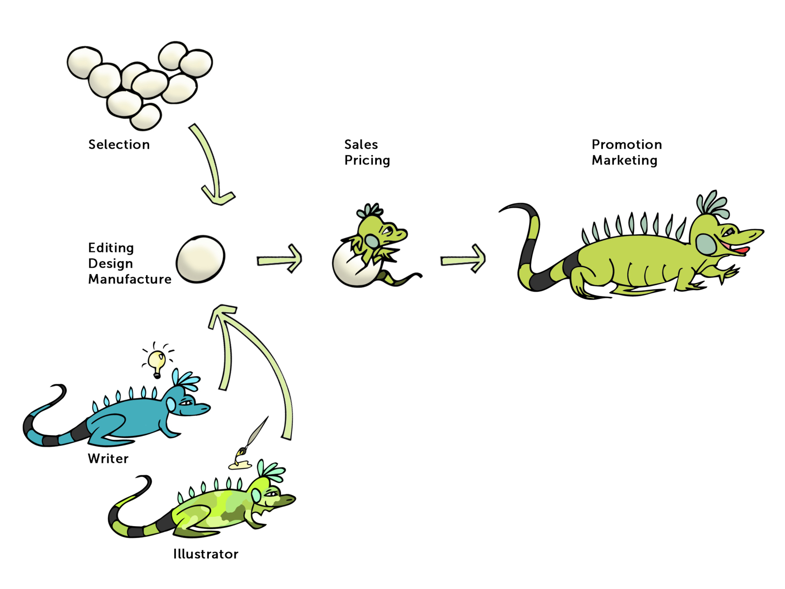
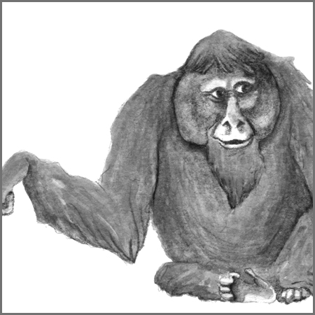
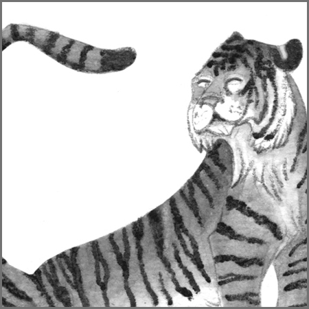
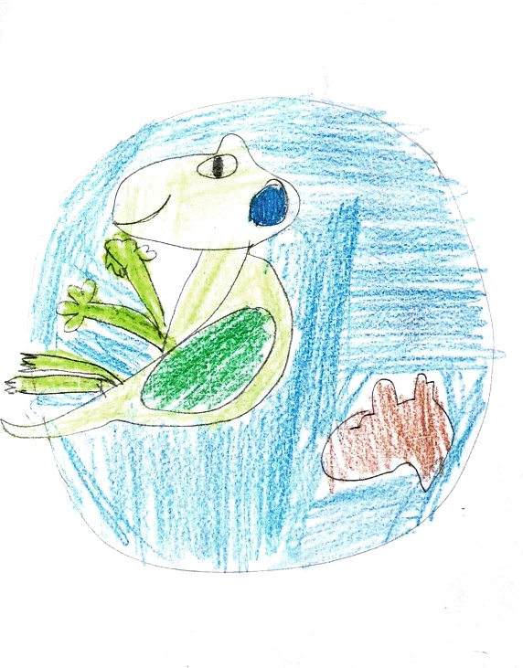
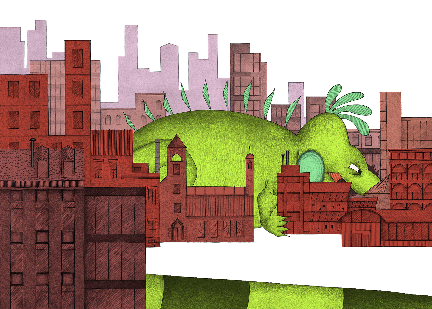
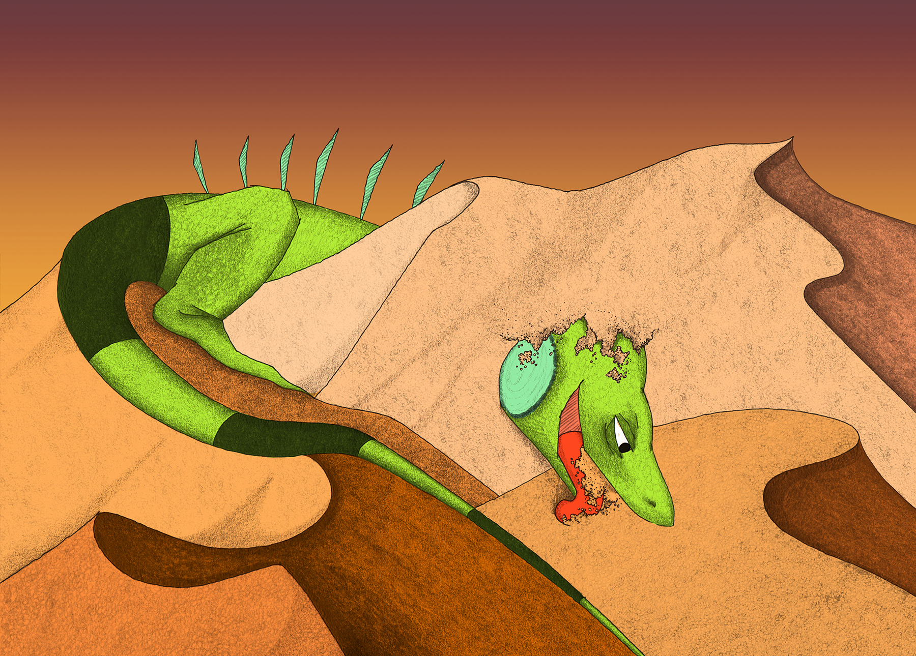
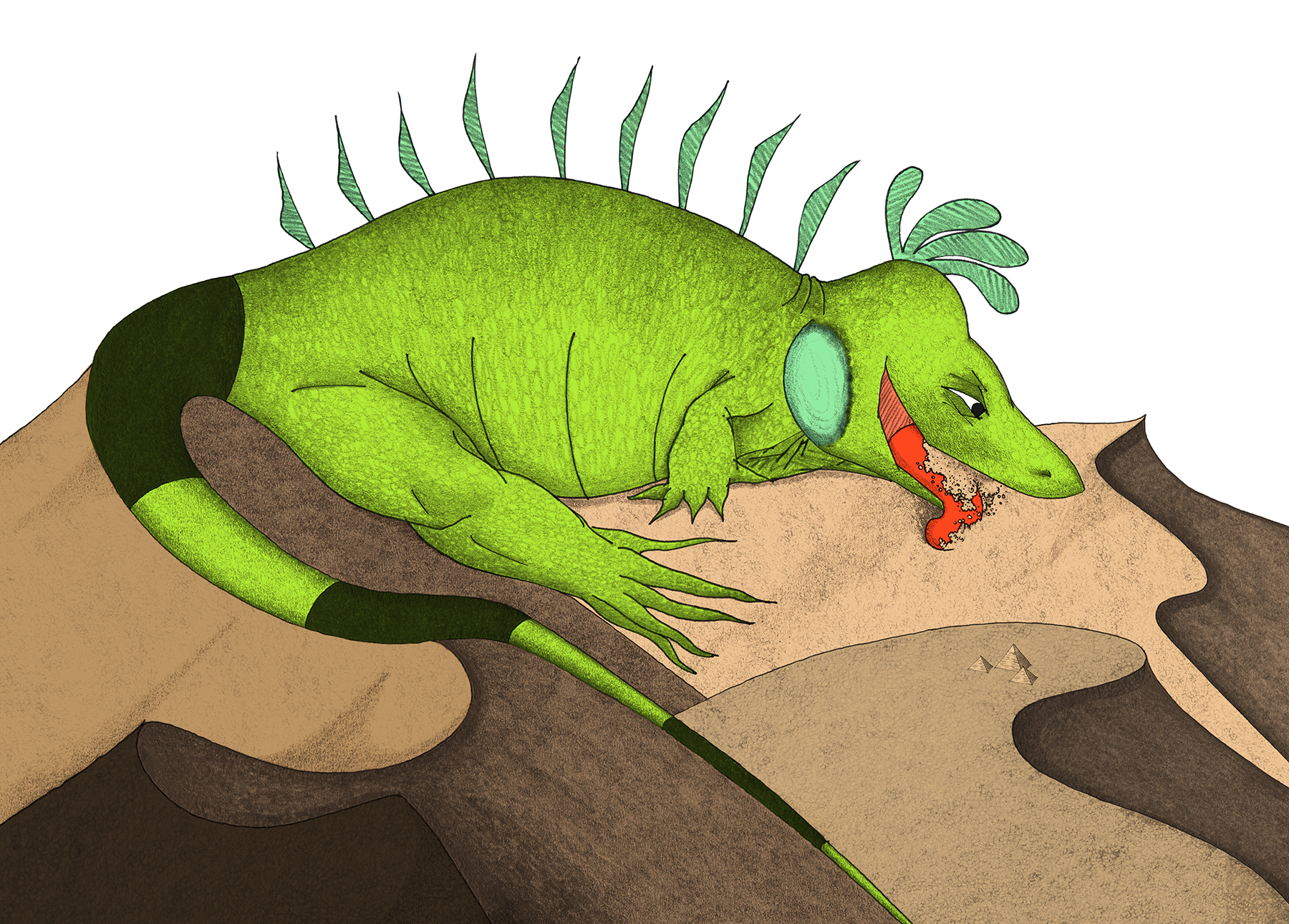
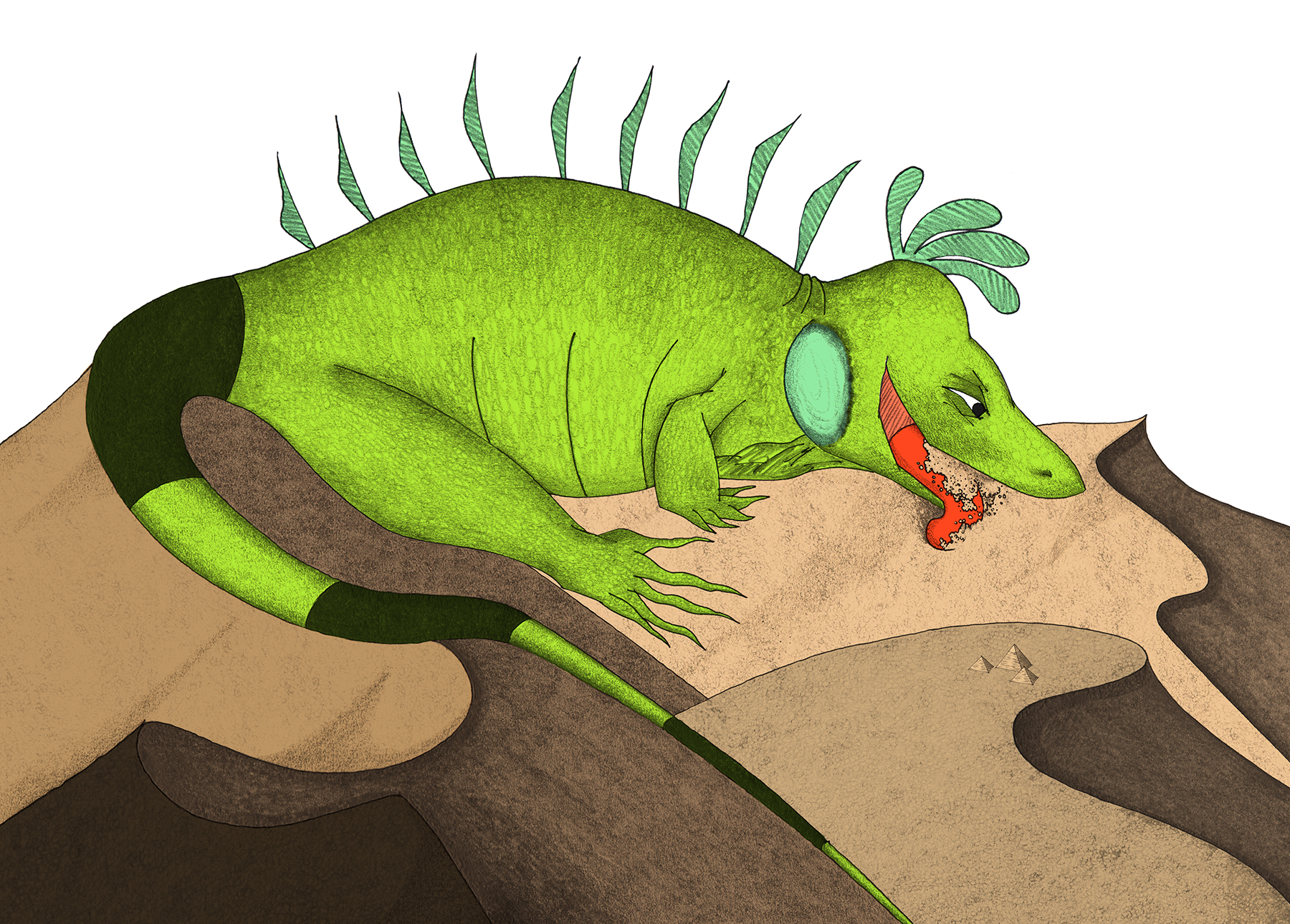
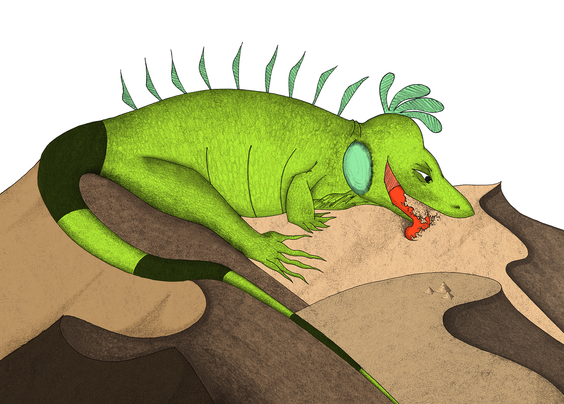
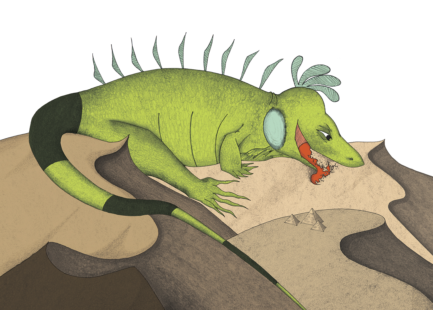
Imagine that this bald little egg is a story idea.
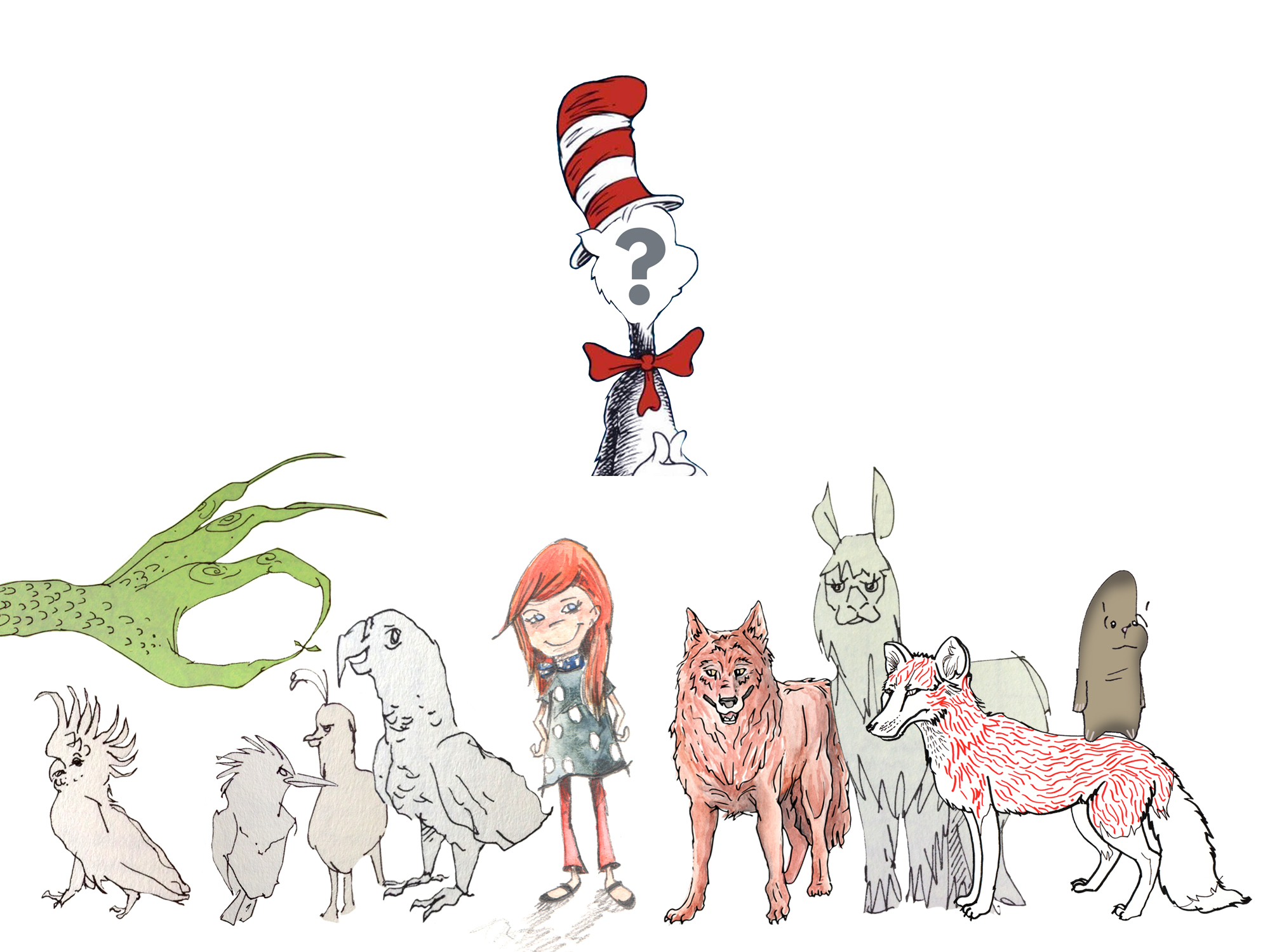
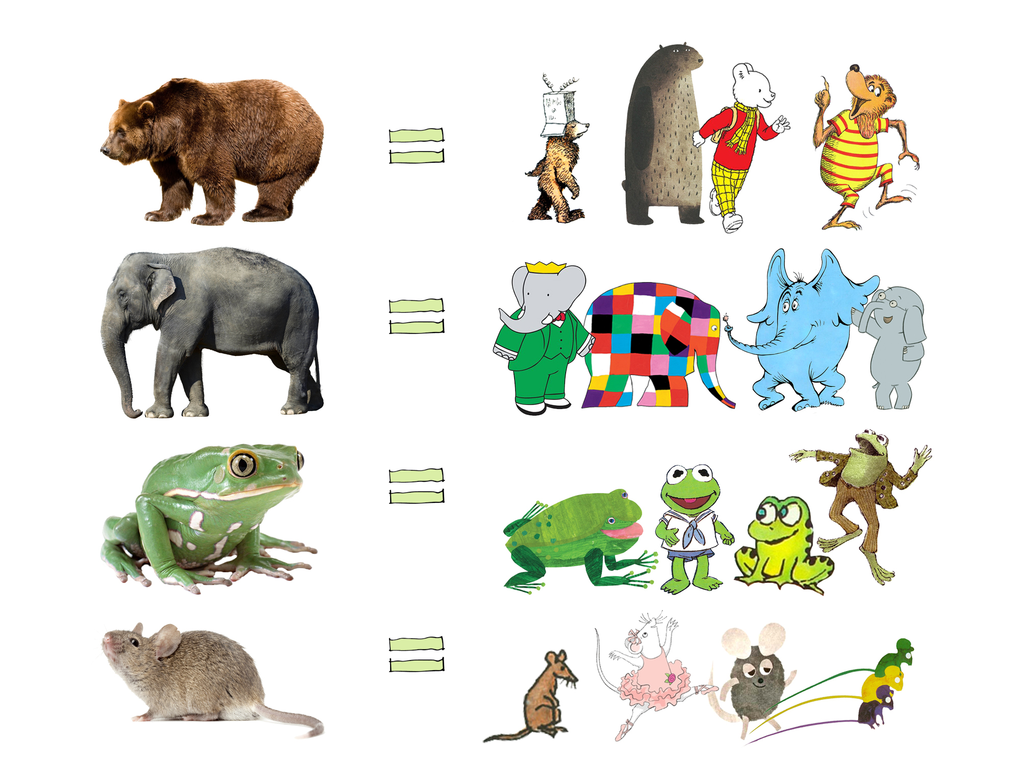
A publisher will either pick a story idea from their arsenal of manuscripts (submitted by hopeful authors**), or as is often the case with children's picture books, will pick a manuscript and pair it with a SEPARATE illustrator to create the artwork for the story. Most often, the author and illustrator do not even meet face-to-face. For authors who also fancy themselves as artists, this can be problematic, yet there is a big risk in submitting both text and illustrations to a publishing house. It is well-established in the children's book industry that manuscripts submitted with images must ace it in BOTH realms to be considered.
** Important to note the 'why' here – most industry folks see a traditionally published book as having passed a certain threshold of quality that warrants publishing. When a publisher agrees to publish an author's manuscript, it is a huge investment for the company, so to be selected by a large publishing house adds intrinsic value to a book. Or so it is believed.
While the story is still an "egg", the publisher's team of editors develops the manuscript alongside the author. At this stage, portions are rethought, chunks are cut out, and other chunks are added in. The editors pull the puppet strings of a full team that designs the book inside and out; they also oversee the manufacture of the physical book. In traditional publishing, this is where the author can step back and watch as the practical steps of creating a book are completed by others. Sweet relief!
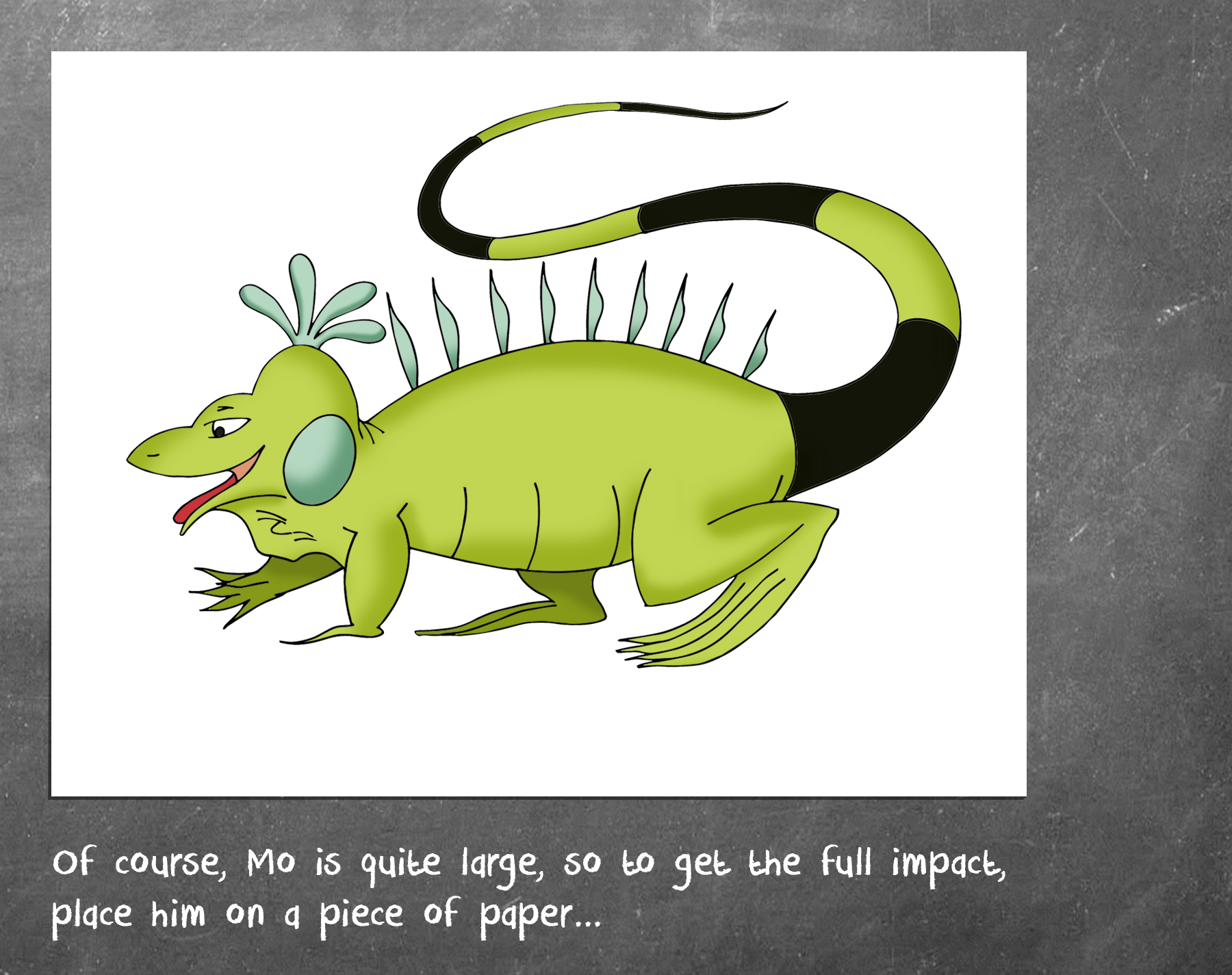
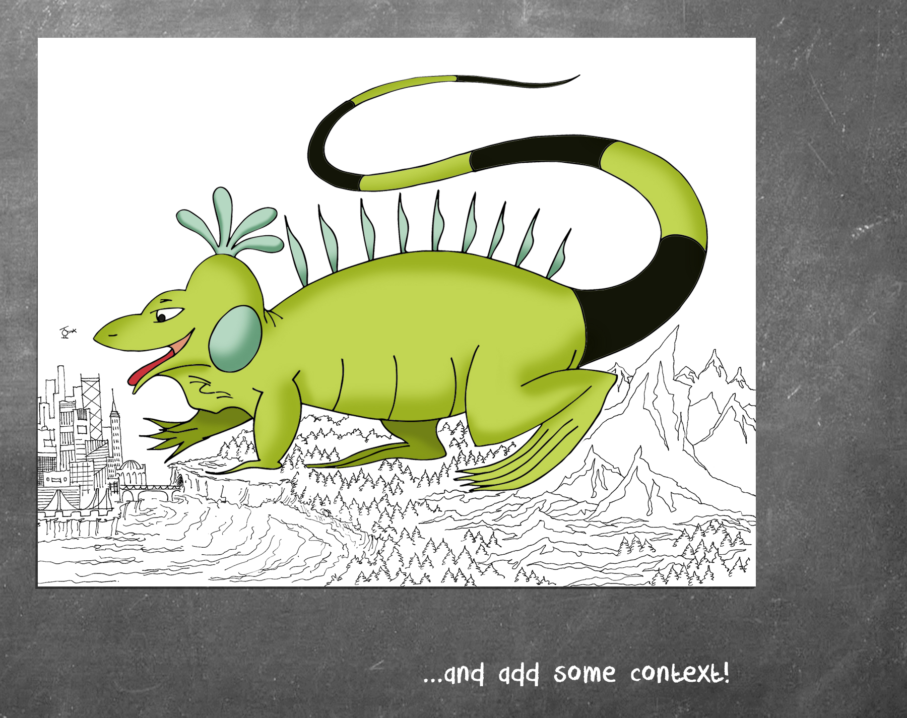
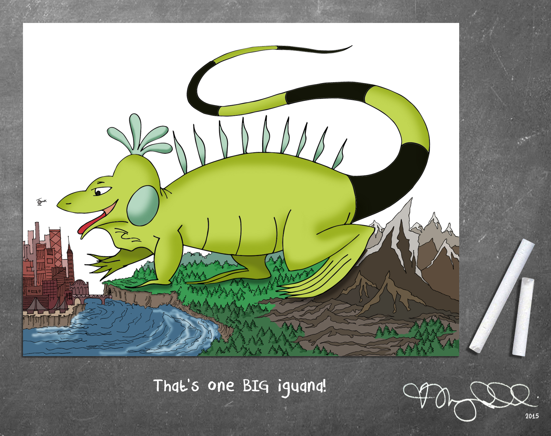
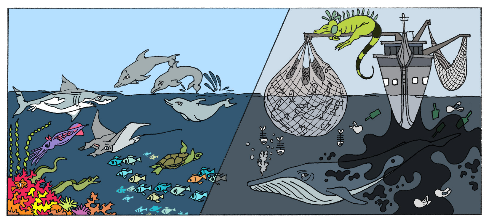
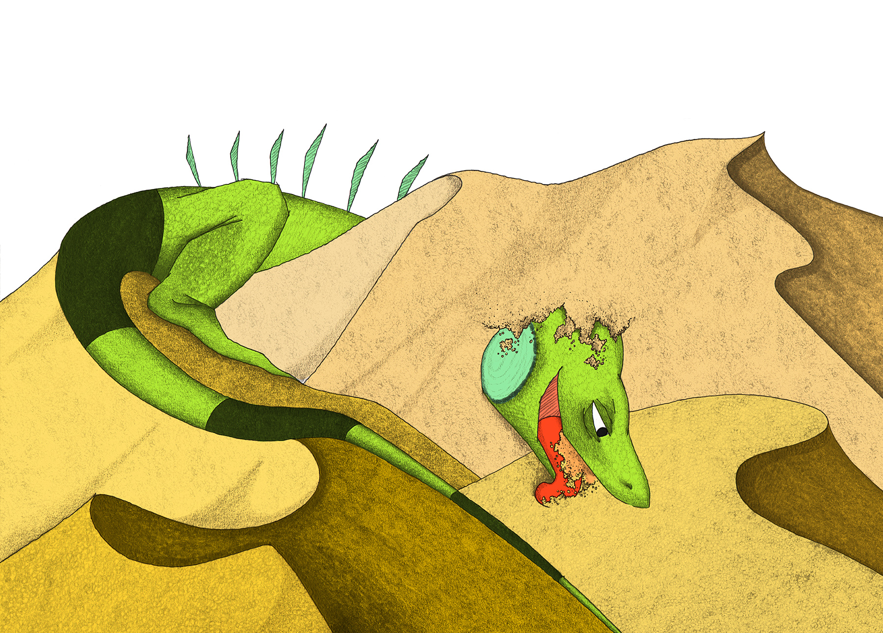
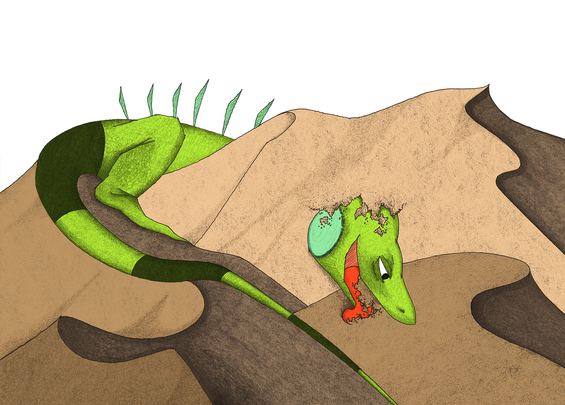
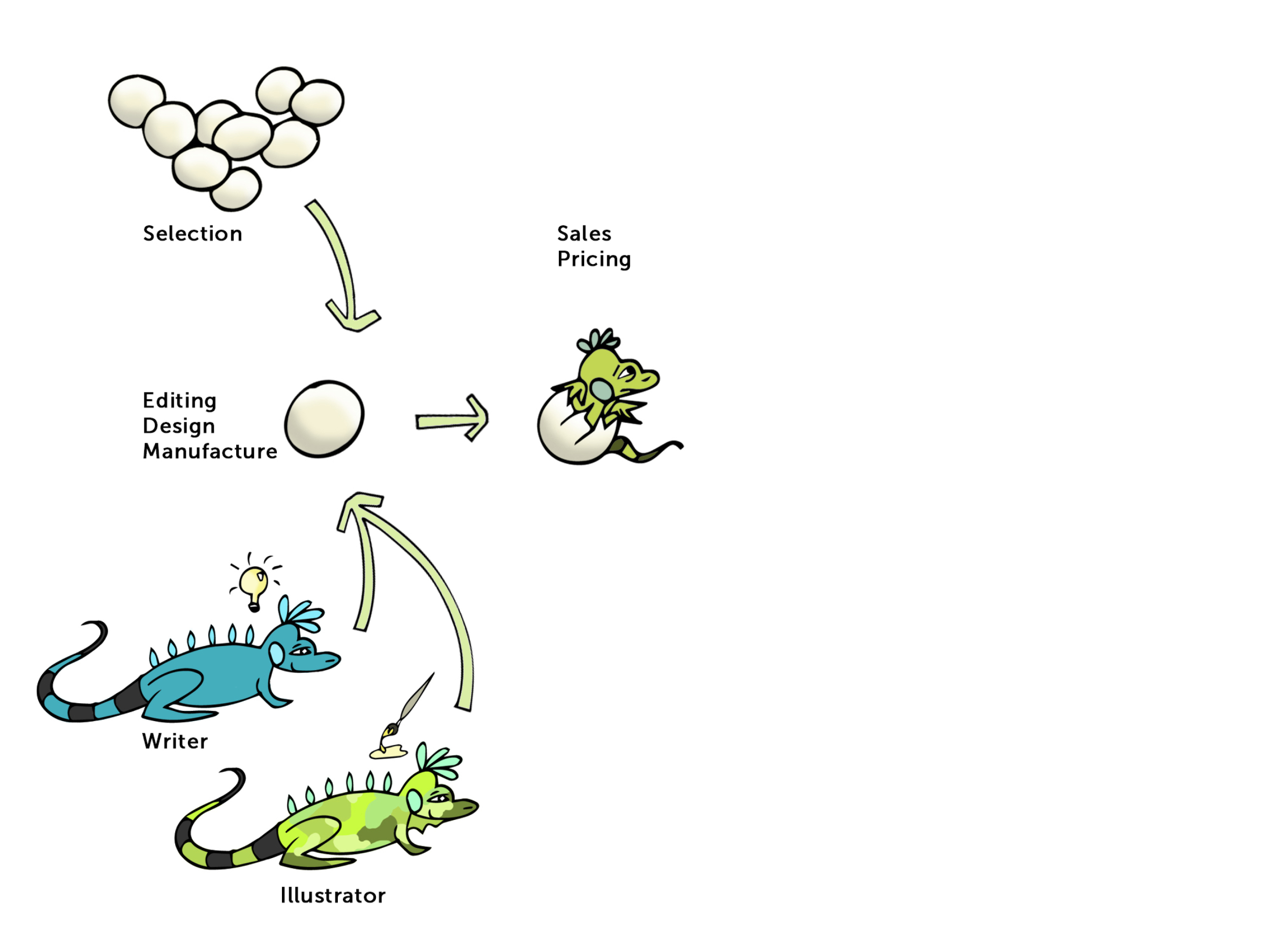
Onward in the life cycle, the crinkled, eggy shell cracks open, and a baby iguana is born!
The publisher determines a fair, Goldilocks price for the book, and works with a massive network of book distributors to place the book in stores, libraries and schools.

One of the more critical roles of the publisher is to leverage their established relationships and sizable staff to MARKET the book. After all, even the most eloquent and profoundly-appealing story won't go far if no one has heard of it. In my limited experience, this really is where the value of a publisher is felt most. The publisher not only pays for professional reviews (several hundred dollars, if purchased by an individual author), they also arrange promotional tours (ahem, several thousand dollars...), and place blurbs in magazines and blogs (where most readers will first learn about them). The Twittersphere is a magical place, but when it comes to selling books, serious buyers are looking to places like the NY Times Best Sellers List, or a host of great children's book blogs (School Library Journal, Great Kid Books and Pen&Oink come to mind).
While promotion of the book is ABSOLUTELY KEY to its success, and the well-connected publishing house allows for this at a broad scale, it is important to remember that each publisher covers a full catalog of books, not just yours. While each book is particularly special to its author, the publisher may not necessarily push her book as much as another title under its wing. Large-scale publishing is revenue-driven (after all, it is their investment), and if your book does not have as much mass appeal as the latest 'burp and poop' story, it may not get as much promo.
In the end, the author's own promotion could play a big role regardless.
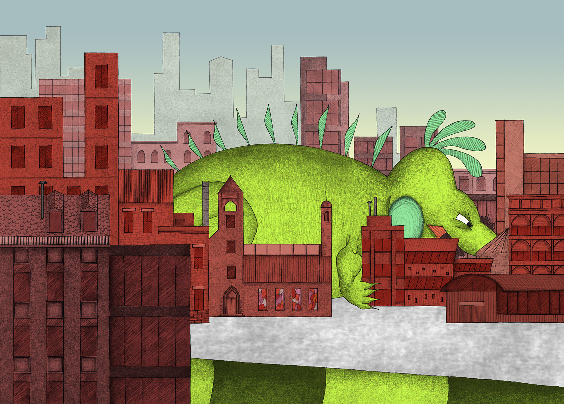
And finally, RIGHTS...so, about those baby iguanas?
This facet of traditional publishing is the most nebulous to me without any real world experience, yet. Rather than play attorney, I can direct you to this helpful website about copyrights, royalties and assorted legalese. In general, the publisher with their great financial resources will control the production of any book-related toys, games, movies, sequels, etc. All this, because they will seek to Obtain All Rights to your book. The author expects royalties from this, of course, and she can negotiate to withhold specific rights (eg. electronic or foreign).
We can clearly understand that the publisher takes on an IMMENSE burden of manufacturing, financing, selling and promoting a new title. Not only is this necessary, it is also a noble pursuit in that it clears away the distractions to the author that would usurp valuable mental real estate. Most of the authors you love can produce great work because a full team of people takes on the task of selling it for them. It's a two-way street.
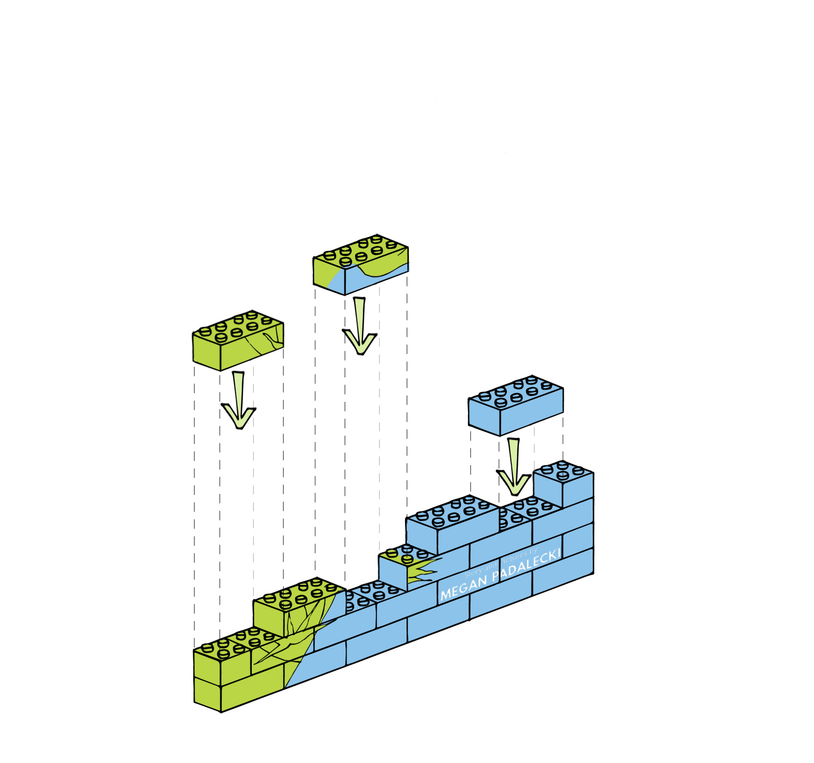
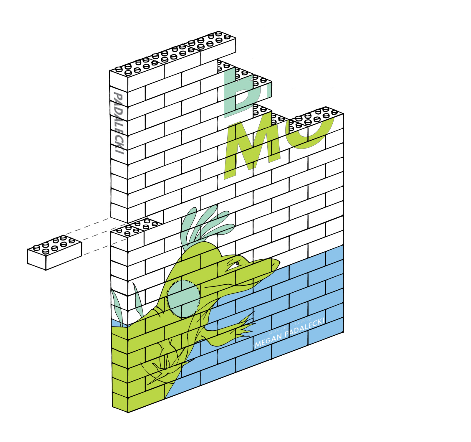
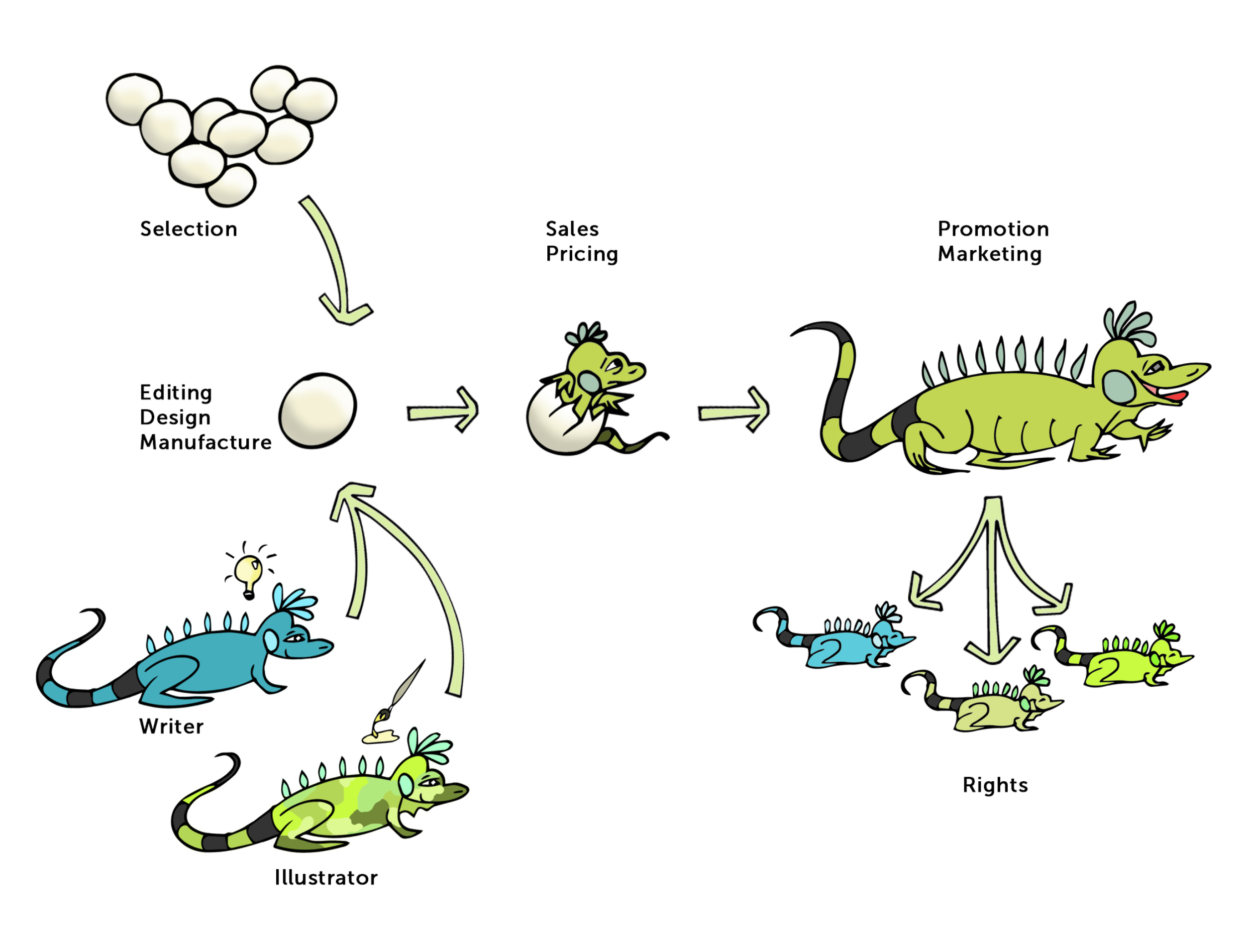
So...what does a self-publisher do?
This one is easy enough, illustrated by this diagram:
That whole life-cycle-of-a-book thing? As a self-published author, I manage it all. Uniquely in my case, I also create the illustrations, though this is by no means required to publish your own children's book. Over the past year, many fellow writers have asked me WHY I chose to self-publish over the more traditional method of seeking an agent or publisher. At long last (and because I love them), I have compiled a list:
WHY DID I SELF-PUBLISH???
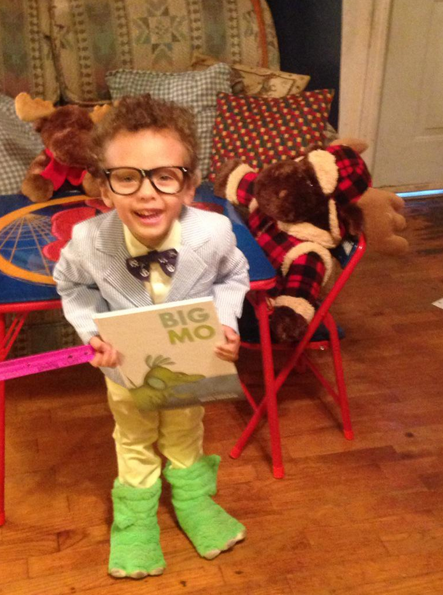
1 | I could fully control the story, theme and tone. After many years working in architecture, I had mastered teamwork and production, but almost always for someone else's design vision. I felt that the time was right to take on a project of my own. With a traditional publishing house, there'd be story and stylistic input from a large team of editors.
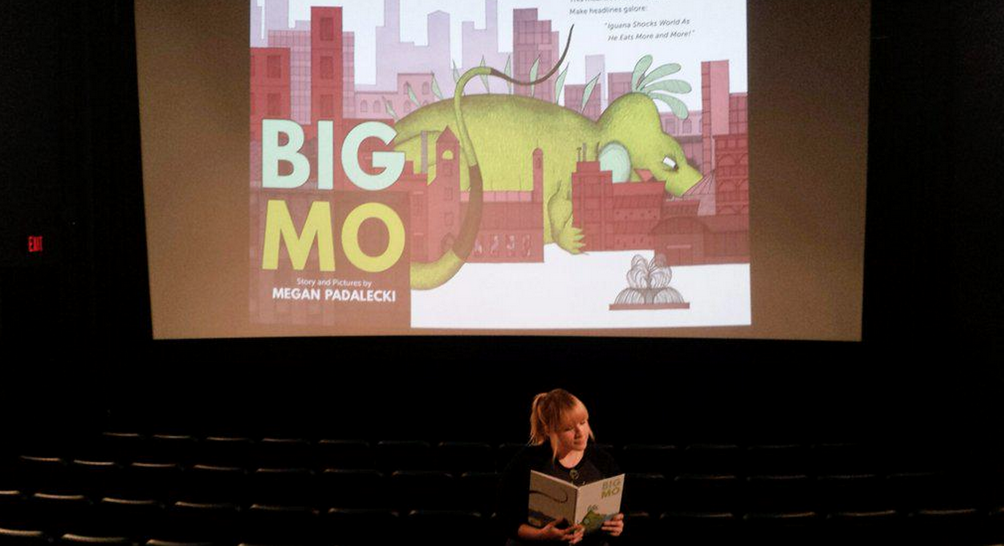
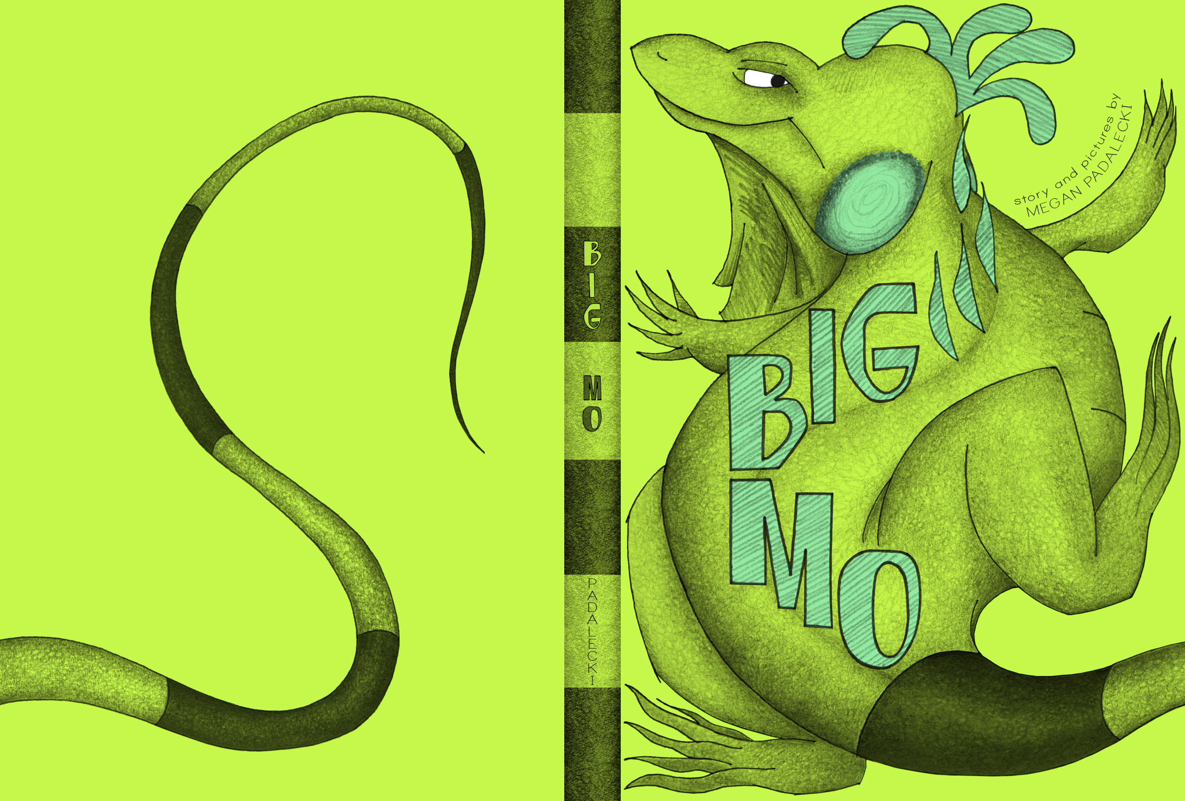
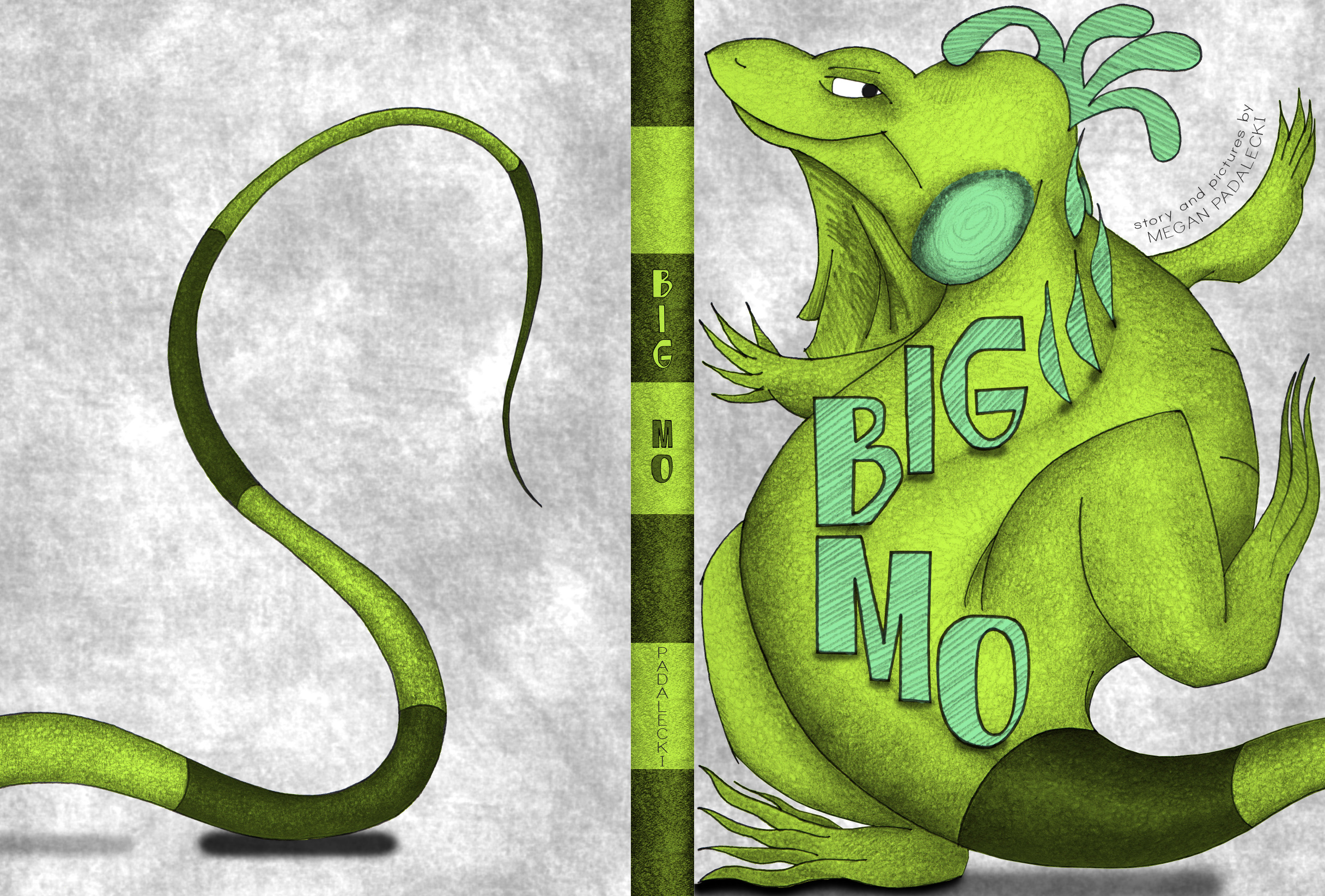
2 | The story I hoped to write had a more delicate message that was perhaps too heavy for big publishers. Big Mo's notions of consumption versus contentment are certainly universal, but I was a bit nervous that a large publisher wouldn't be convinced to promote it. Nearly a year in, I realize that I was wrong about that!
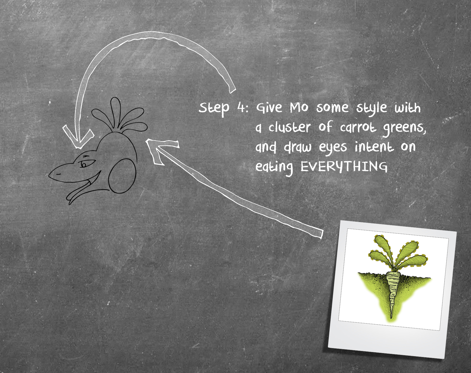
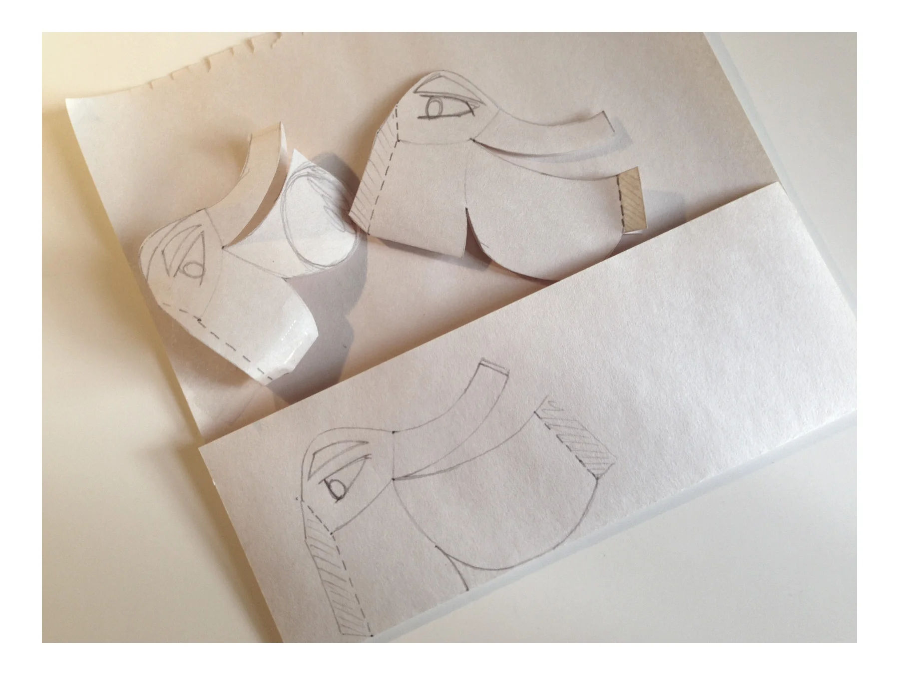
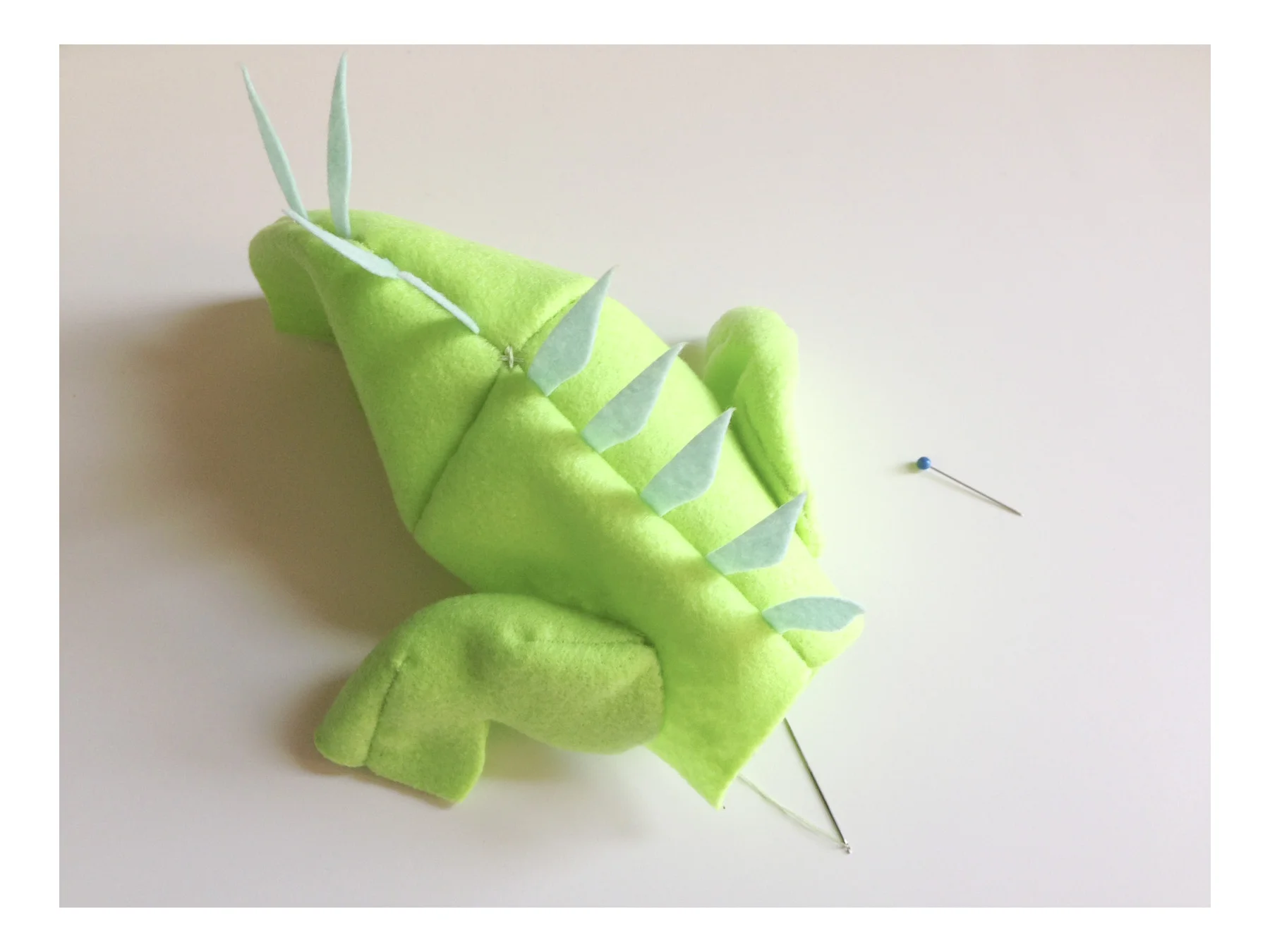
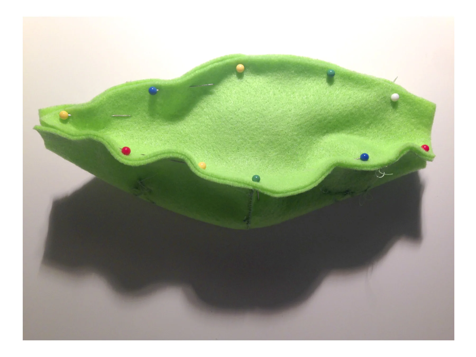
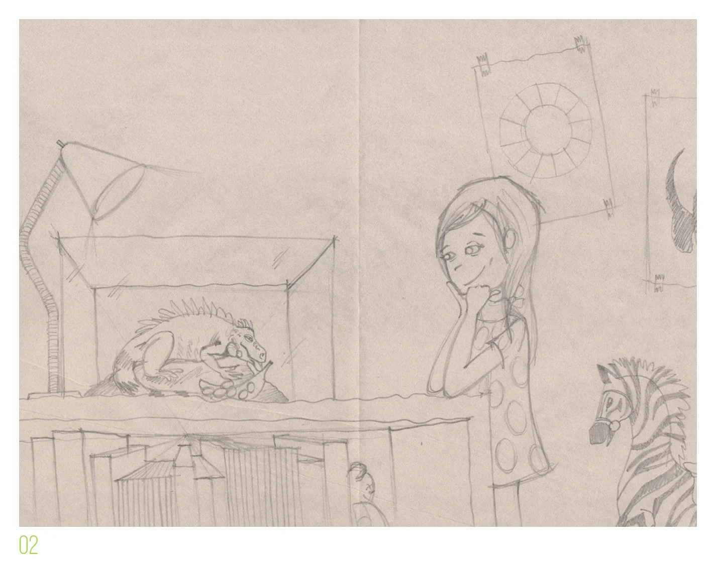
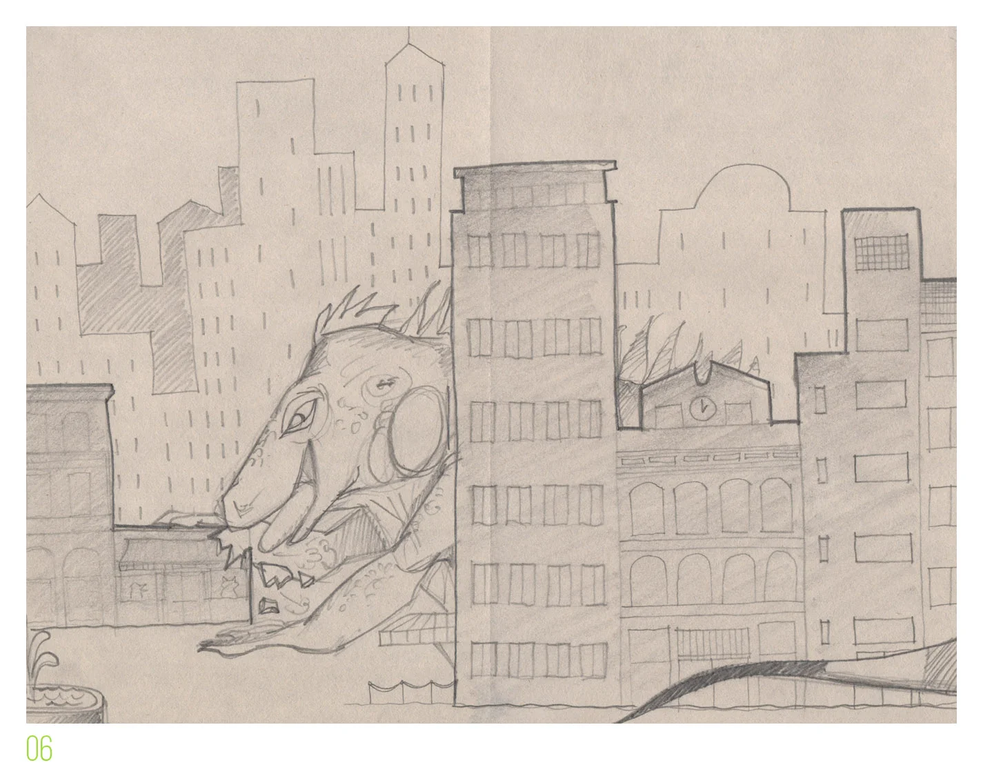
3 | Illustrating is the real draw for me (no pun intended). I had no interest in passing Big Mo to another artist to complete the book. For me, the story is nothing without the illustrations, and vice versa. They inform each other and in my creative process, they are interlinked. Self-publishing allowed me to do both.
4 | Architectural education and professional work gave me a strong foundation in 2D computer programs, layout experience, and the ability to coordinate among several players (US Copyright Office, Book Manufacturer, Amazon Distribution, Dept. of Taxation, etc). There's a certain level of comfort that one needs in assembling things (eg. buildings!) in order to create a quality, physical book through traditional offset printing. Note that with digital print-on-demand companies, this is all somewhat lessened.
5 | I had quit my day job ( ! ! ! ), so I could focus fully on founding a small business (PadaleckiStudio) and managing it daily. It's a bit wobbly at first but with time, the day-to-day business demands level out a bit. That is, until Book #2 rolls around...
6 | I was able to eek out the funds for the First Printing of Big Mo. This is admittedly the scary part, as the cost for several thousand books could easily put a brand new compact car in the driveway. Lucky me, I don't require a car or a driveway!
7 | There are gazillions of companies that exist to distribute self-published books these days. For the widest distribution (worldwide), I chose Amazon Seller Central, which collects a portion of every sale, charges a monthly service fee and an inventory storage fee. It's not a perfect service, but it does the trick.
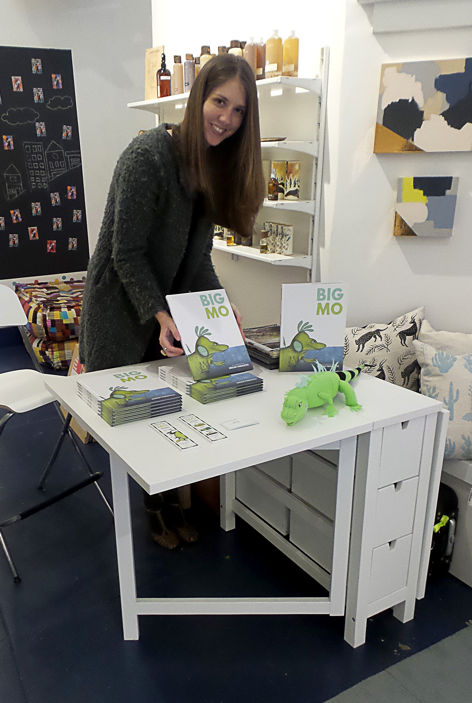
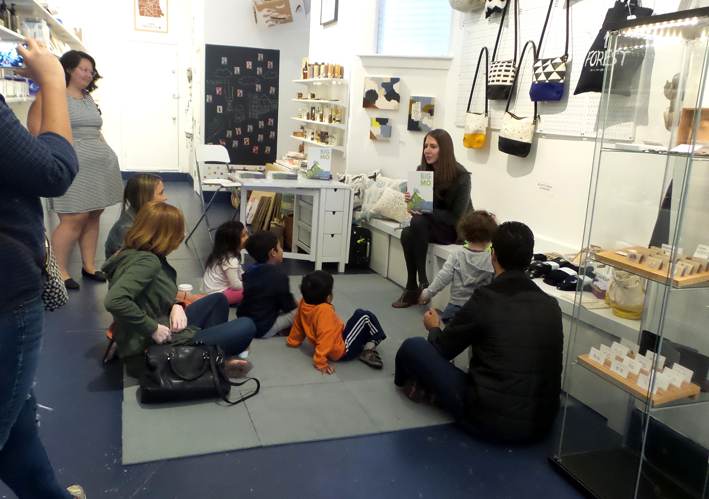
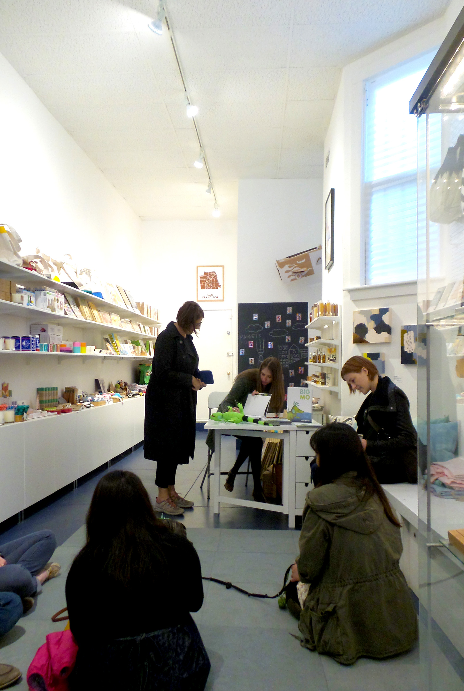
8 | The San Francisco Bay Area where I live, has an endless array of wonderful independent book sellers. This is certainly not the only city where this is true, but Bay Area shop owners really show that they support local authors. By participating in local story times and book signings, I am able to support them, too :) If you are an author, make sure to meet your local indie book sellers, and read to your cute local kids!
9 | It has been said before, but social media has changed the game. Never before has an independent author had the power to reach so many so quickly at no monetary cost. Time spent can be a doozy, but it is also very rewarding sharing news of your work with others!
10 | Lastly, and this one is important if you plan to self-publish full-time, the return on each book is much higher than with traditional publishing, when a small royalty is paid out per copy sold. Of course, the pay must be balanced with the initial investment of printing the books (remember that compact car?). Sometimes a publisher will pay the author an advance, but the author may be expected to pay the advance back to the publisher in copies sold. Tricksy!
(continued below...)
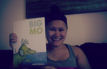
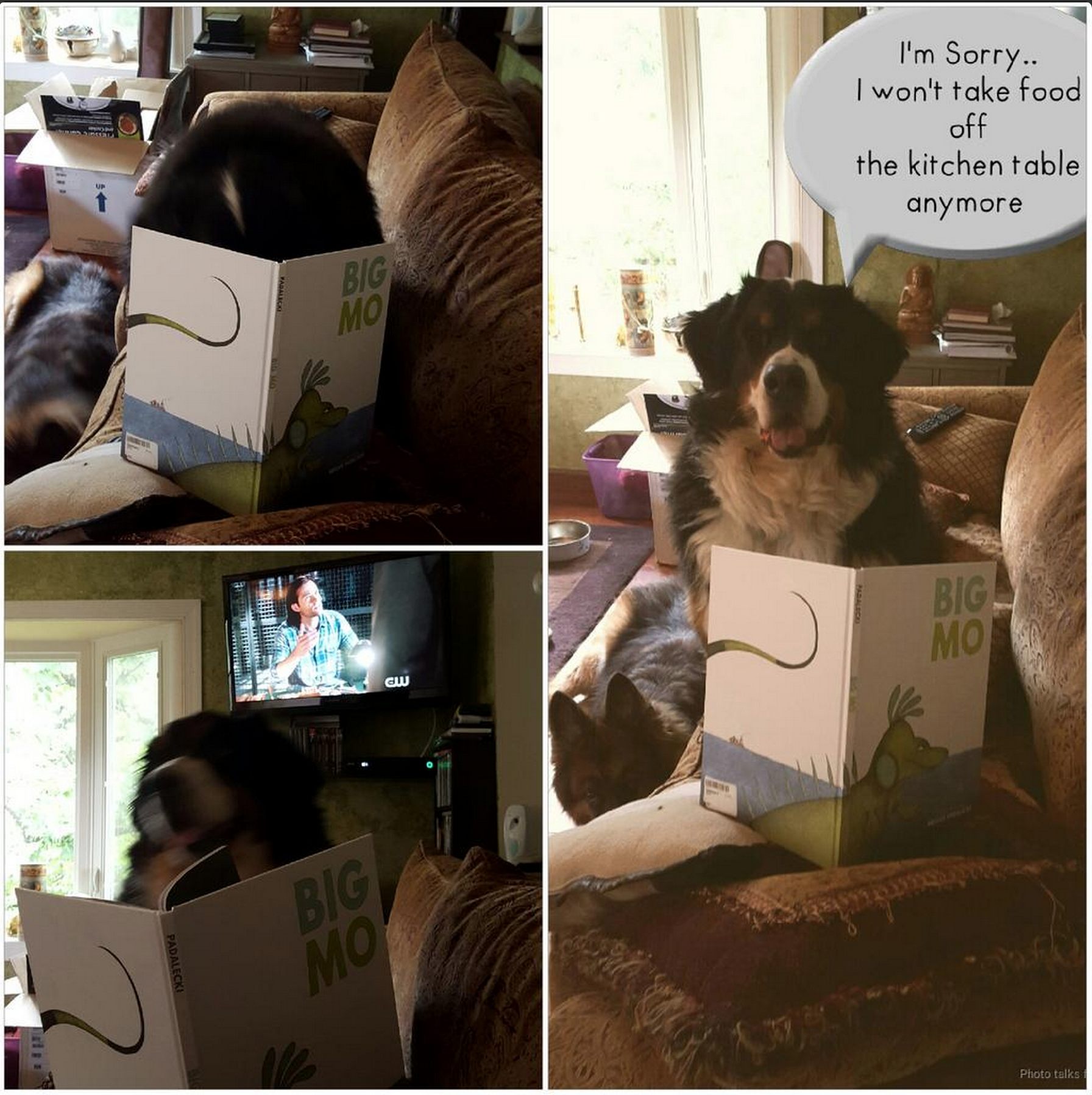
Yes! This is one way to promote!
HOW TO PROMOTE YOUR BOOK

This list is not exhaustive of ALL the ways in which a self-published author can promote his/her book, but this is what I have tried to varying degrees of success. Once you have a completed book that is fully yours, you will do whatever it takes to get the story into the hands of little readers!
1 | Social media is your friend, and also a way to make connections near and far. As an independent author with no marketing team, accounts with Facebook, Twitter, Instagram, Goodreads, etc will prove invaluable in establishing your work online. No bit of news is too small to mention, so be sure to share it all!
2 | On that note, to be taken seriously, you'll need a website. When I submit Big Mo to bookstores and blogs, I always include a footer linking to my website. This is pretty much expected, so find a website builder that works for you. I use Squarespace, which is intuitive with a great support team. Look for online coupons for your annual subscription.
3 | Blog! Proven by you in this moment, a blog is a great way to maintain interest and traffic to your website and work. It is also an excellent way to give back, as I hope to do by sharing my lessons learned in self-publishing :)
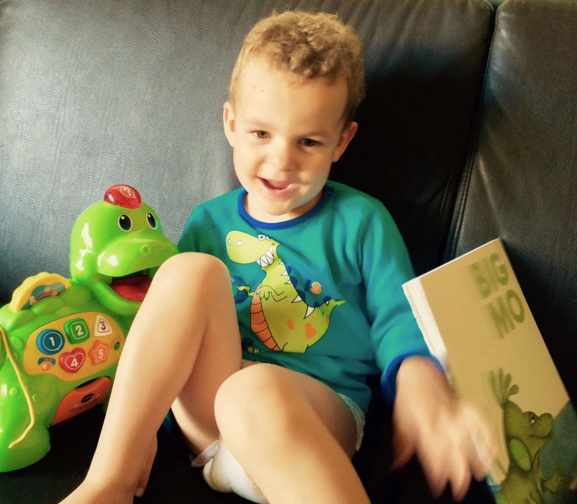
4 | Elementary School Author visits are a time-honored tradition** and you don't need to be represented by a major publisher to participate in them. Once you have a book (children's or YA), you have an "entry ticket" to discuss the creative process with students. I have visited Preschool to 3rd grade levels, and each event is a learning process! It is a fun challenge to take your completed work (the book) and find ways to engage young readers in creativity. I have designed slideshow presentations that I project in the classroom or library, as well as quick activities involving Big Mo. Kids also love drawing demonstrations!
** Even traditionally-published authors make a major portion of their income from appearances and school visits. It helps to offer a book pre-sale to students in lieu of an author's fee in some cases.
5 | Be creative when considering public speaking events. For example, I have spoken at a college-level writing workshop and at an architecture firm about Big Mo and my process. These were both extremely engaging, and they introduced the story to a unique group of listeners. Try speaking at the high school level, at libraries, daycares or book clubs. Even local farmers markets are good opportunities to introduce your story to gatherings of people.
6 | Bookstores are generally thrilled to welcome local authors, either for a reading or a book signing. Even if you don't draw a crowd initially, these are invaluable experiences for a professional author. Mingling with the public and fielding questions about your work are factors that ANY author should be comfortable with.
7 | It is a sad truth that most books are purchased online at this point – in fact, this is why book designers recommend cover designs that are eye-catching at a 'thumbnail' size. With this in mind, it is important to share about your book in any way you can online. Book interviews and reviews should be a goal. If your work is good, it will speak for itself and interested writers and bloggers may reach out to you. Otherwise, if you are still relatively unknown, it is your responsibility to inquire with media outlets (again, this is where a link to your website is handy). No matter how little or well-read a blog is, it is great to be interviewed or reviewed. Think baby steps! And from my own experience, for every 20 blogs you request a feature in, you may hear back from one.
8 | Professional Book Reviews (such as from Kirkus) are always a possibility, but they do cost money.
9 | A more tactical way to get your book some exposure with relevant industry folk is to submit for book awards. There are dozens of awards that are acclaimed (many specifically for independent publishers), and dozens more that are less so, but still worth considering. Each has its own particular submission criteria, accepts copyrights from specific timeframes, and includes an entry fee. In any case, a submission for an award means that at least one person will be reading your work with a critical eye, and they just may share it with others.
10 | Festivals and Conventions of all types occur throughout the year in the US. Whether an event is explicitly related to your genre of book (or to books at all), each is a fantastic opportunity to meet readers, discuss your work, and receive feedback (and hopefully make some sales!). To name a few: Book Expo America, Shaboygan Children's Book Fest, NAEYC Expo, Texas Book Festival. If your book covers a specific topic or theme, there are conventions and expos for that, too :)
Above all else, be persistent, yet PATIENT. As I mentioned, not everyone is going to respond to you. If they don't, just send gentle reminders until you are convinced that the path is a dead end. Most people are busy with their own lives and work (I am also guilty), and simply can't find the time to meet you or respond to your work. But there are some who will, and it will be a huge boost when they do!
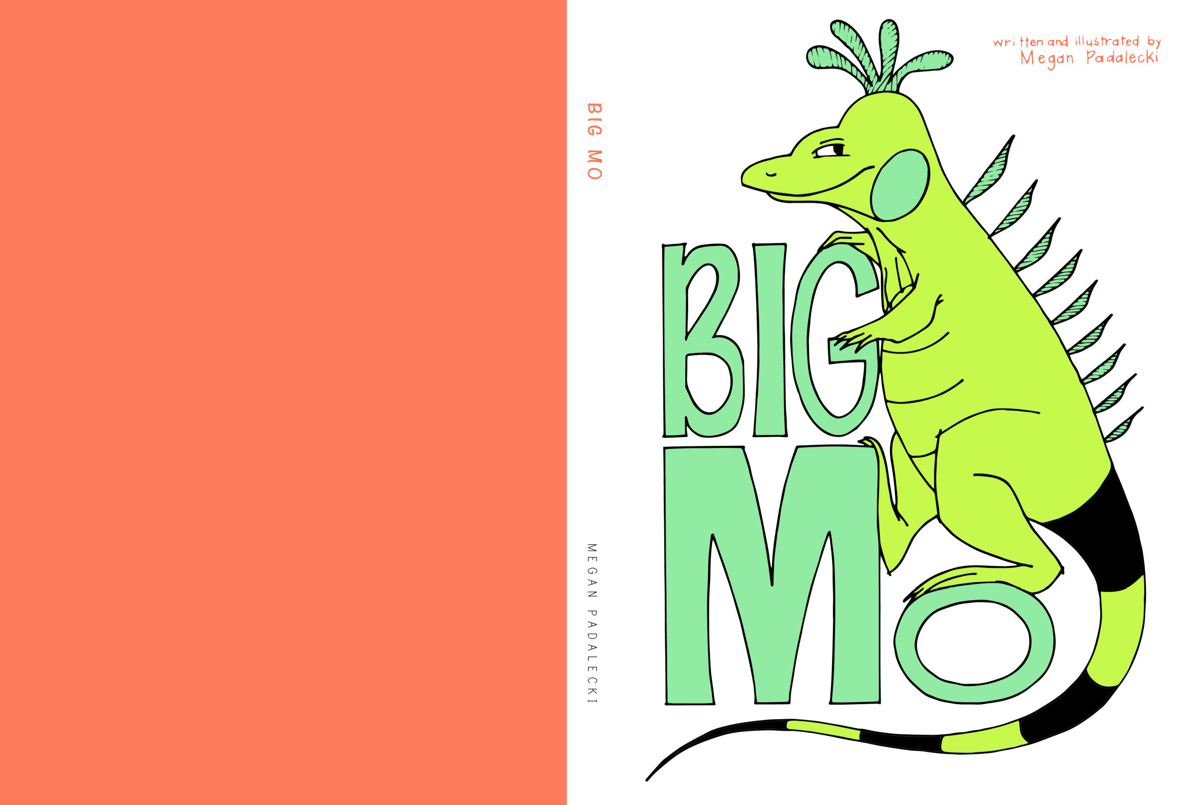
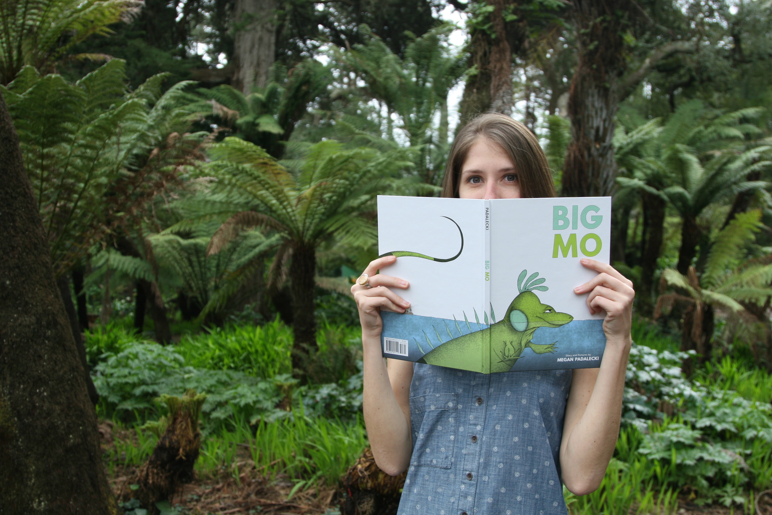
There's only one person who knows if self-publishing is right for you, and you're looking at them (I mean, if a mirror happens to be nearby...). There are pros and cons in both traditional and self-publishing, and to start down either path demands serious research and planning. In my own life, I determined that I'd jump into writing and illustrating on my own terms, because the timing was right. My goal was a quality story, both physically and thematically. Every piece of Big Mo reflects my own unique and individual touch – my SELF. It's pretty exhilarating, and I am eager to jump in again :)

Footnote: My self-published book, Big Mo, was created from scratch using traditional four-color offset printing methods, by Lake Book Manufacturing in the USA. I chose this process because it is the same that Big Publishers use to manufacture sewn, hardcover children's books of high quality. Though promo tactics are the same regardless, note that there are other means to publish a book, including digital print-on-demand and ebooks. Any chosen method will require obtaining a Retail Seller's Permit in your state.