What makes for a successful cover?
I have my guesses...
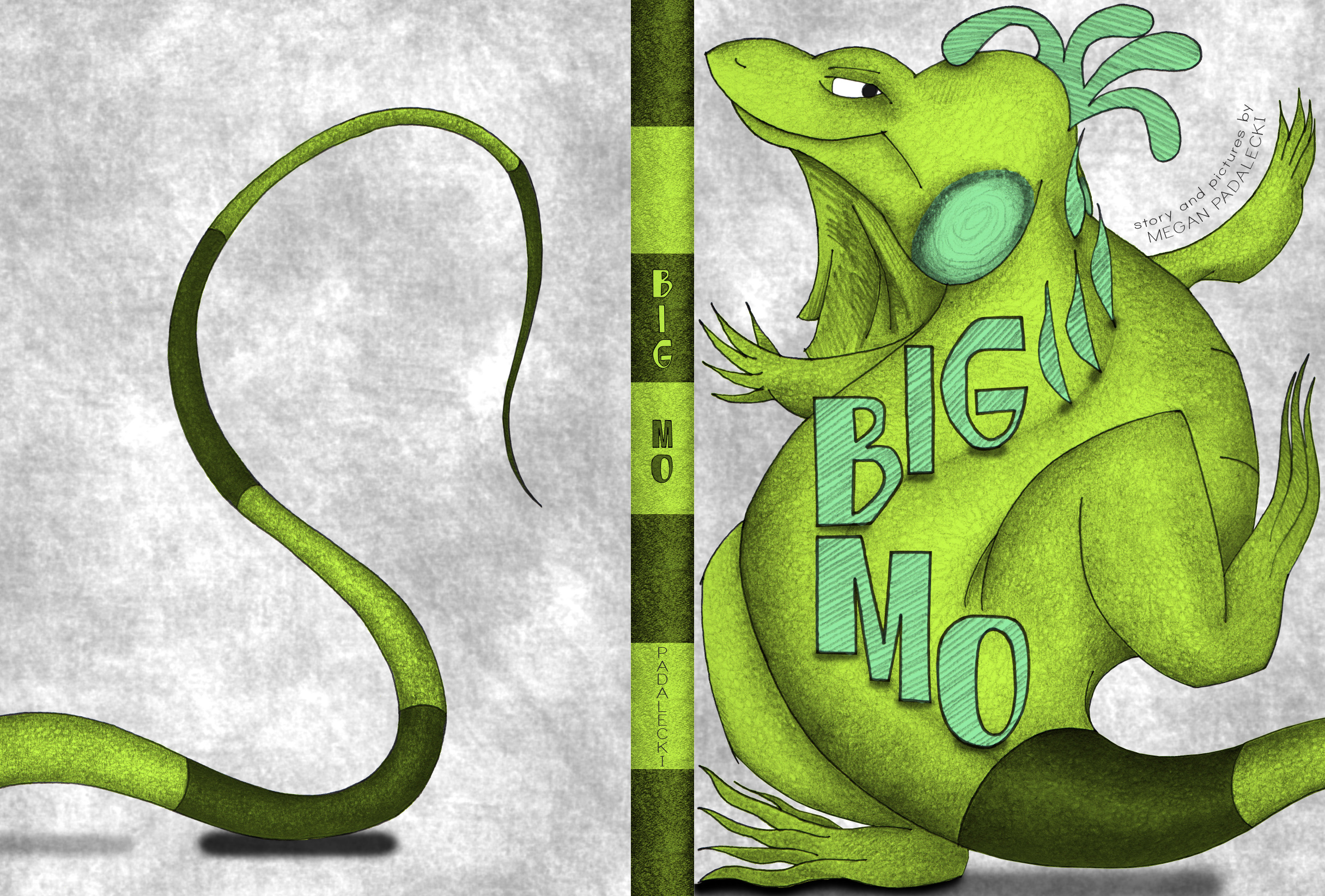
01 TITLE | The book should have a large, EASY-TO-READ title. I sifted through hundreds of fonts to settle on 'League Spartan', and even altered the "G", which previously had a truncated arc. Perfectionist, much?? Not only should the title be highly legible, it should also be crisp and balanced. It should share the cover with the image, not overpower it.
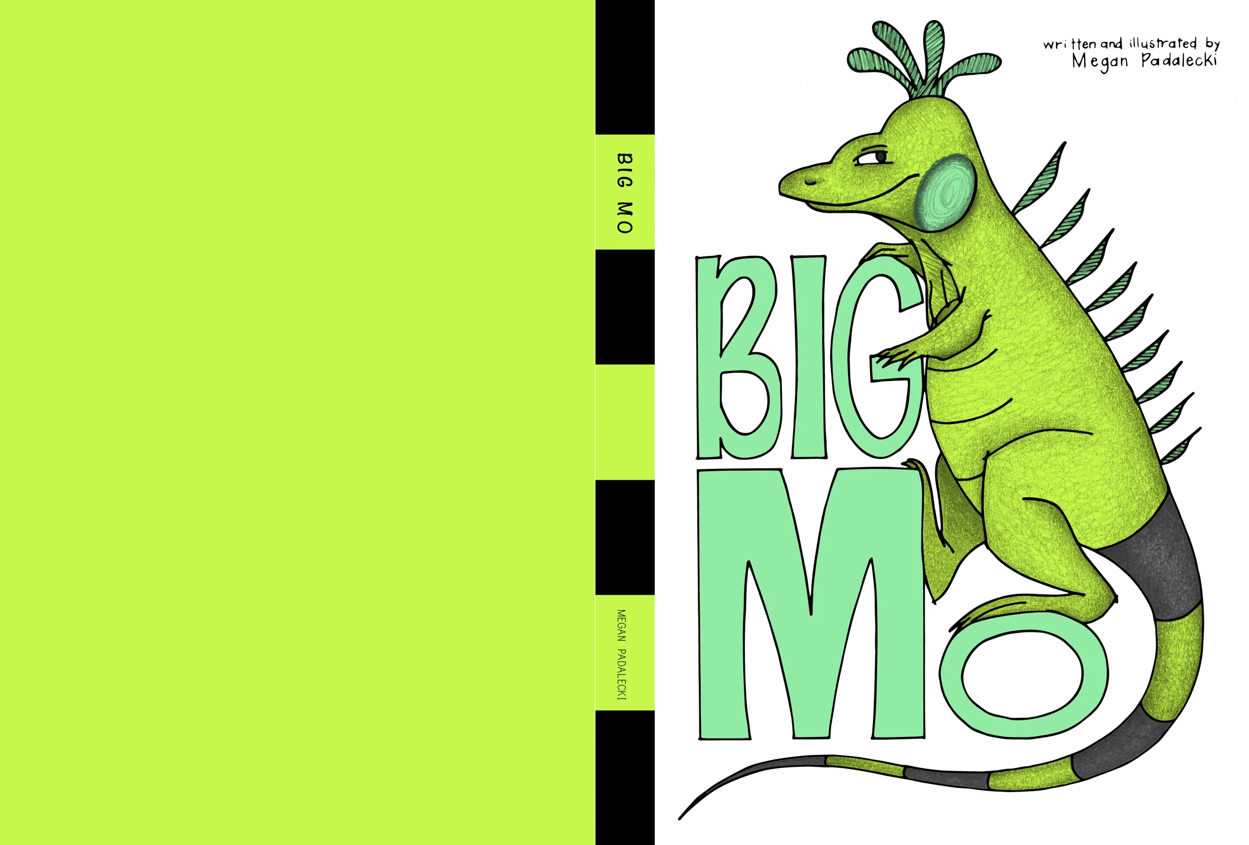
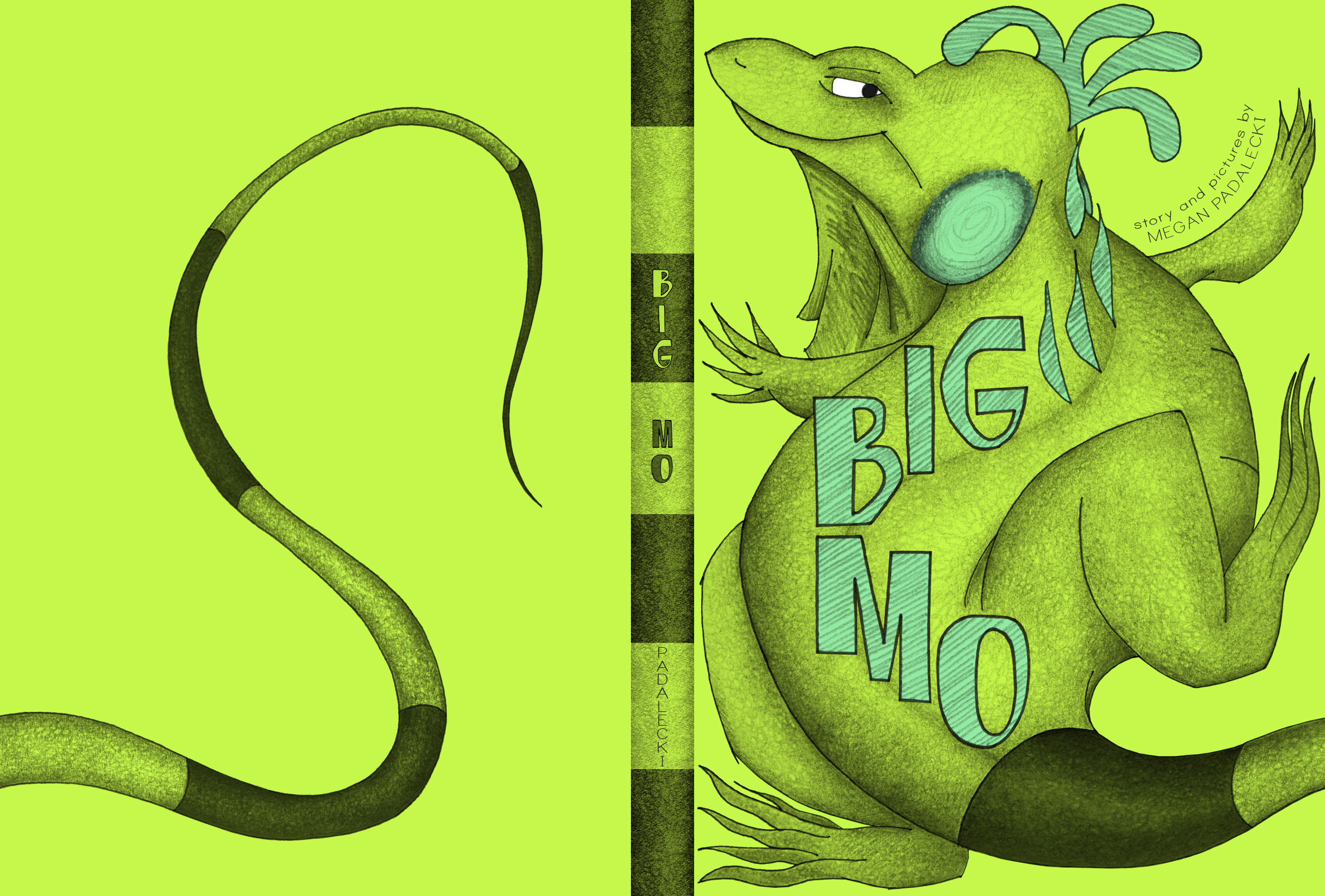
"BIG" is meticulously stacked above "MO", to imply a square of space in the top right corner of the front cover. Close friends can vouch that I spent WAY too much time debating the addition of the thin, grey border and 'Mo' textures on the letters! Ultimately, simplicity won out and the grey border creates a visual POP (which screams "illustration!!" and not "graphic design!!") when compared with the borderless option:
02 COMPOSITION | I am a sucker for The Rule of Thirds when it comes to composition. Horizontal and vertical alignments are deliberate and when "unfolded", Big Mo's cover reads as a complete picture. The cargo ship is even centered on the barcode boundary, proving that no degree of obsession goes overlooked by THIS lady!
The negative space between elements can be just as powerful as the elements themselves. In the example, Are You My Mother?, the negative space is colored teal, whereas my white space is, well...white. This void space helps to emphasize the focal points of the cover - Mo's contented face and the Title itself.
03 QUALITY | Maybe this goes without saying, but the cover image should represent the quality of the illustrations between the covers. I had toyed with the idea of a vectorized cover image - that is, an image with sharper edges, that would have the feel of a digital sign or poster. This would look more professional, I thought. Yet this book is drawn by hand, and to imply otherwise on the cover did not seem true to the style. The illustrations were created with pen and ink, so I chose to represent this on the cover as well.
04 EYE-CATCHING | I thought to myself while designing the cover, what book would I pick up off the shelf? And I imagined "big" me (Megan) and "little" me (5-year-old Meggie) wading through a sea of books and choosing to find out more about the playful-seeming Big Mo. Animals tend to catch my eye, and an adorable green lizard inexplicably floating in water is no exception! As a designer, I am drawn to subjects that pop on a white background, and Mo is composed to imply a sense of movement from rear cover to front. Picking up this book, one must wonder, "what's the deal with this iguana?".
Note, it is also important these days to create a cover that looks clear and great as a thumbnail-sized image, because many people first interact with a book on a computer screen.
05 INTRODUCE | The main character MUST be introduced on the cover. He's the star of the show, after all.
06 PREVIEW | Just as the cover should be eye-catching, it should also entice the reader to open it. The cover can act as a sort of "preview" of the story within.
This can be achieved with contradictions. In the example, Mr. Tiger Goes Wild, we see a proper, well-dressed tiger in a top hat - yet he is standing in a dense jungle setting. This implies some sort of dramatic shift that occurs in the tiger's character or location (and is also explained quite literally by the Title). On the Big Mo cover, we see an iguana floating in water. This seems innocuous enough, yet by flipping to the back cover, we see that his scale is immense compared to the cargo ship floating by. Now we understand that this is a sea, and not a bathtub, and that this is truly a BIG Mo! The contradiction of an ordinary iguana being as large as a sea tempts the reader to find out how this came to be.
07 SPINE | The spine is a study in and of itself. It can be argued that in most bookstores, a book's spine is the only visible representative for the entire book! Within the 1/4" width of the spine, every bit counts. Once again, I used compositional tricks and ample white space to stand out. Mo's body is carefully positioned so that his spike falls perfectly within the spine.
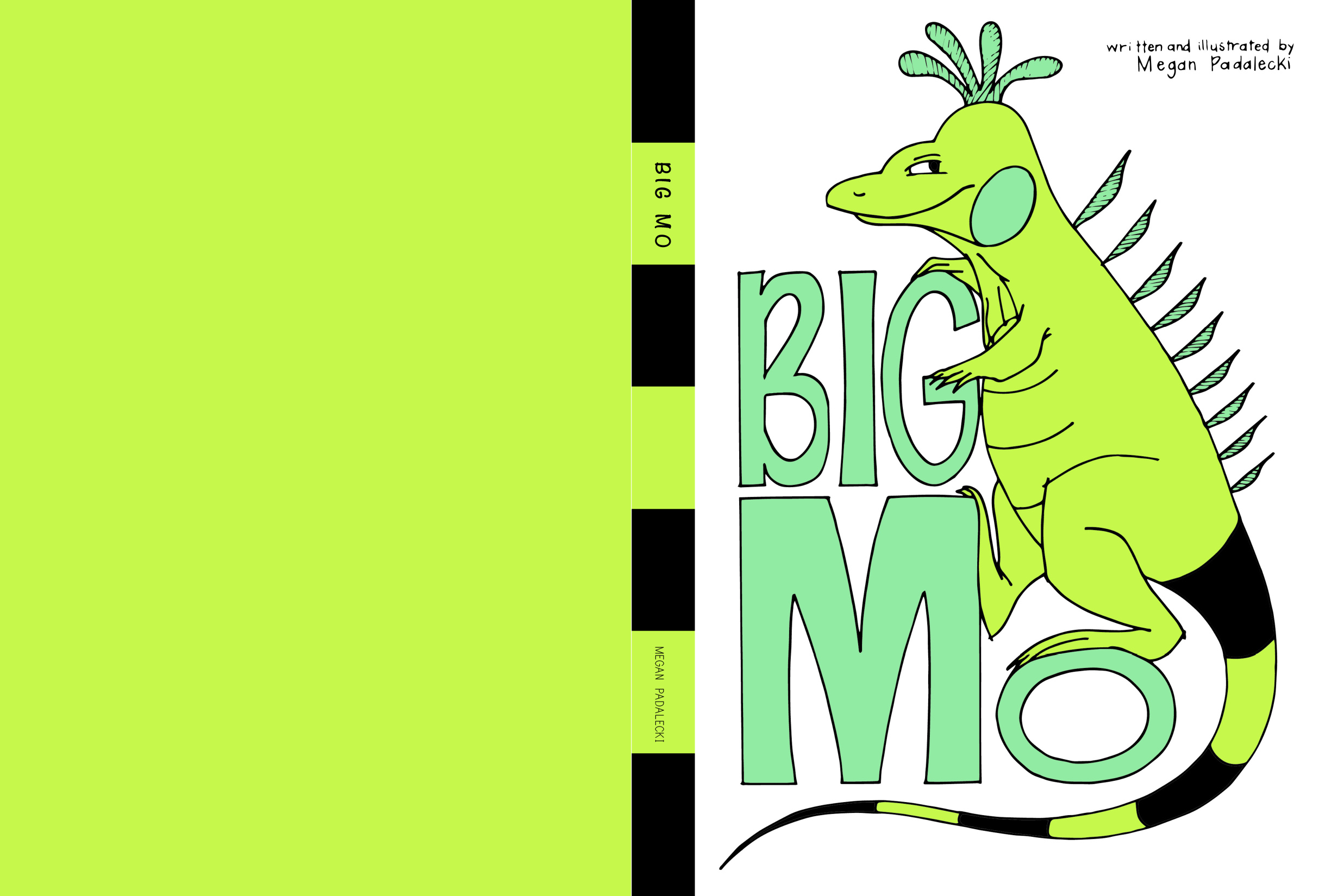
In my earliest iterations, I was certain that the spine should be striped in green and black, like Mo's tail. This would certainly be unique among other books on the shelf, right? Though this is true to some extent, I was more satisfied with the feel of a cover image that "wraps" from front to rear. Mo's tail makes an appearance on the rear cover, as a way to establish scale with the cargo ship. In doing this, the enormity of Mo's size is revealed only once the reader flips the book over - making for a fun surprise! To have broken this complete scene in half by striping the spine could have been a mistake. Mo's tail instead patterns the book's end papers - a happy compromise : )
Naturally, I did not come to this cover immediately. Instead, I kept the challenge of designing just the right cover forever on my mind, sketching thumbnails along the way from June until November. Especially November, when my deadline loomed near...
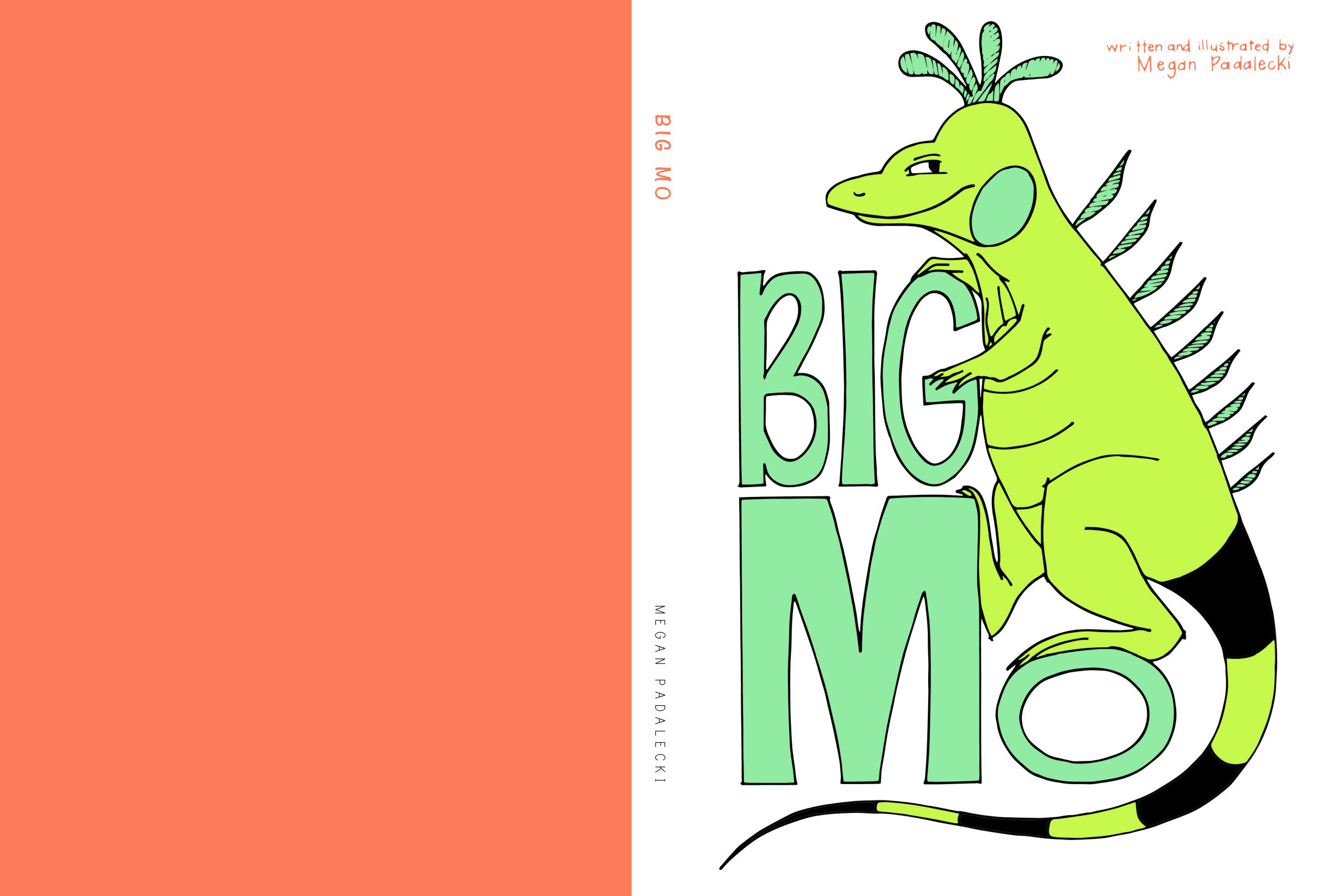
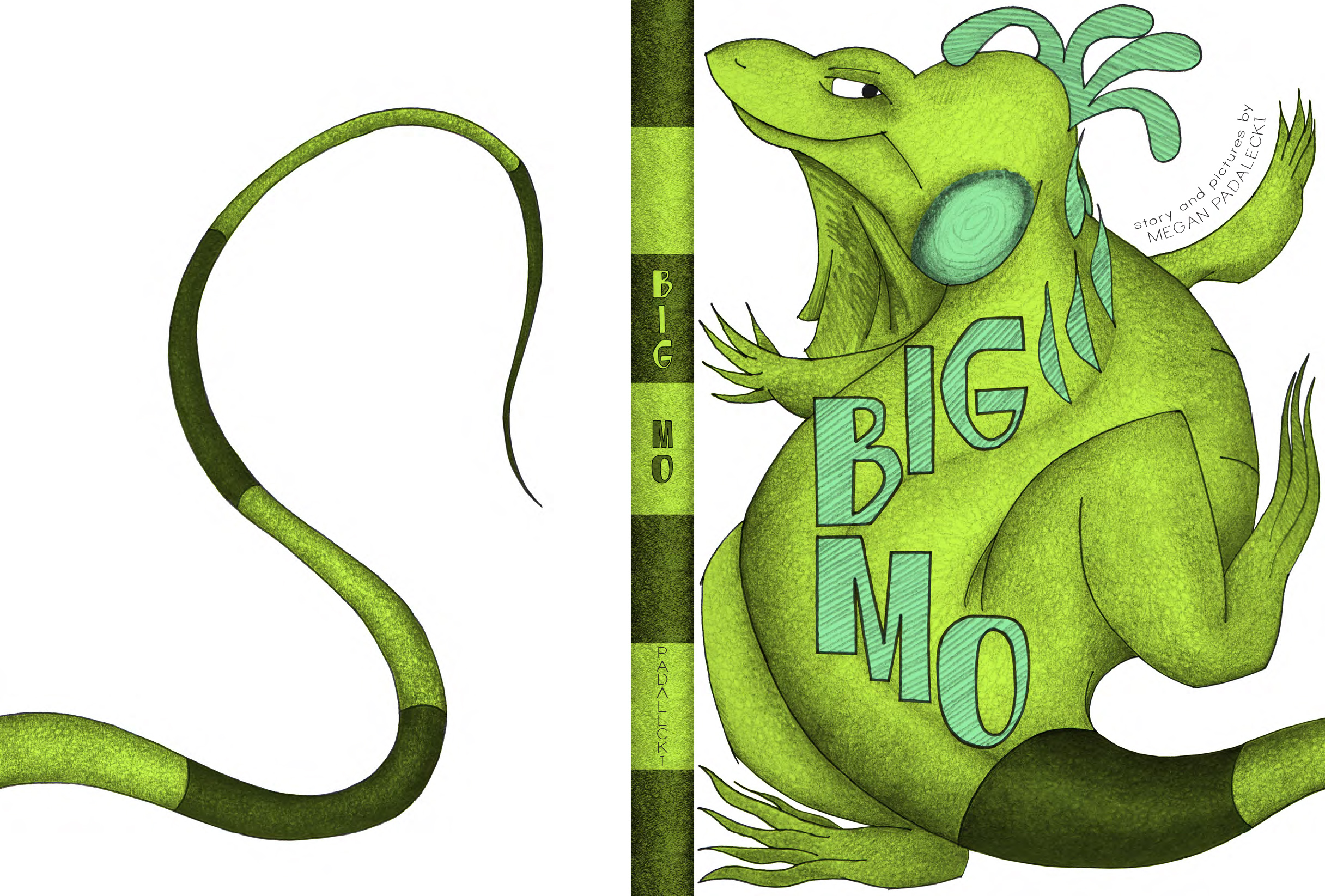
I also created a few more 'polished' covers, which I pinned to my wall for review along the way. These did not make the final cut, but I learned what worked and what didn't from each:
As with every aspect of this book, I had to take a chance and go with my gut. I hope the final cover is one that makes its mark on the shelf!


