VERSIONS

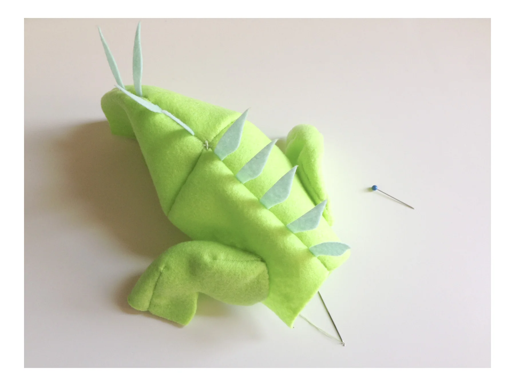
The rules of the game: revise, revise and REVISE.

There are rare moments in life where a fully-formed and perfected thing is created.  More often in the creative arts, a final product is the result of countless iterations.  Refinement thus becomes an art form in and of itself.

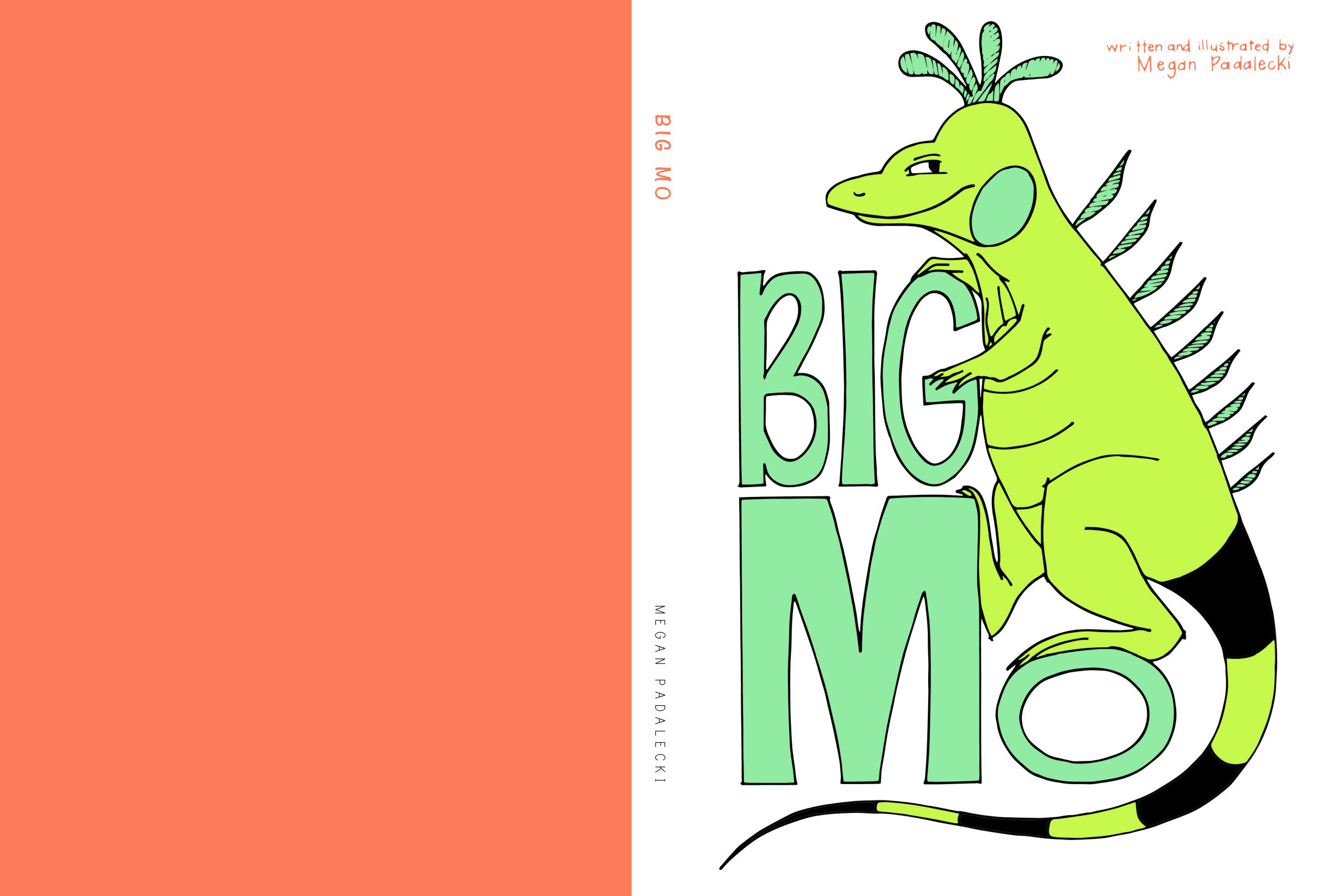
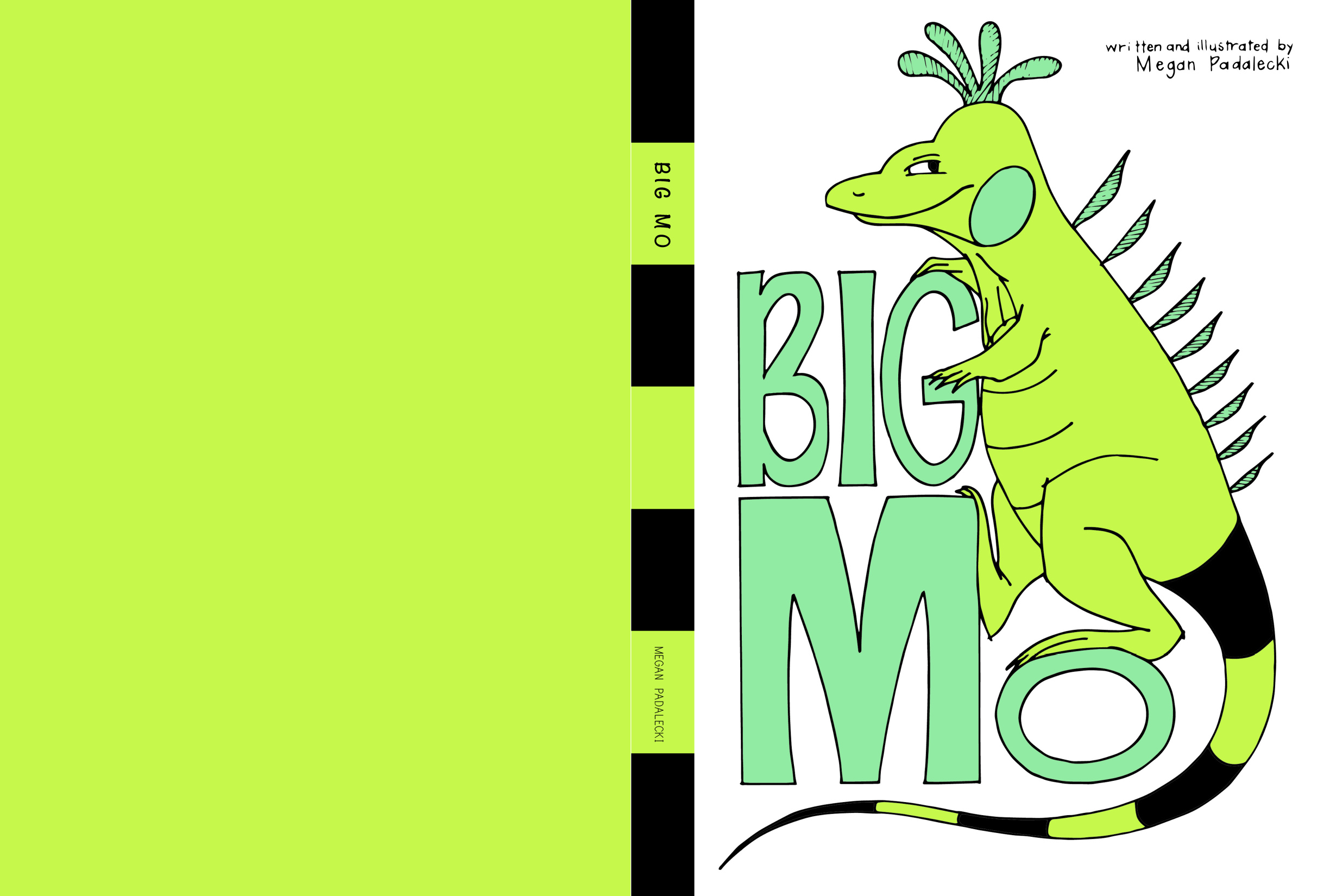
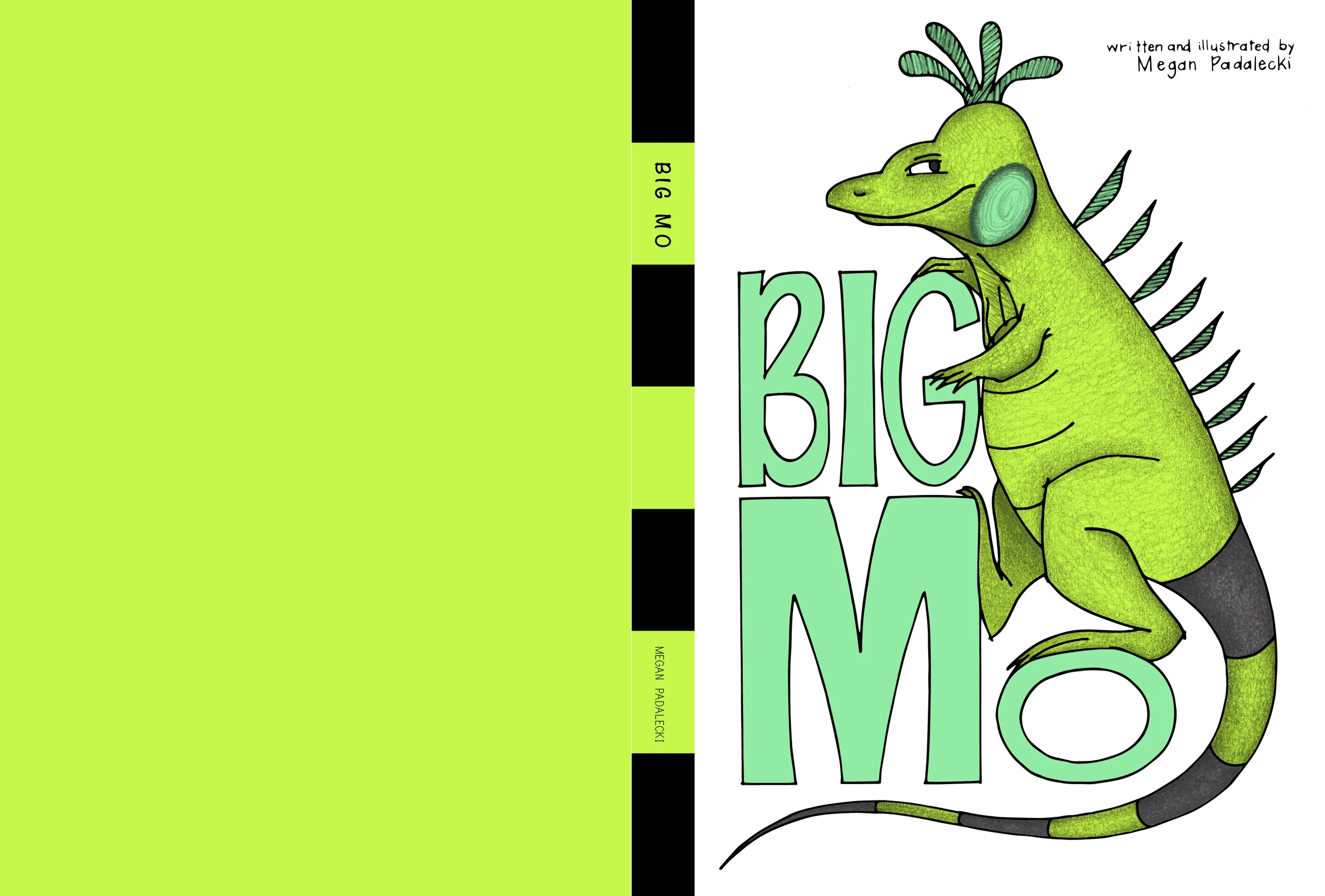
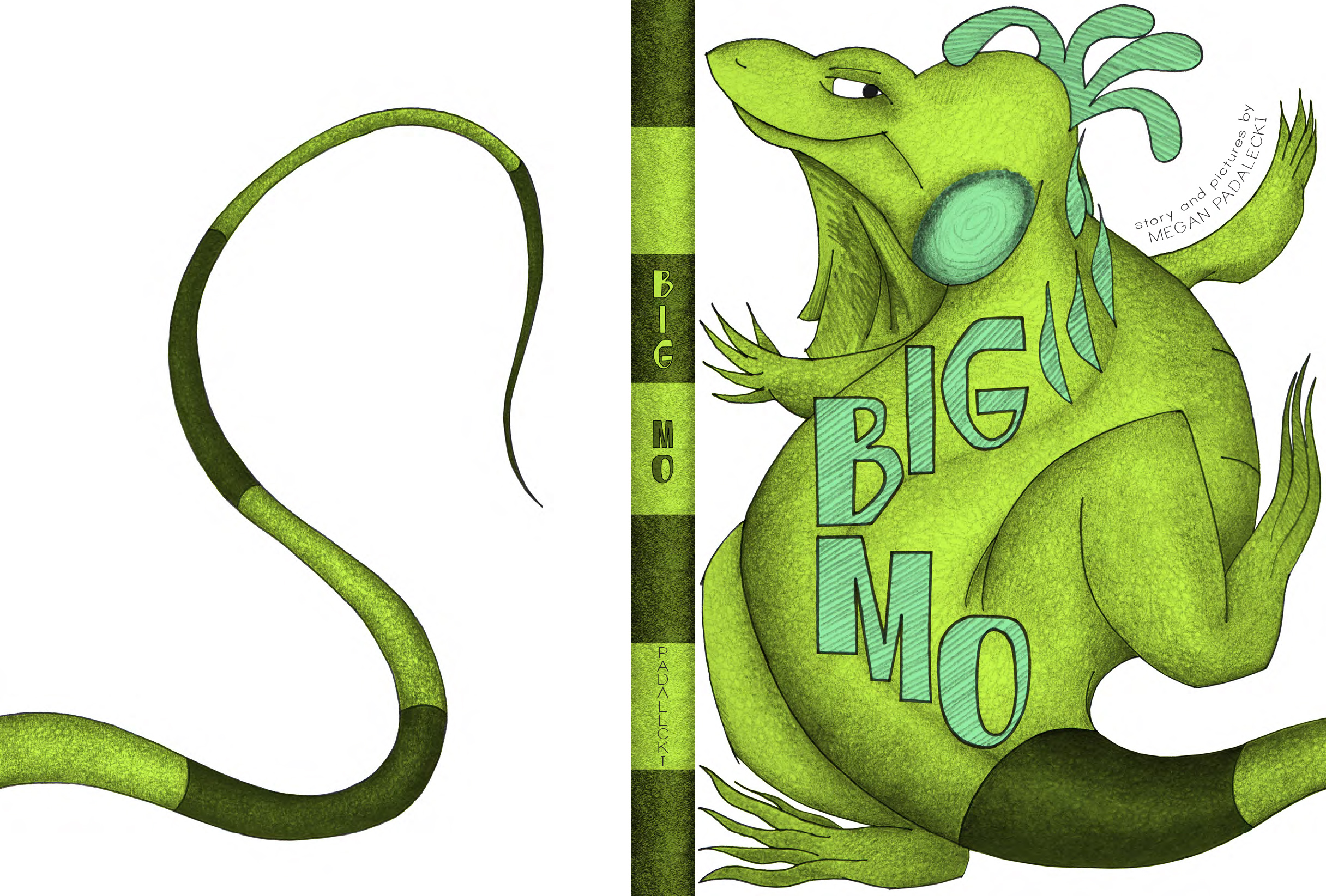
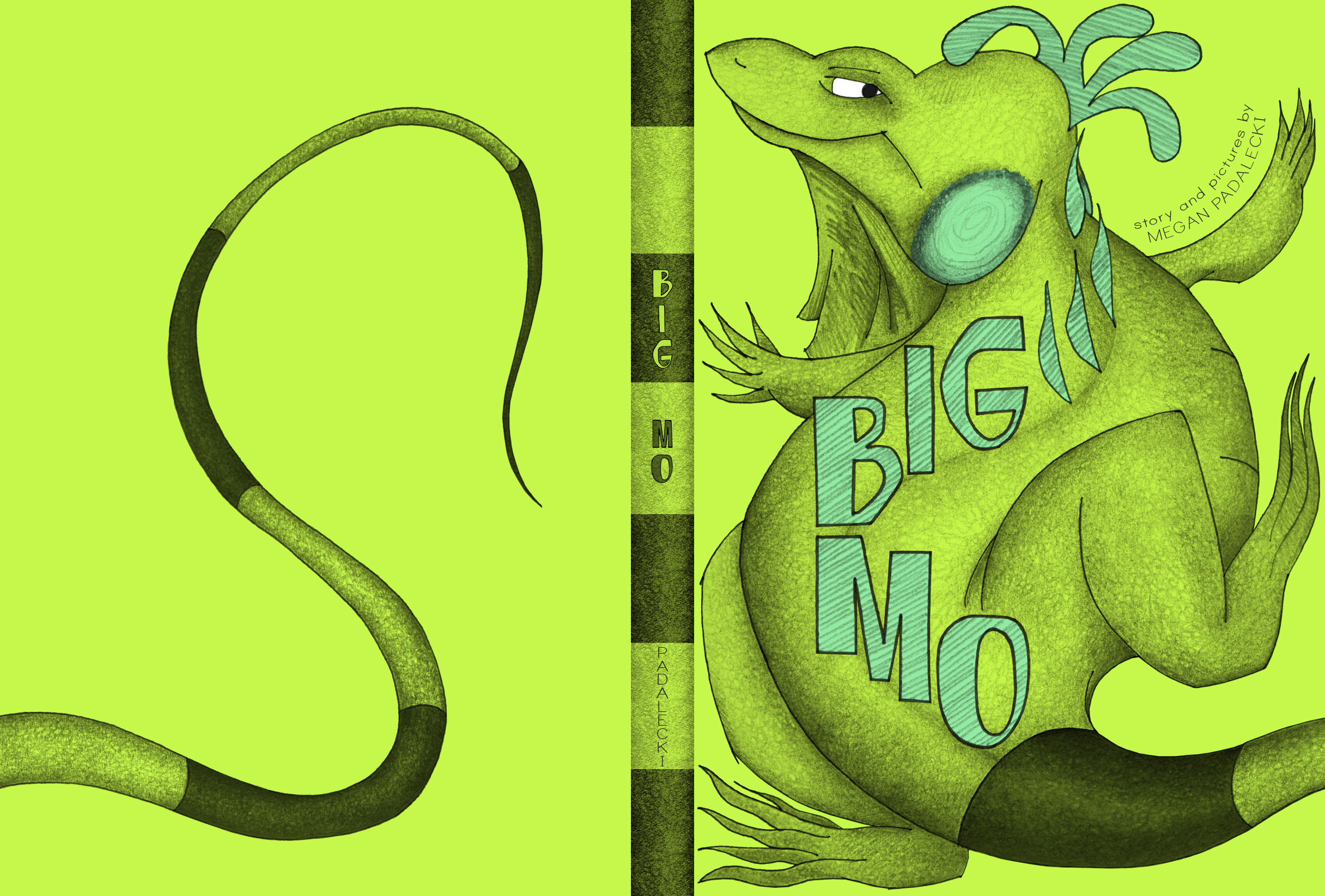
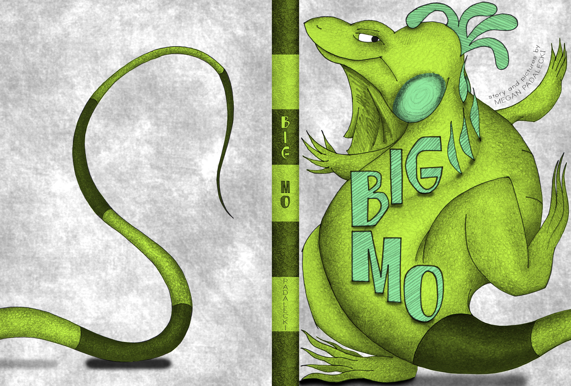
Let's take a look at a few images from Big Mo.

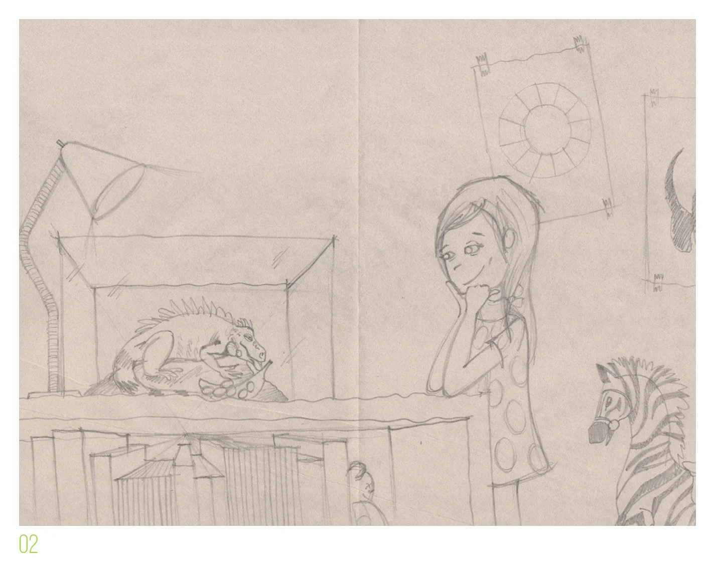
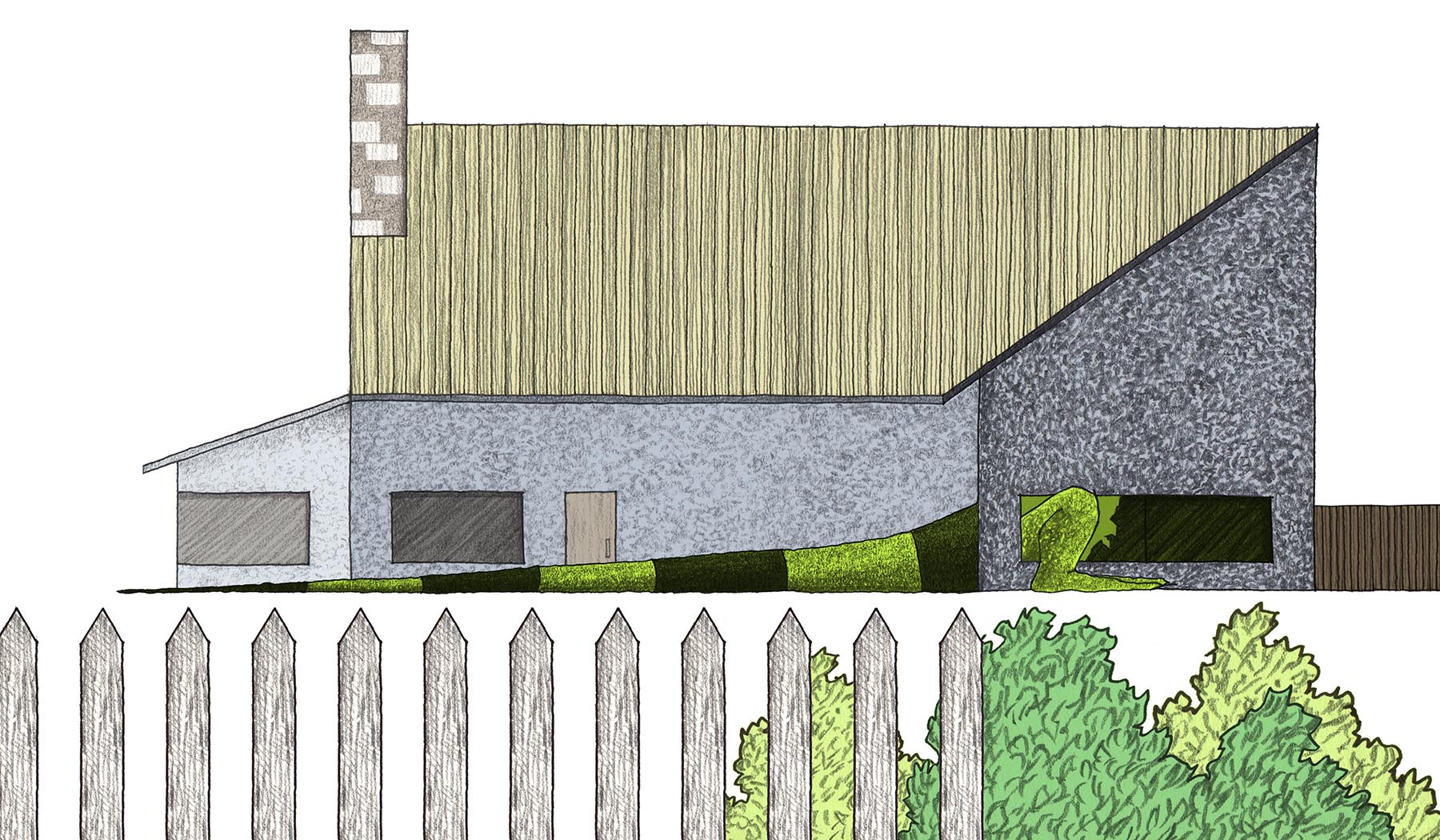
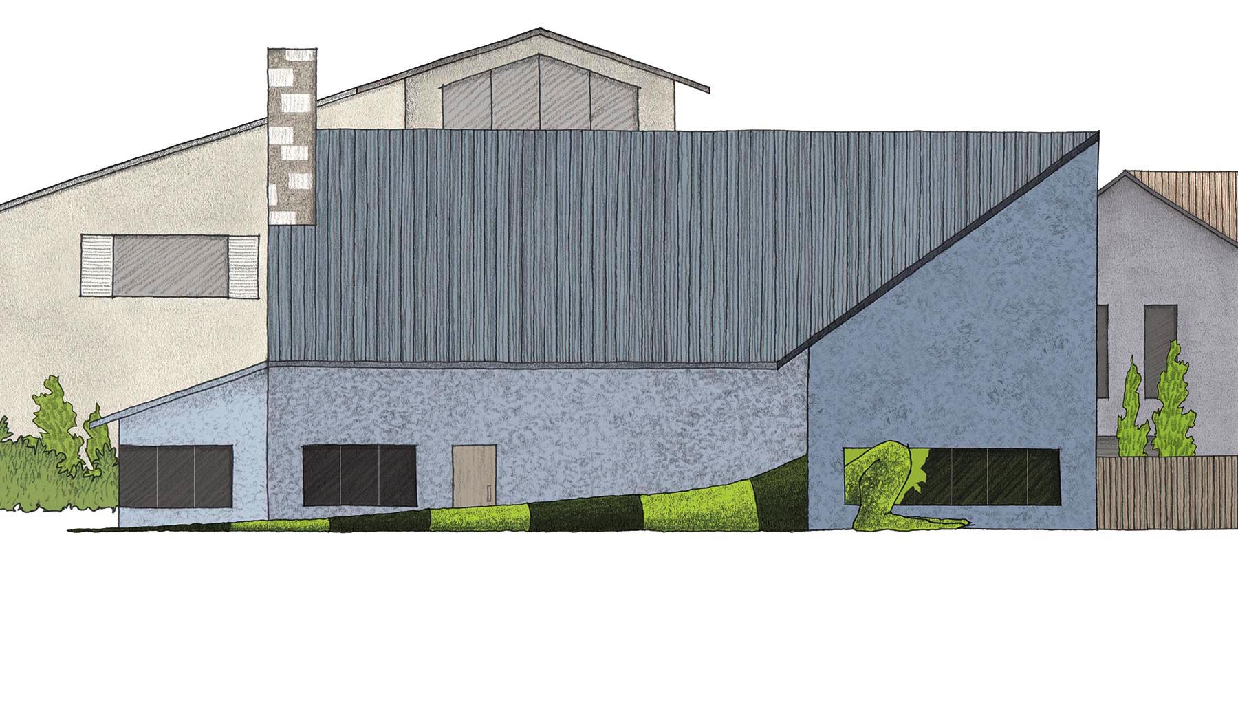
At this point in the story, the reader realizes for the first time that Mo is not simply going to grow larger than his tank - he's going to keep going!  In my initial concept sketch, Mo is the size of the family van, enjoying a windshield wiper toothpick.

While this image does give an indication of his journey to come, it had two problems for me:

          1.  The car is too specific and realistic, and the setting in the garage was difficult to convey without using one-point perspective, which I hoped to avoid altogether for simplicity of visual style. **Note: more on perspective in a future post!

          2.  This scene is an important cue for the reader for the "speed" of Mo's exponential growth, and by this point, he should be much larger than a car.  So, to keep the anticipation alive, I drew Mo as partially hidden inside the garage, presumably waiting to burst out!

The illustration was "blocked out" on the page, and only very minor elements, like foreground and color selection, were changed.


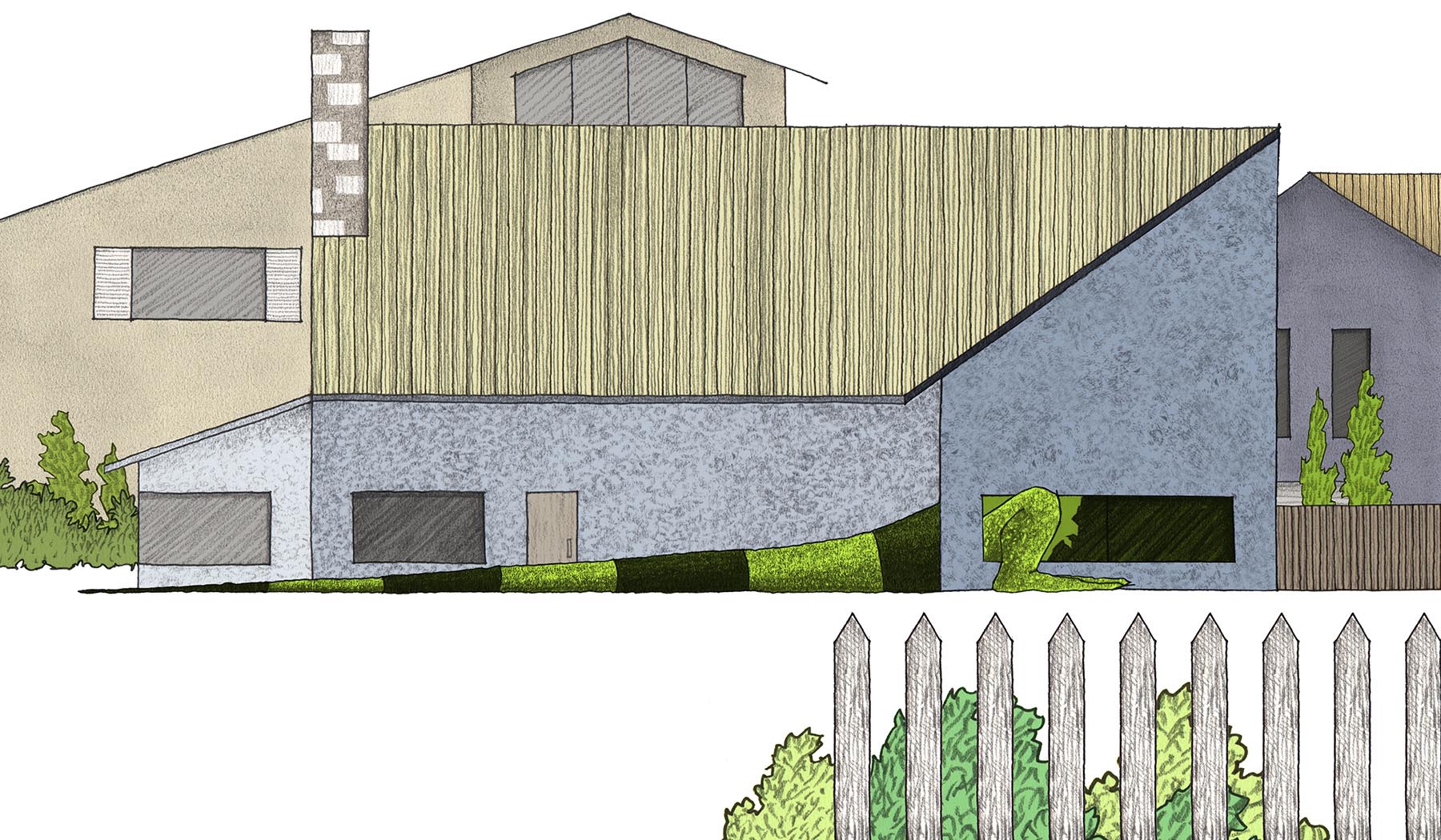
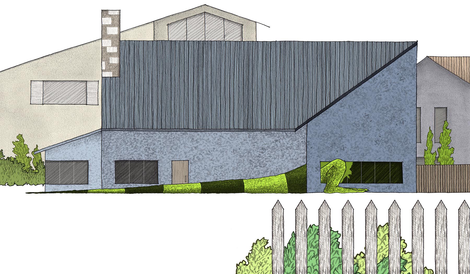
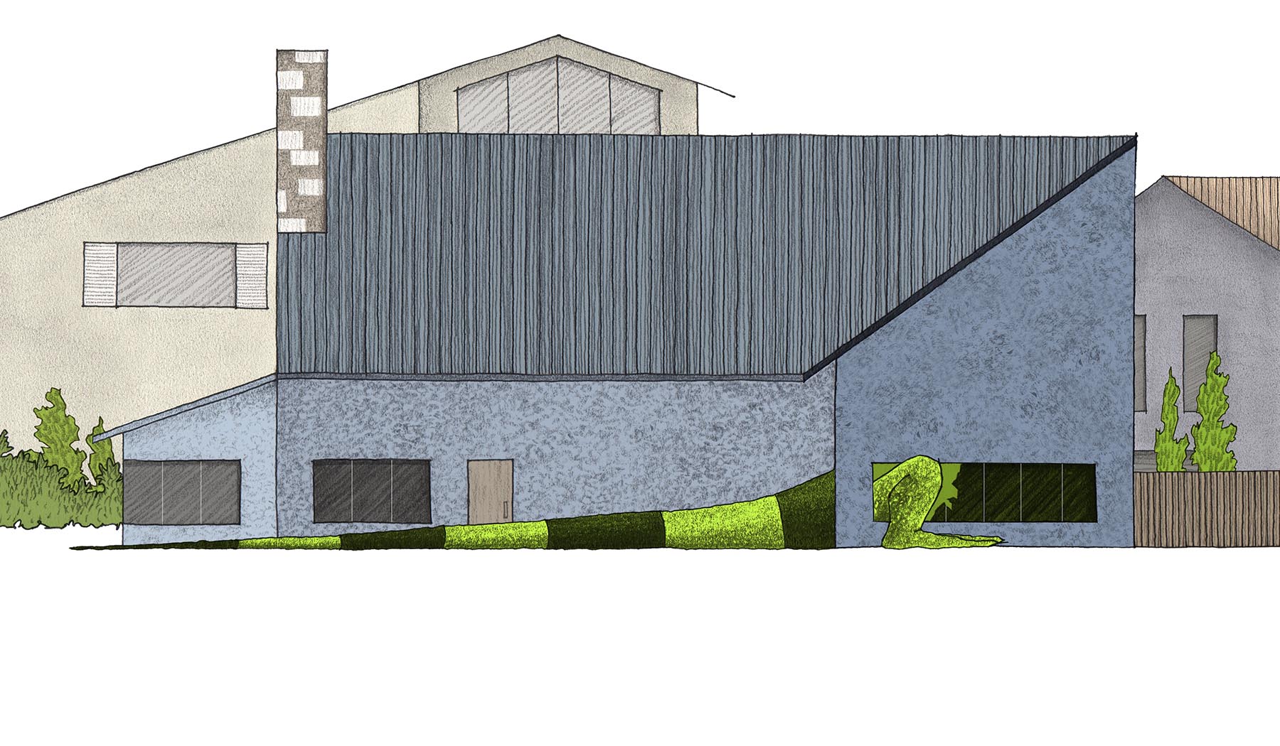
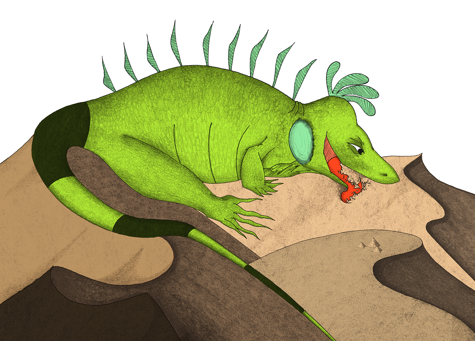
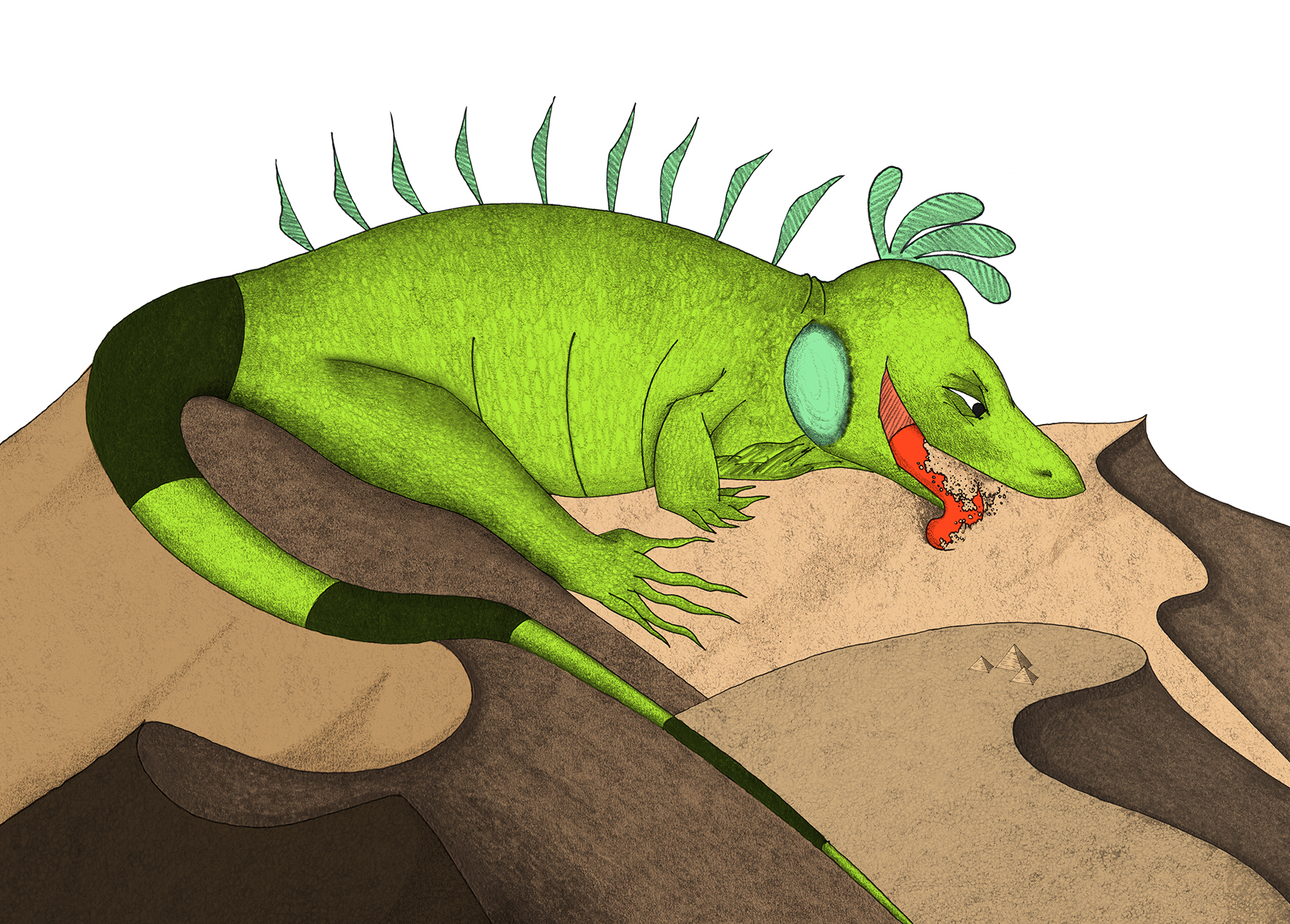
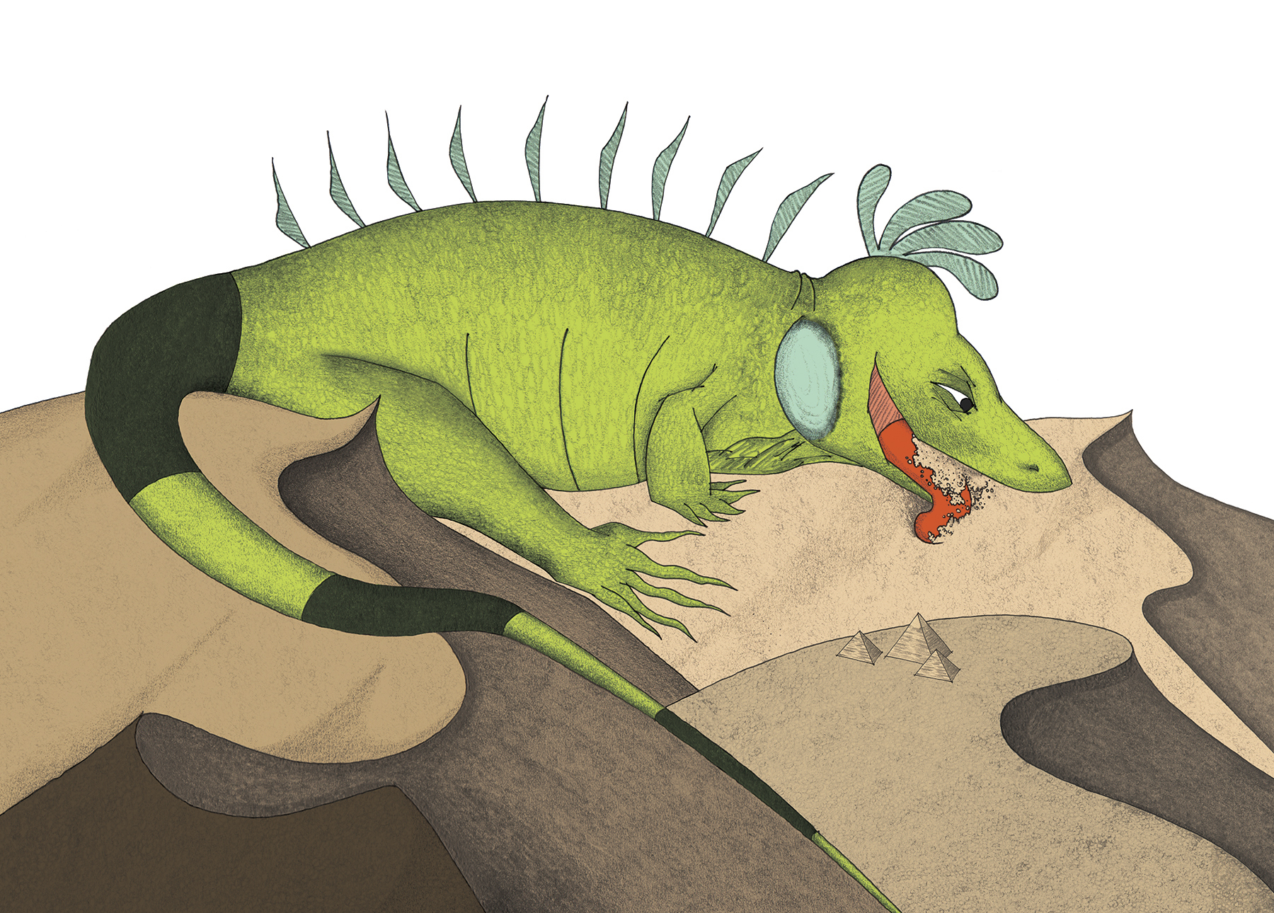
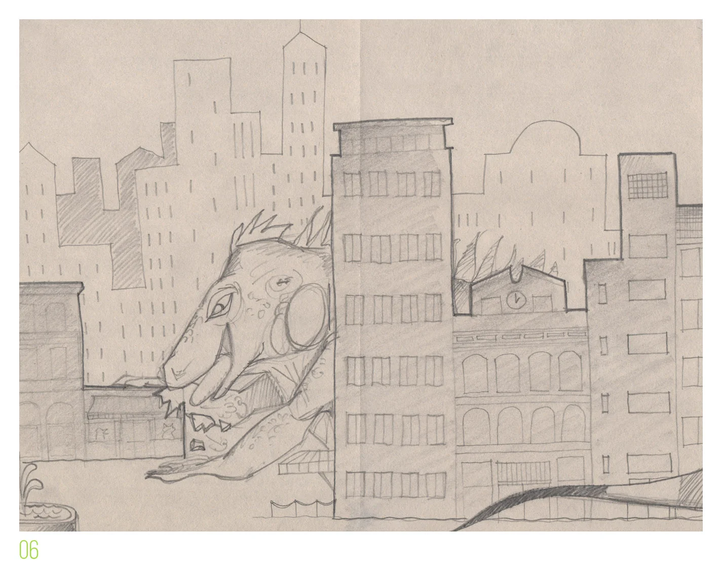
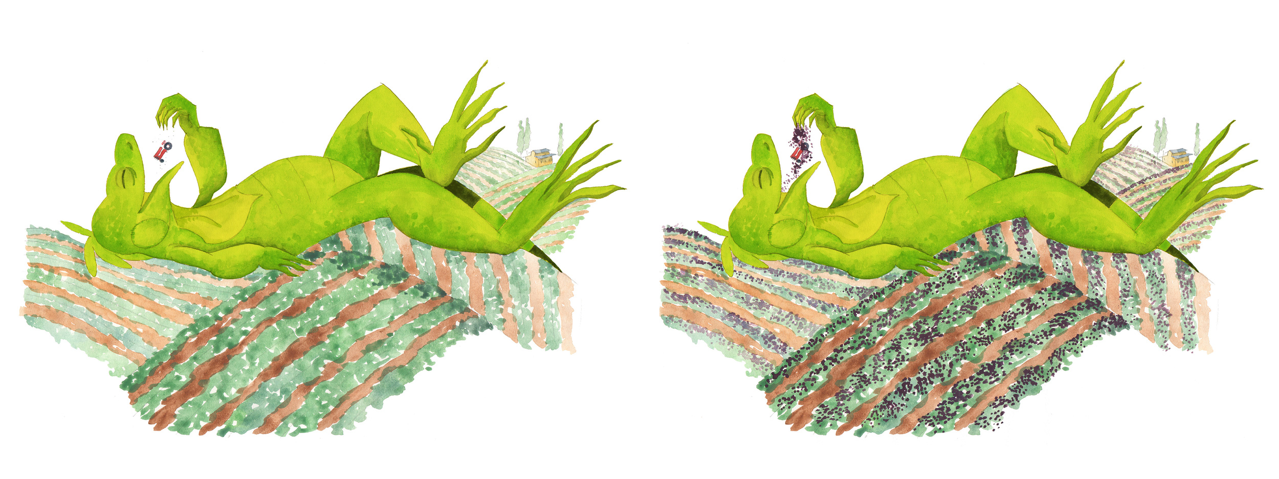
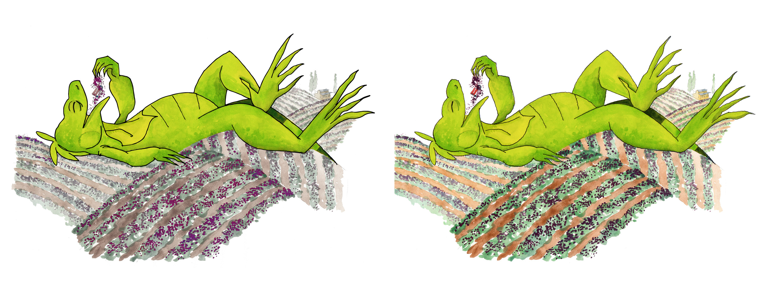
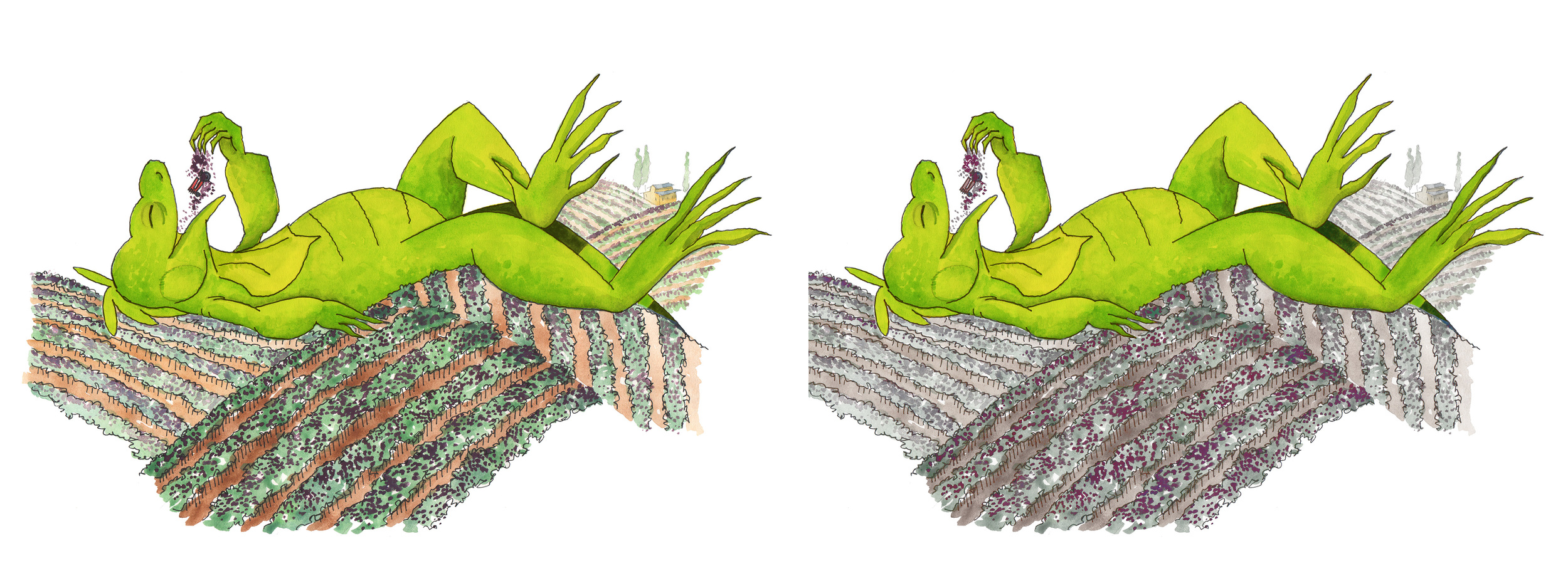
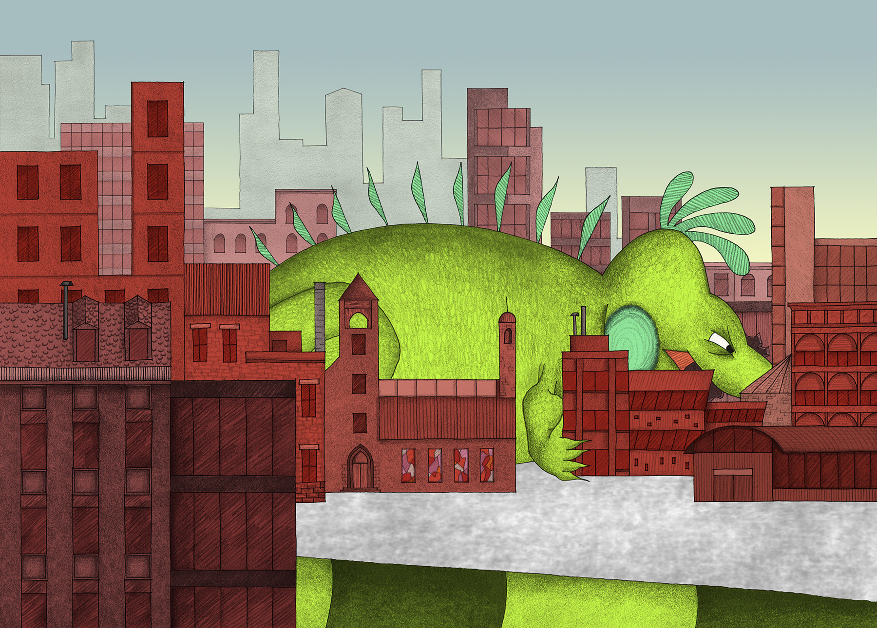
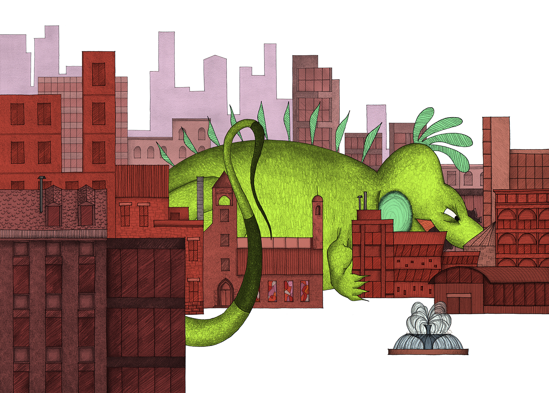
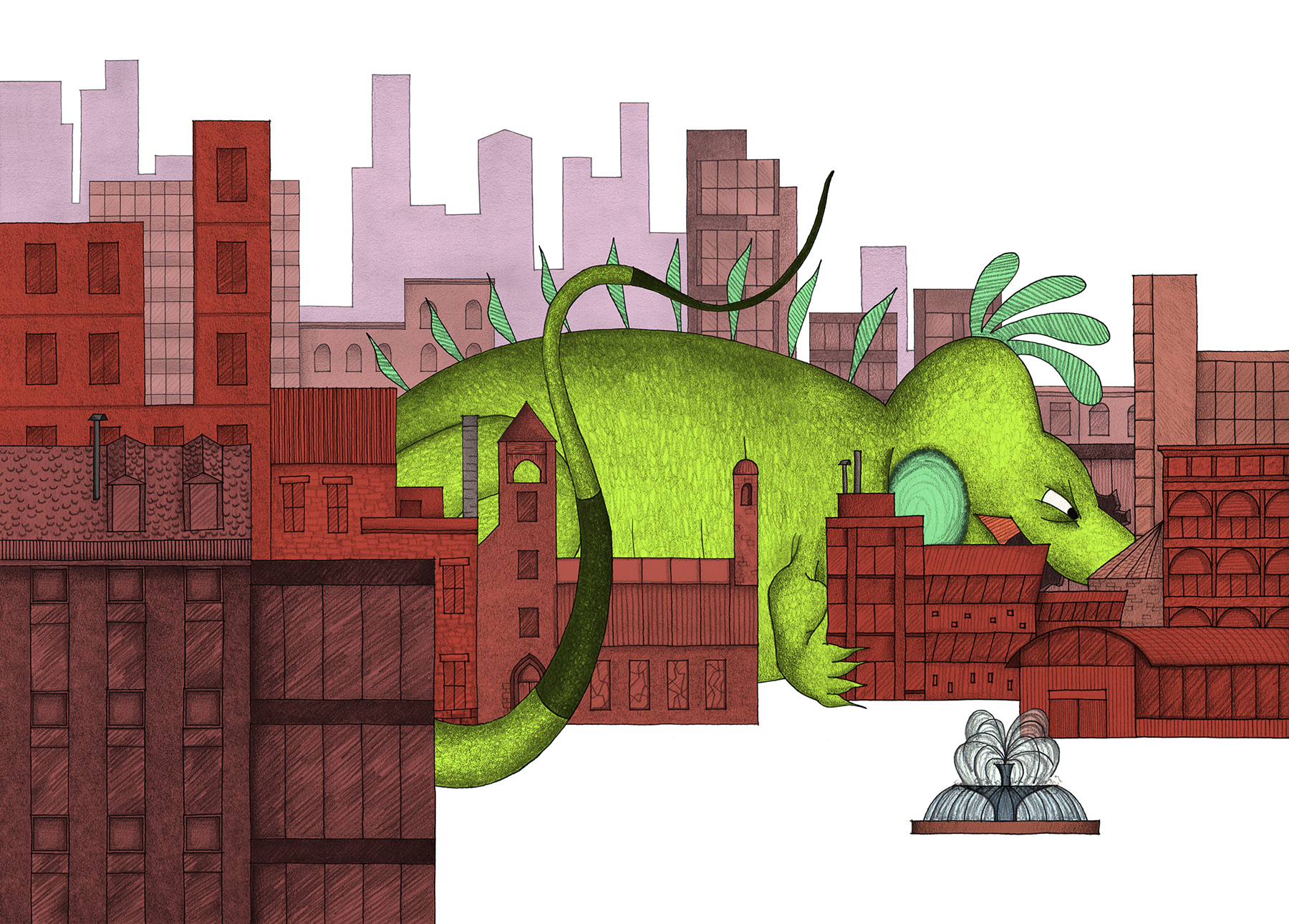
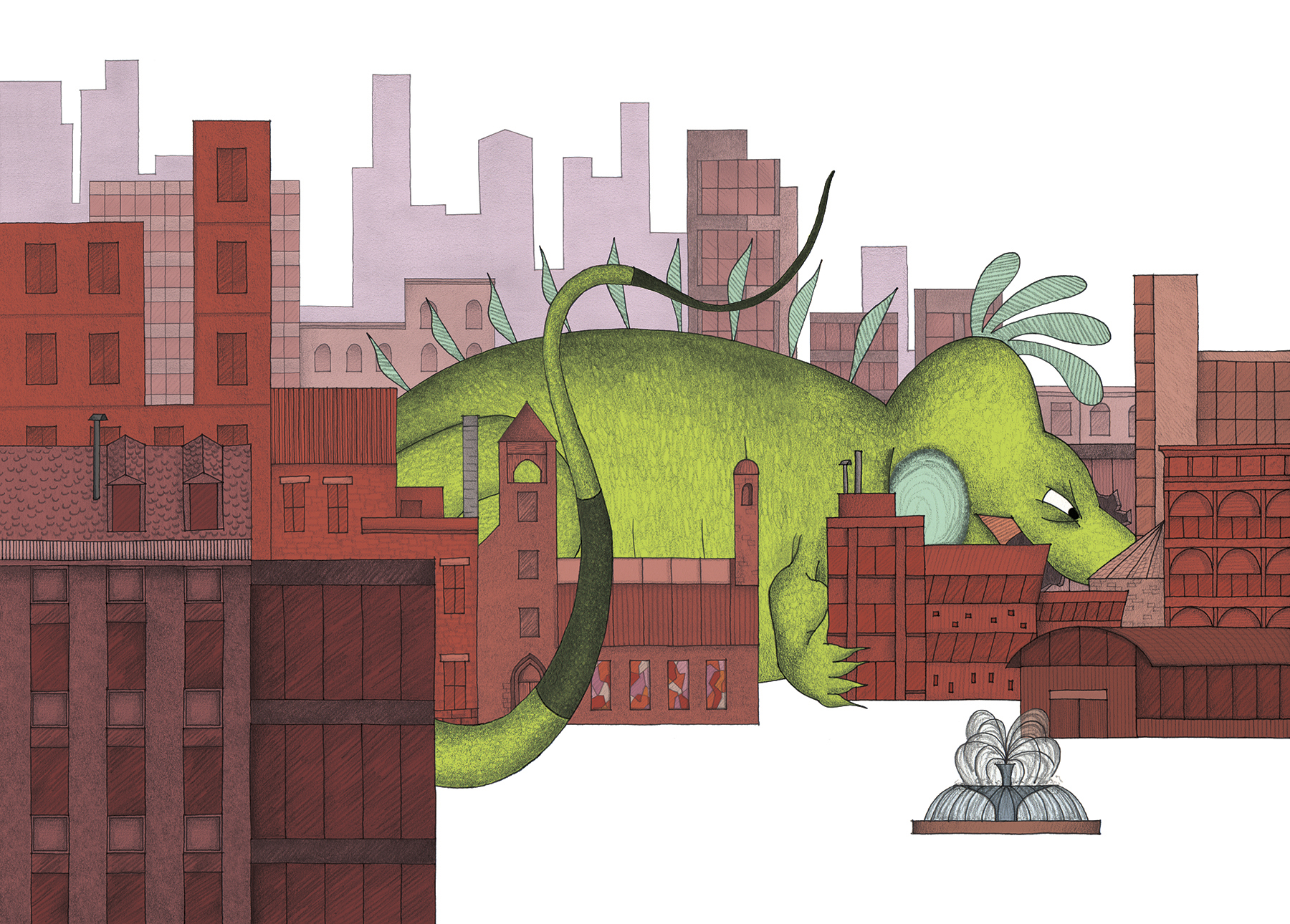
By the time Mo is as large as a city, his destruction is far-reaching.  With his larger size, Mo's body began to encroach on the boundaries of the drawing page.  This was a fun side effect, and meant that I could really play with the relationship between Mo and his surroundings.  When flipping through the book, you may notice how his body tends to mimic the contours of the land around him, whether he is lounging on vineyards or weaving through a downtown maze, as with this scene.  

The anatomy of an iguana is particularly suited to active and dynamic positions in "landscape format", with a bit of humor to boot!

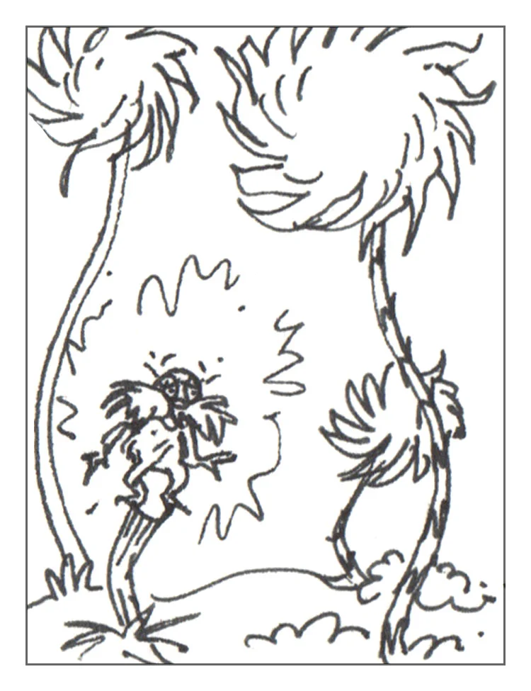
This particular illustration forced me to make an important decision on the status of human figures (ie. to include, or NOT to include?).  I decided to represent the presence of humans without actually drawing them.  The concept of an iguana growing out-of-control is potentially scary to a child, so I took precautions to leave the people OUT.  There was a visual implication to this, too, because humans would be no larger than dots as Mo's scale grew through the story!

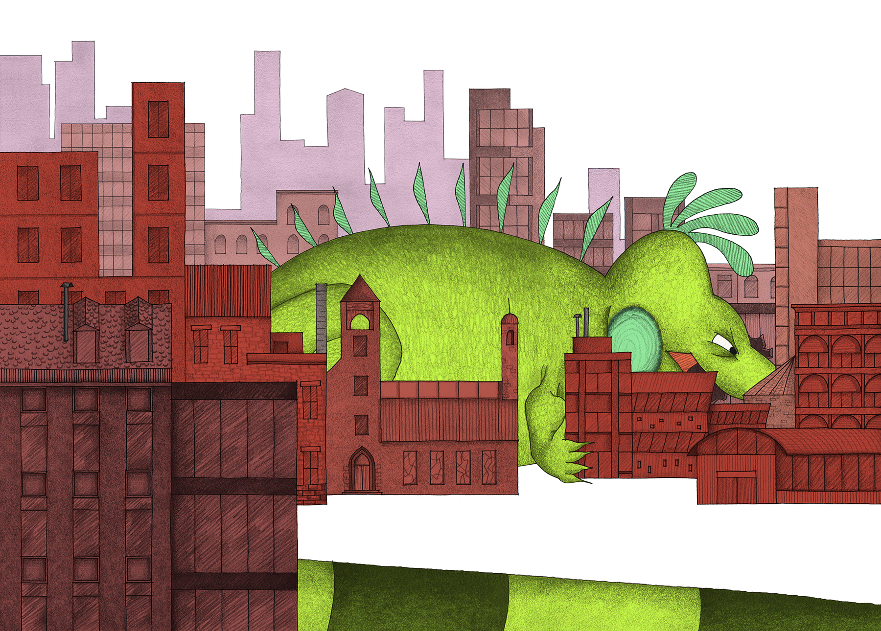
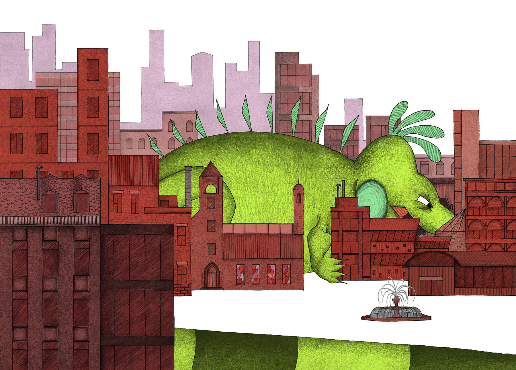
Revisions to this spread were mostly cosmetic as I altered the tail, tones and details. Unintentionally, I had created a "Spot the Differences" puzzle for myself.


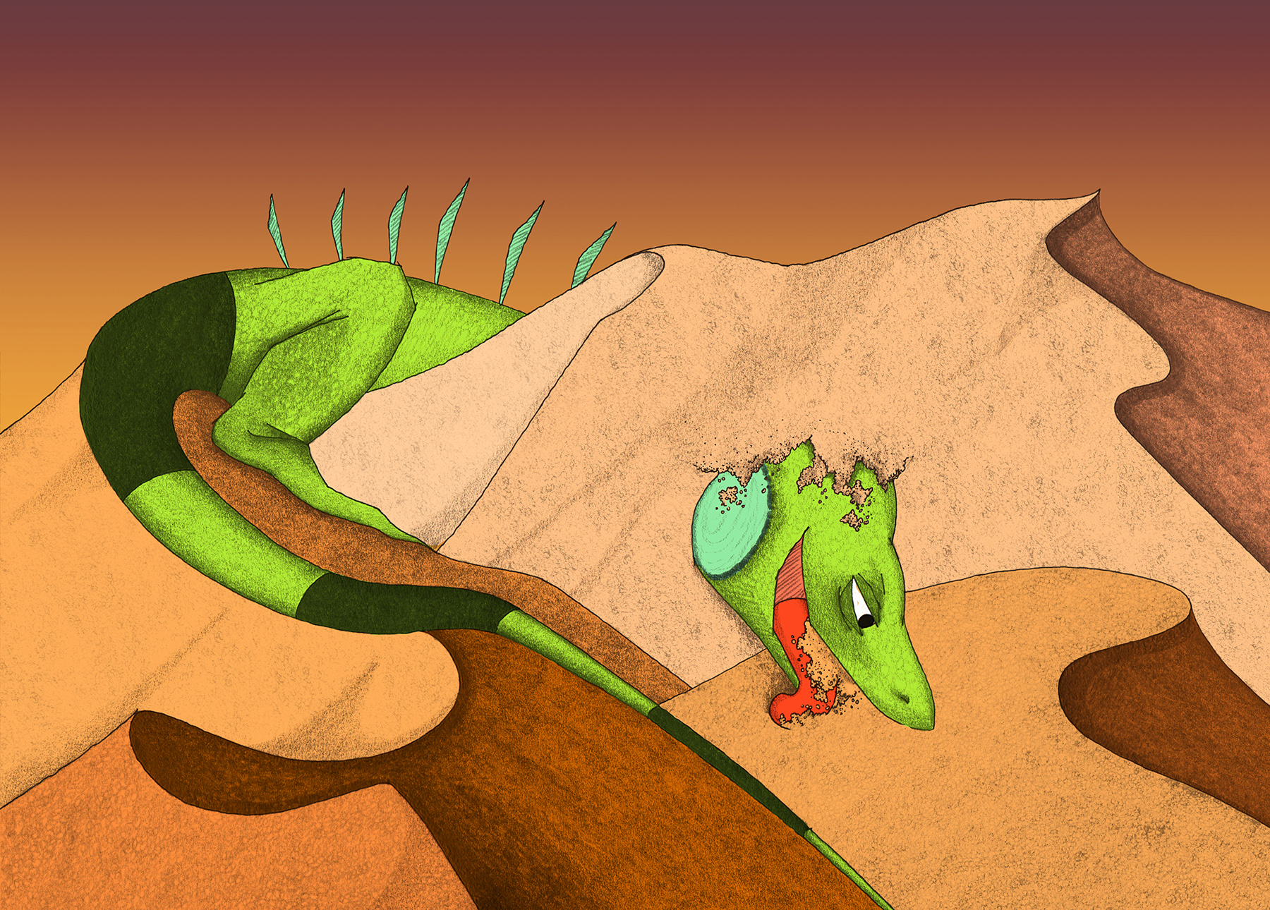
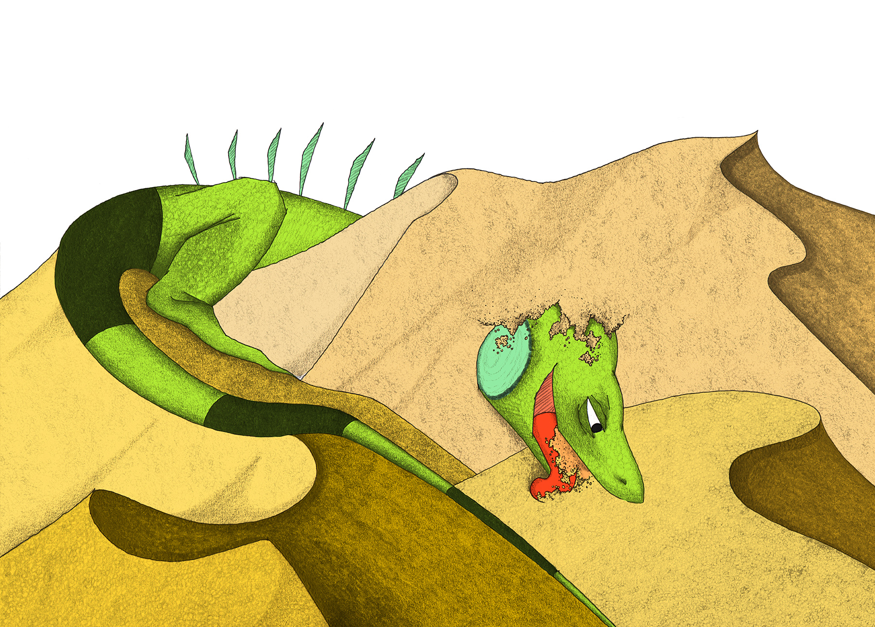
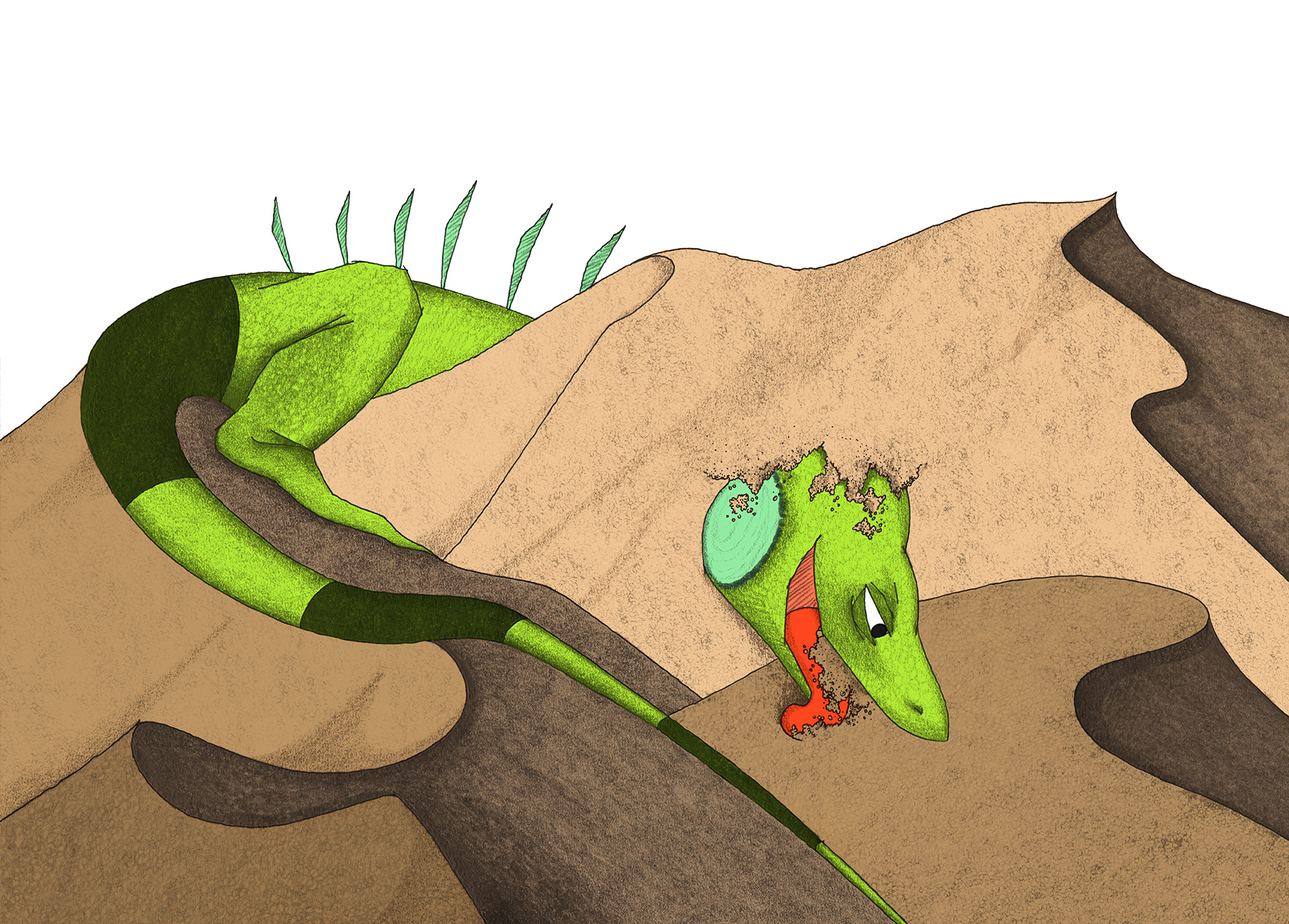
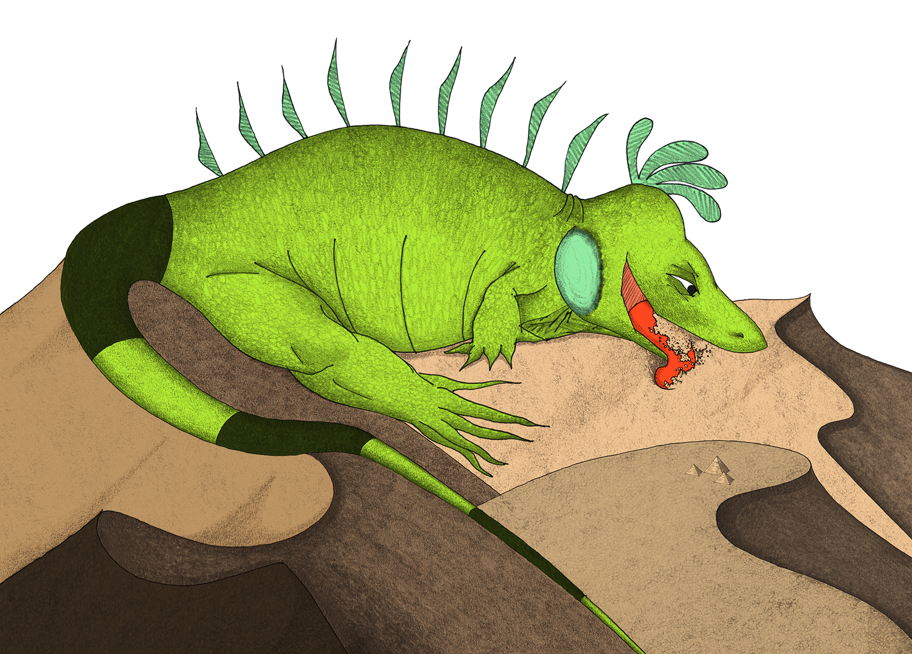
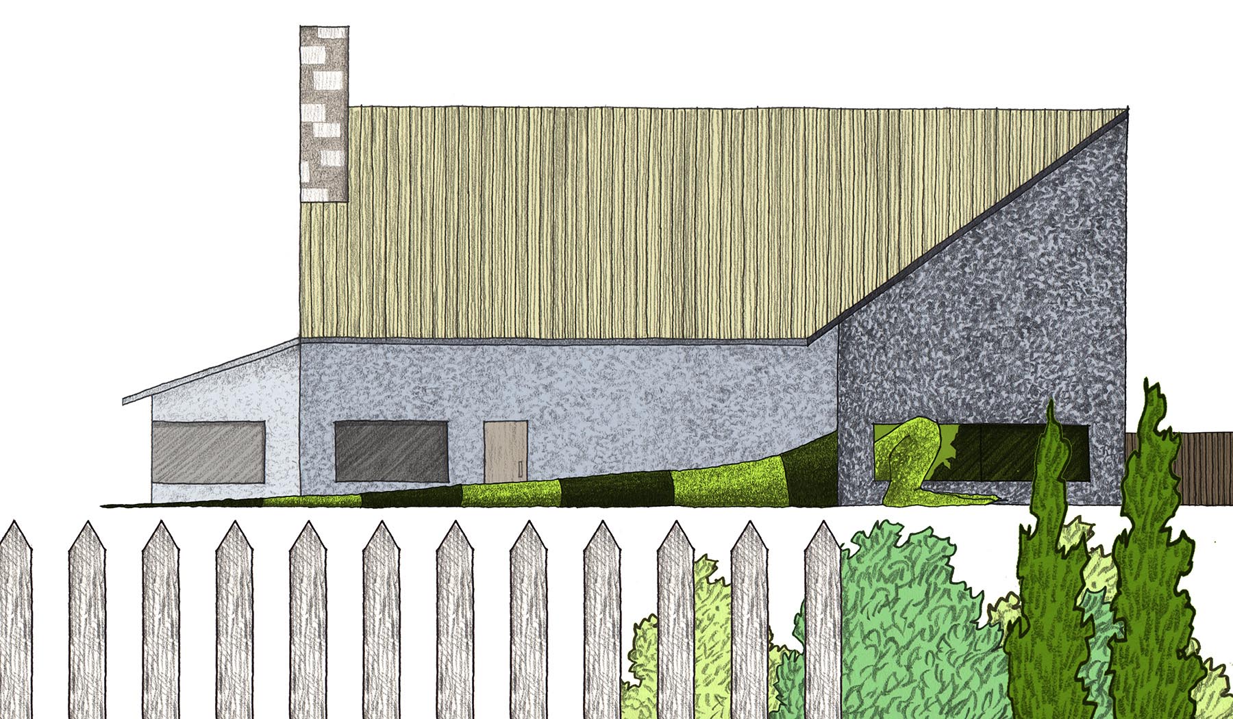
To say that this illustration was the bane of my existence for a few months would be an understatement!  There were even times when the spread was removed altogether in favor of a smaller page count, because I just couldn't seem to get Mo's positioning right.

The spread seemed destined for the cutting room floor.  

All the raw material was there: Mo is comically larger than a mountain - the size of an entire desert, in fact.  His expression shows that he has a renewed focus on consuming everything, and he is guzzling sand like so many crystalline jelly beans.  Yet, this drawing eluded me for quite some time.

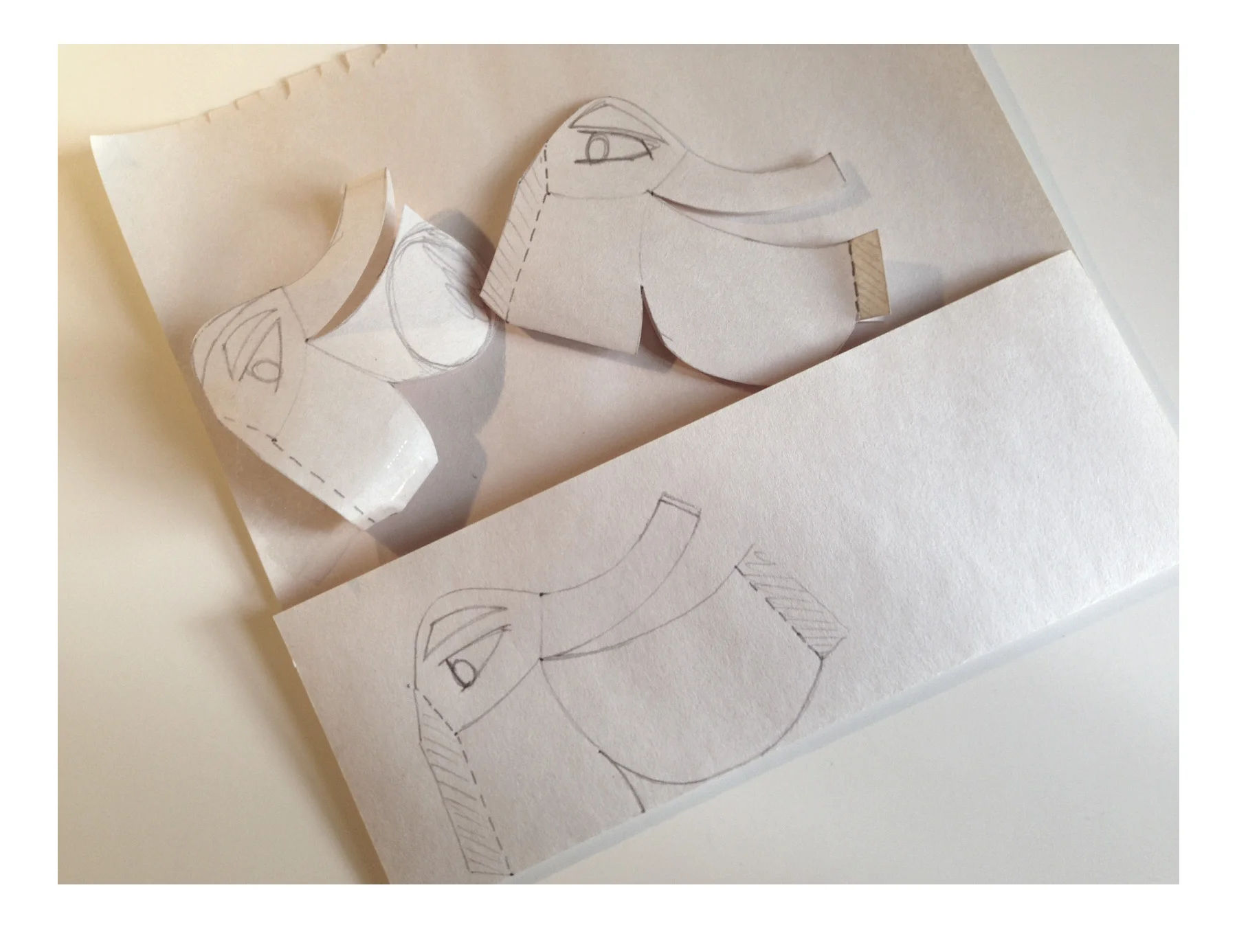
The evolution of this scene was the most drastic as I pushed, pulled, and generally manhandled the drawing to reach its final form, complete with tiny Giza Necropolis.

**Note: guest appearance in the fourth frame of an iguana thigh fit for an NFL player

FELT & FLUFF

It's a fact - kids love soft things.  

In anticipation of a slew of elementary school Author Visits, I decided that Mo should accompany me to each school.  Children form intimate attachments to characters in books, so bringing a physical Mo along could really emphasize that bond (and help to tell his story)!

The only challenge?  There's no Big Mo Store, so I had to build him myself:

Build-A-Mo Diagram 1.0

Build-A-Mo Diagram 1.0

01  SKETCHES & TEMPLATES  |  This is how every project begins for me - with brainstorming and documentation of each component.  In this case, Big Mo is technically a sculpture made of a limited material palette of felt, thread and FLUFF.

2D sketches are great for quickly understanding the scope of the project, but for me there is no substitution for 3D studies and models.  I used a pad of newsprint sheets to test some of my theories on forming just the right shapes.  When a stuffed animal is typically produced (in a large factory or otherwise), it is sewn from a set of templates, which are "road maps" for each piece.  For dimensional shapes, the assembly of each piece of the puzzle can get complicated fast.  Certainly time-consuming, this process gives new life to the old adage, "measure twice, cut once"!

02  HEAD  |  When illustrating Mo, I always draw his head first.  It made sense to sequence the assembly head-first, as well.  With the head completed, it allowed me to size the body proportionally and more importantly, it kept a set of watchful eyes on me over the weeks as I slowly completed the project...

Mo's snout began as a template (which accidentally met it's ill-fated end in a trashcan).  The main portion of the head resulted from a series of refined templates, until I found a corresponding fit for the snout that was "juuuuust right".  Remember that even though the head looks one way in 2D on paper, the final look stuffed with cotton fill is somewhat unpredictable.

The template was transferred to green felt, which I unearthed at the bottom of a fabric store remnant bin.  Not quite the subdued green in the print version, but it'll do : )

I use round-head pins to attach components temporarily.  Each piece is sewn from the inside, so that the messy thread knotting is not visible.  I use a stitching style that my grandmother taught me, but am by NO MEANS a sewing expert!  If Mo were turned inside-out, a complicated web of spaghetti would be revealed, and you would think that I did this wearing a blindfold.

Mo's eyes were embroidered on by adding layer upon layer of white, then black, thread, giving his dismembered face just the right amount of 'tude.

The head spikes were cut out of mint felt and sewn into the "skull cap".  Then, a newsprint jaw template was taped to the head as a "mock-up" of the eventual fabric piece.

I definitely poked my fair share of fingertips sewing the jaw, tongue and cheek patches to the head assembly.  At this stage, Mo could have diverged toward a career in the Puppet Theater, but I had other plans.

For major components like the head, body and tail, each assembly is sewn inside-out, and then flipped outward in one dramatic flourish!

03  BODY  |  Individual back spikes (9 total) were cut out.  It was critical to find a fabric rigid enough to stand upright and maintain its shape.  The green felt is soft and cuddly, while the accent mint felt has a slightly rougher, paper quality to it.  I can't claim to be very educated in this realm, but I did luck out by finding the ideal felt for the job!

The football shape of the body is comprised of 5 patches, symmetrical about the spine.  I began by connecting the Right Front, Right Rear, Left Front and Left Rear patches.  Along Mo's spine, I inserted and secured each spike so that it could be flipped outward later.

04  LEGS  |  The legs are critical to the overall piece, because they help to physically balance the body as it sits on a table (or a shoulder!).  The rear legs required a dimensionality that implies movement/crawling, while the front legs could be sewn flat to the body.  At Mo's shoulder, the front legs are attached with a sturdy "X" that allows for a slight freedom of movement.  I referenced my illustrations of Mo to ensure a proportion that seemed true.

Once the legs were secured, I unfolded Mo's "skin" to prepare for the final piece of the body.

Flipped inside-out once again, I carefully tucked 9 spikes and 4 legs into the body pouch, and secured the flat belly piece with pins.  It reminded me of these:  80's Kid

Proper sequencing was a constant concern.  If I sewed too far on any piece, I wouldn't be able to pull the insides back out again.  Note: I learned this the hard way sewing the tail.

I left an opening at the "neck" to receive the head, and another at the rear to stuff with cotton fill.  A touch of detail was added with black thread stripes at the belly bulge.

05  FLUFF  |  Mo took shape after a good stuffing with cotton fluff! 

06  FEET  |  After filling the rear legs with fill (neither over nor under-stuffed), Mo's long feet were delicately sewn from the outside.

Something was still missing...

07  TAIL  |  Building the tail was innocent enough in the beginning.  As an architect, I get some level of comfort from straight lines and measurements.  I had a given circumference for the base of the tail (ahem...that gaping hole in Mo's rear end...), and a given overall length (basically, equal to the overall body+head length).  The template was simple:

Each trapezoidal black piece was measured directly from the green "pennant" base, and sewn into its corresponding slot along the tail.

Thinking that I was being super-clever, I left an opening at the tip of the tail to make it easier to flip the piece inside-out.  Unfortunately, the fabric was extremely thick at the black segments which were "doubled up", and the black tip just WOULD NOT pull through to the wider open end.  It was stuck, much like:  Oh, bother

It was at this point that I got really creative, scouring my home for long, skinny tools to dislodge the fabric which was now wedged deep inside the tail.  After exhausting my repertoire of cooking utensils, I eventually had success with a threaded needle taped to the end of a wooden skewer which I used to thread the tip through.  

Success!  With the tail fully extended, I stuffed it with loose fill and pinned it to the body.  This was by far the trickiest stitching of the piece, as I carefully threaded the perimeter of the cone to the opening of the body.  While complicated, it was also the LAST STEP, and thus reason to celebrate!!

Big Mo is now ready for his public debut!!


PART II : ILLUSTRATE

Let's walk through my illustration process using one of my favorite scenes of Mo on the mountain.  Before I had the story fully fleshed out in storyboard format, I had already toyed with this particular image.  Something seems so loveably goofy about an awkward, enormous iguana resting on a mountain range with his tongue out, and I imagined this scene to get a few laughs from kids!  

Back then, I had fallen into a temporary obsession with the serigraphs of Eyvind Earle, whose dreamy landscapes are composed of bold and often rigid blocks of color that emphasize the contrast between shadow and light.  My first attempt to compose this mountain scene was completed quickly and digitally from a sketch out of my sketchbook - you'll note that this was early on, and Mo's appearance had yet to be defined/refined:

Click the images above to explore Eyvind Earle's website, or visit http://www.graphicine.com/eyvind-earle/ 

I see this as the midpoint of the action of the story - the first moment of rest in which Mo has the chance to reflect on his G R O W I N G predicament (whether he chooses to do something about it or not . . .).  Because this is a moment of significance, I link Mo's body and posture on the mountain back to his posture on Page 1 of the story, when he is lying idly on his warming rock.  A little mimicry and foreshadowing go a long way . . .

Throughout the story, I utilize a mixture of atmospheric (aerial) perspective and linear perspective.  Think of linear perspective as the way in which all things appear to recede into space, like looking at a box that "angles" away into the distance.  By contrast, atmospheric perspective is a simpler way to convey a sense of distance and depth, because objects in the background are rendered with less detail and often a "haze" or lightness.  Imagine a child's puppet theater where there is a foreground (the stage border and curtains), a middle ground (the puppet), and a background (stereotypically, a painted scene of Venice or some similar, idyllic Italian town).  My drawn environments are for the most part rendered this way, with objects layering on each other.  

I chose this method because it is the most similar to the compositional tendencies of children.  I'm sure we all know a kid (maybe even YOU) who once drew a beach scene with a line of sand in the foreground, squiggly lines of waves in the middle ground, and setting sun on the background horizon.  It's a classic!

STEP ONE  |  To begin, I draw the 'middle ground' - Mo on the largest mountain.  I work on 9" x 12" sheets of Strathmore, so the entire image cannot be captured on just one sheet.

STEP TWO  |  Many graphic artists who work with hand drawings use a light box to hand trace over images.  My mother was a journalism teacher in her past life, and I remember playing with her classroom light box as a kid, back in the day when it took a minute for the fluorescent bulb to flicker to life.  These tools are more sleek now (click to see what I mean), but I still prefer to use my window on a sunny day!

STEP THREE  |  There is nothing to literally trace in this case, but I underlay the mid-ground image of Mo to roughly size and locate the mountains that will become the foreground.  Because these will be composed digitally, it doesn't matter how they are drawn on the page.  Notice that there is an overarching strategy for the texture of these mountains, of linear, sketchy lines.  Mo is gigantic by now, so his body should be crisply-textured, while the mountains (much smaller than him by comparison) can be "looser".  Compare this to the more detailed and realistic stone texture of the mountain in the earlier train scene, when Mo and the mountain are much closer in size.

STEP FOUR  |  Each drawing component is scanned into the computer at high resolution (300 dpi is recommended for any print material, especially if it is your first children's book!).

STEP FIVE  |  In my photo editing software (I use Adobe Photoshop), I carefully place Mo and the mountain on the 2-page spread, so that no critical information falls within the gutter (NOTE: the gutter is the centermost inch of width that is essentially lost forever once the book is folded and bound).  Likewise, I don't want to lose anything in the bleed zone, which is the border that ultimately gets cut off in the binding process.  As with building buildings, there is a margin for error in the binding process, so the bleed zone allows the machinery to be less precise than a rocket ship, yet still generally accurate.

STEP SIX  |  Remember how fun it was to kill 3 or 4 hours in a coloring book as a kid?  This step is nearly as fun as that, with a bit more emphasis placed on "staying in the lines'.

STEP SEVEN  |  Now the fun begins, as the random mountain peaks are copied from the original drawing paper and placed in their best location on the digital layout.  Remember about the gutter and bleed zones, which will not be visible in the final book!

STEP EIGHT  |  Just as the colors were layered with brown on the bottom and mint green on the top, the mountain scapes' colors are layered so that the lightest brown tones are on the 'bottom', and the darkest (and thus nearest) are on 'top'.  After that, "streaks" are added to imply dark, jagged shadows (shout out to Eyvind Earle!!).

STEP NINE  |  At this point in the story, Mo has grown incrementally (and exponentially) compared to his surroundings.  At this midpoint, I considered the sequence of his growth very carefully.  Resting on this mountain, Mo has grown larger than an entire forest, yet he is not yet large enough to swallow the Sahara Desert.  He is still a few pages shy of having a head at 30,000 ft elevation (high enough to swallow an airplane).  This may seem like analysis that is far too scientific for a picture book!  However, tracking Mo's growth was helpful to creating a logical flow from his journey's beginning to end.

To reinforce the enormity of his size, I decided to add ice caps to all of the mountains.  As a cold-blooded lizard, he likely won't be able to rest for too long up there.  

STEP TEN  |  Of course, no illustration would be complete without those little details that do NOT make the final cut - in this case, a blimp for scale!  This little dirigible remained in the illustration for several iterations until my reviewers were kind enough to tell me that "because it is funny" is NOT a good enough reason to stick an arbitrary blimp in the background.

And there you have it, folks!  

The final, cropped image - straight from my computer to your hardcover book!  Ok, maybe not straight there. . .

THE EXPERTS WEIGH IN!

Thank you to Mrs. White's fabulous FIRST GRADERS at Oak Creek Elementary School deep in the heart of Texas - budding artists, for sure!

COVER GIRL

What makes for a successful cover?  

I have my guesses...

01  TITLE  |  The book should have a large, EASY-TO-READ title.  I sifted through hundreds of fonts to settle on 'League Spartan', and even altered the "G", which previously had a truncated arc.  Perfectionist, much??  Not only should the title be highly legible, it should also be crisp and balanced.  It should share the cover with the image, not overpower it.

"BIG" is meticulously stacked above "MO", to imply a square of space in the top right corner of the front cover.  Close friends can vouch that I spent WAY too much time debating the addition of the thin, grey border and 'Mo' textures on the letters!  Ultimately, simplicity won out and the grey border creates a visual POP (which screams "illustration!!" and not "graphic design!!") when compared with the borderless option:

02  COMPOSITION  |  I am a sucker for The Rule of Thirds when it comes to composition.  Horizontal and vertical alignments are deliberate and when "unfolded", Big Mo's cover reads as a complete picture.  The cargo ship is even centered on the barcode boundary, proving that no degree of obsession goes overlooked by THIS lady!

The negative space between elements can be just as powerful as the elements themselves.  In the example, Are You My Mother?, the negative space is colored teal, whereas my white space is, well...white.  This void space helps to emphasize the focal points of the cover - Mo's contented face and the Title itself.

03  QUALITY  |  Maybe this goes without saying, but the cover image should represent the quality of the illustrations between the covers.  I had toyed with the idea of a vectorized cover image - that is, an image with sharper edges, that would have the feel of a digital sign or poster.  This would look more professional, I thought.  Yet this book is drawn by hand, and to imply otherwise on the cover did not seem true to the style.  The illustrations were created with pen and ink, so I chose to represent this on the cover as well.

04  EYE-CATCHING  |  I thought to myself while designing the cover, what book would I pick up off the shelf?  And I imagined "big" me (Megan) and "little" me (5-year-old Meggie) wading through a sea of books and choosing to find out more about the playful-seeming Big Mo.  Animals tend to catch my eye, and an adorable green lizard inexplicably floating in water is no exception!  As a designer, I am drawn to subjects that pop on a white background, and Mo is composed to imply a sense of movement from rear cover to front.  Picking up this book, one must wonder, "what's the deal with this iguana?".

Note, it is also important these days to create a cover that looks clear and great as a thumbnail-sized image, because many people first interact with a book on a computer screen.

05  INTRODUCE  |  The main character MUST be introduced on the cover.  He's the star of the show, after all.

06  PREVIEW  |  Just as the cover should be eye-catching, it should also entice the reader to open it.  The cover can act as a sort of "preview" of the story within.

This can be achieved with contradictions.  In the example, Mr. Tiger Goes Wild, we see a proper, well-dressed tiger in a top hat - yet he is standing in a dense jungle setting.  This implies some sort of dramatic shift that occurs in the tiger's character or location (and is also explained quite literally by the Title).  On the Big Mo cover, we see an iguana floating in water.  This seems innocuous enough, yet by flipping to the back cover, we see that his scale is immense compared to the cargo ship floating by.  Now we understand that this is a sea, and not a bathtub, and that this is truly a BIG Mo!  The contradiction of an ordinary iguana being as large as a sea tempts the reader to find out how this came to be.

07  SPINE  |  The spine is a study in and of itself.  It can be argued that in most bookstores, a book's spine is the only visible representative for the entire book!  Within the 1/4" width of the spine, every bit counts.  Once again, I used compositional tricks and ample white space to stand out.  Mo's body is carefully positioned so that his spike falls perfectly within the spine.

In my earliest iterations, I was certain that the spine should be striped in green and black, like Mo's tail.  This would certainly be unique among other books on the shelf, right?  Though this is true to some extent, I was more satisfied with the feel of a cover image that "wraps" from front to rear.  Mo's tail makes an appearance on the rear cover, as a way to establish scale with the cargo ship.  In doing this, the enormity of Mo's size is revealed only once the reader flips the book over - making for a fun surprise!  To have broken this complete scene in half by striping the spine could have been a mistake.  Mo's tail instead patterns the book's end papers - a happy compromise : ) 

Naturally, I did not come to this cover immediately.  Instead, I kept the challenge of designing just the right cover forever on my mind, sketching thumbnails along the way from June until November.  Especially November, when my deadline loomed near...

I also created a few more 'polished' covers, which I pinned to my wall for review along the way.  These did not make the final cut, but I learned what worked and what didn't from each:

As with every aspect of this book, I had to take a chance and go with my gut.  I hope the final cover is one that makes its mark on the shelf!

THE RAREST ON EARTH

Mo has been called many things - "a menace", "a monster, "a threat" - but first and foremost, he is an IGUANA.

Specifically, Mo's character is modeled after a Common Iguana, or Green Iguana (zoological name: Iguana iguana).  These lizards are common as pets and are prevalent across Latin America and the Caribbean.  As a children's character, an iguana is exotic and colorful enough to engage interest, but still familiar (and fun to pronounce!).  Mo can transition from page to page, from scaly and frightening, to friendly and lovable!  Iguanas themselves are not particularly threatening by their nature (technically, they are herbivores), but they also carry an element of danger and unpredictability.  Mo and all reptiles are diverse and unique creatures!

I hope Big Mo speaks for environmental stewardship -
the notion that we share a collective ecological responsibility.

As it turns out...

While researching for Mo's future of storytelling, I happened upon a creature that just may be the perfect character to introduce in a Mo "series": the Blue Iguana!! (Cyclura lewisi)

These iguanas are known for their striking blue color, and are cherished as a symbol of national pride on their native island of Grand Cayman.  Unfortunately, they also hold the title of 'rarest iguana on Earth', and were only recently removed from the IUCN Red List's Critically Endangered designation (ie. just one step from Extinct).  They are now classified as Endangered, a sad status to share with other threatened species like the Bengal Tiger and Giant Panda.  Blue iguanas have lost their coastal habitat to human settlement, and are regularly killed by feral, non-native predators like dogs and cats, which these iguanas have not developed an evolutionary fear of.  Even Mo and other "invader" Green Iguanas compete with the Blues by devouring their natural environment (sound familiar?) and reproducing at a rapid pace.  Although Blue Igs are endemic to the Cayman Islands, the hordes of Green Iguanas have stronger "fight or flight" instincts against predators, gained from their collective memory as pets. 

There is a bright side, though!

Thanks to the efforts of the partners of the Blue Iguana Recovery Programme (BIRP), captive breeding and release of "head start" iguanas has brought the population of this stunning species up to nearly 750 individuals, and growing.  To find out more, click below: 

"When asked ... why I should concern myself so deeply with the conservation of animal life, I reply that I have been very lucky and that throughout my life the world has given me the most enormous pleasure.  But the world is as delicate and as complicated as a spider's web.  If you touch one thread you send shudders running through all the other threads.  We are not just touching the web, we are tearing great holes in it." - Gerald Durrell, Founder of the Durrell Wildlife Conservation Trust, a partner of BIRP

PART I : MY TOOLBOX

No creation is possible without the proper supplies, whether they are stored in a toolbelt, a zippered bag, or just a messy pile teetering on the edge of the desk.

While crafting the drawings for Big Mo, I used a variety of supplies - "tools" - which were within arm's reach throughout the process:

01  PICTURE BOOKS | As a first time illustrator, I kept a pile of example children's books for reference.  These precedents provided a broad swath of illustration styles and layout techniques.

02  IGUANA PHOTOS | I don't keep a pet iguana (...yet...), so photos provided a necessary reference for iguana body language, movement and behavior.  Like how they eat trains.

03  SKETCHBOOK | I take this thing everywhere, in case an idea sparks on the go!  For me, "thumbnail sketches" and storyboarding are the first steps for the composed drawings. 

04  DRAWING PAPER | Because the drawings are inked in pen and textured in pencil, I use an all-purpose, 70 lb. Strathmore drawing paper.

05  2B PENCIL | The Derwent 2B pencil is ideal for Mo, because it is hard enough for fine detail and soft enough for widened lines (eg. Mo's scales) and smearing (eg. background objects).

06  STRAIGHT EDGE | Throwback to my architectural training, but I prefer to use an Architect's scale for any lines that need to be straighter than my eyeballing can achieve.

07  BLACK PEN | I use the Pilot Precise V5 (rolling ball), which has a name fit for Air Force One! 

08  IMAGINATION | Let's face it - this one is pretty important...

09  SHARPENER | Even the lightest touch can flatten a 2B pencil, and because Mo's body is dense with texture, my pencils need frequent filing.  Lots of inch long stubs on my desk!

10  TRACE PAPER | Because the illustrations are composited digitally, I use trace paper to position some elements more precisely on the drawings.  Great for mistakes and revisions, too!

11  ERASER | I use Staedtler Mars Plastic for those times when I've been overzealous.  Be careful to let the ink dry before erasing, or prepare for a smeared disaster!!

12  WATER | Best to stay hydrated for those long drawing days when minutes turn to hours!

13  SCANNING BED | This is indispensable for me, as each of my drawings is hand-drawn and must be imported at a high resolution into the computer.

14  PHOTO EDITING SOFTWARE | I use the Adobe Suite out of habit, but there are tons of alternatives out there for image editing.

15  "SAVE AS" BUTTON | Because even when a drawing is "done", it is only the first in a series of many options!! 

IN THE BEGINNING

There seem to be three ways to conceive of a story:

( 1 ) the subconscious gradually reveals something coherent (a pot boils over) 

( 2 ) a sudden and alarming spark (the eureka! moment) 

( 3 ) attack by brute force (STICKS MAKE FIRE!)

In my case, the concept for Big Mo came from a gooey combination of all three!

I suppose I began with intent - to write a story for kids that promotes the health of our world - a story that matters.  This intent lived in my brain for a long while (Method 1), and I didn't poke at it.  I educated myself in global issues and let those simmer.  I took to heart a proverb that I happened upon, attributed to the Cree Indians:

|   When the last tree is cut down, the last fish eaten, the last stream poisoned - Only then will you realize you cannot eat money   |

The proverb is admittedly a bit intense for children (!!), but the crux of the proverb remained an inspiration for Mo's story of uncontrolled consumption.  This is represented best in the first draft to ever make it to my studio pin-up wall (see if you can spot the similarities to your copy of the final book!):

I can take no credit for Mo being an iguana.  He was just born that way when I woke up one morning and thought, "Oh, an iguana!" (Method 2).  We creative folks live for moments that just pop into existence without too much effort!

Beyond the great fortune of sudden discoveries, I was left with the task of forcing some sense into it all (Method 3):

If Mo is an iguana, where does he live and how did he get there?  Should he use dialogue to explain his thoughts?  Where will he end up?  Is my theme clear and relatable?  Does he have a motivation, or is he mindless?  Aaaah, he's too BIG for the page!    

Through months of research, storyboarding, review and revision, the story of Big Mo took shape.  The design process is iterative, growing richer as layers of meaning and complexity stack to the sky.  This first 16 spread draft was just the beginning in a long series of connections, complications, and concoctions!


THE ELEMENTS OF STYLE

The process that took Mo from a figment to a figure was about 5 weeks in the making, but refining his appearance lasted through the summer and into the fall.  If I really think back to recapture the process, development of this strange iguana continued right up to press time!

So what elements make up a good children's character?  

First, there should be something memorable to the character.  Kermit the Frog's odd, crossed pupils and neck frill; the long, tendril fingers of the Grinch; Frog and Toad's anthropomorphic wardrobe.  Something else these characters have in common?  They're all green!  Seems Mo's foundation runs deeper than I had suspected.

Texture is also a consideration.  Max's Wild Things are so rich with detail that they seem real.  Beatrix Potter's vignettes are no larger than playing cards, yet they contain whole worlds through her mastery of atmosphere and character texture.  Similarly, the wintery animals of Jan Brett's work are practically painted from life.  With more detail comes more engagement with the story, giving kids more content to question!

Simplicity is key, as well.  This may seem contrary to the need for detail and texture, but simplicity and detail can in fact make great bedfellows.  Peter Brown's Mr. Tiger is an excellent example.  Even with his brushed accents, occasional speckled marks, and subtle expressions, Mr. Tiger is simple and reproducible.  A few blocks of orange.  Half-moon paws.  Green oval eyes and seven or eight stripes on his back.  The figure is complex enough to excite, yet formally basic enough that a kid would have a great time drawing him in her notebook.

So, about that iguana?

STEP ONE | Learn Iguana Anatomy :

Sketchbook Contents | June 2014

STEP TWO | Test Illustration Methods:

Watercolor Tests | June 2014

Watercolor Test | June 2014

Watercolor / Texture / Hardline Tests | June 2014

Pencil Tests | July 2014


Digital Composition Test | June 2014

STEP THREE | Make Mo DISTINCTIVE, refined and simpler:

Mo Character | Digital and Watercolor Composite Tests | June 2014

Mo Character | Simplify Tests | July 2014

Mo Character | Head Shape Tests | July 2014

STEP FOUR | Add Texture, Select Colors and VOILA!

Mo Character Features | July-August 2014

Ultimately, friendliness and texture won out over the more biologically-accurate or hard-edged digital versions of Mo.  I also learned that I could watercolor Mo just fine, but that my skills fell apart when I attempted to paint complete landscapes (I should have practiced more in art class!!).  For Mo's setting, I wanted to achieve solid, rich colors that offered a bold contrast to the organic curves of his shape.  

Using this logic and following my gut (!!!), I arrived at the solution for Mo's illustration style, which complements his setting pretty well:

Hand-drawn ink outline   +   Soft pencil texture   +   Bold digital coloring

Now that's one stylish lizard!    


A FEW OF MY FAVORITE THINGS

With any creative project, as an artist, I look to the works of others for reference and inspiration.

As a first-time author learning the "norms" of the children's book industry, I spent much time leafing through contemporary and classic books to absorb information on page and word count, story arc and theme, illustration style and formatting, and the more mundane issues such as creating a copyright block.  My modest bookshelf of precedents was indispensable as I created Big Mo.

I turned to a few of my favorite books, each a piece of art in its own right!

|   click thumbnails and hover over image for more info   |